
Introduction

In web design, a grid is a layout technique that provides an ordered framework for placing pieces on a webpage by classifying material into rows and columns. A grid can be defined as a set of intersecting horizontal and vertical lines. The CSS Grid layout divides the page into main areas. It defines the relationship between parts of a control built from HTML primitives in terms of class, position, and size. The Grid property provides a grid-based layout system with rows and columns. It makes it easy to design web pages without positioning or floating. One popular grid system that gives developers control over the dimensions, orientation, and alignment of grid elements inside the grid container is CSS Grid Layout.
Brief Explanation of CSS Grid
'Grid layout' the web page is multi-dimensional. To work with grids, we need a grid container & grid item.
Properties of grid containers
This property can only be applied to grid containers.
The properties are:
- Display: grid
- Grid-template-columns
- Grid-template-rows
- Column-gap/row-gap/gap
Display: It specifies the targeted component to be grid.
Syntax
display: grid;
Grid-template-columns: It specifies the number of columns along with their width.
Syntax
grid-template-columns: value;
Grid-template-rows: It specifies the number of rows along with their height.
Syntax
grid-template-rows: value;
Example
- grid-template-columns: 200px 200px 200px;
- grid-template-rows: auto auto auto;
- grid-template-columns: repeat(3, auto);
Column-gap/row-gap/gap: It specifies the gap between grid-item. The gap is the short-hand property of column-gap and row-gap.
Properties of grid-items: These properties we can apply only on grid-items
- grid-row-start: It specifies the starting row (syntax grid-row-start: 1)
- grid-row-end: It specifies the last row (syntax grid-row-end: 4)
- grid-column-start: It specifies the starting column (syntax grid-column-start: 2)
- grid-column-end: It specifies the last column (syntax grid-column-end: 4)
- grid row: It is a shorthand property of grid-row-start and grid-row-end (syntax grid-row: 1/4)
- grid-column: It is a shorthand properties of grid-column-start and grid-column-end (syntax grid-column: 2/4)
- grid-area: It is a shorthand properties of grid-row-start,grid-column-start,grid-row-end,grid-column-end (syntax grid-ares: 2/4/1/4)
How to implement a CSS grid with an example?
<!DOCTYPE html>
<html lang="en">
<head>
    <meta charset="UTF-8">
    <meta name="viewport" content="width=div, initial-scale=1.0">
    <title>Document</title>
    <style>
        .grid-container{
            display: grid;
            grid-template-rows: 150px auto  auto 150px;;
            grid-template-columns: auto auto auto auto;
            height: 800px;
            width: 1000px;
            margin: 50px;
            gap: 10px;
        }
        p{
            text-align: center;
            font-size: 25px;
            font-weight: 200;
            padding: 50px;
        }
        .grid-item1{
            background-color: rgb(56, 188, 245);
            grid-column: 1/5;
        }
        .grid-item2{
            background-color: orange;
            grid-row: 2/4;
        }
        .grid-item3{
            background-color: green;
            grid-row:2/4;
            grid-column: 2/4;
        }
        .grid-item4{
            background-color: yellow;
            grid-row: 2/4;
        }
        .grid-item5{
            background-color: blueviolet;
            grid-column: 1/5;
        }
    </style>
</head>
<body>
    <div class="grid-container">
        <div class="grid-item1"><p>Header</p></div>
        <div class="grid-item2"><p>Left sidebar</p></div>
        <div class="grid-item3"><p>Main content</p></div>
        <div class="grid-item4"><p>Right sidebar</p></div>
        <div class="grid-item5"><p>Footer</p></div>
    </div>
</body>
</html>
CSS Styling:
- The <style> tag within the <head> section defines the CSS rules for styling the elements.
- The .grid-container class styles a container element using CSS Grid properties:
- display: grid; sets the container as a grid.
- grid-template-rows and grid-template-columns define the grid layout with four rows and four columns.
- height: 800px; and width: 1000px; set the dimensions of the container.
- text-align: center; centers the content horizontally.
- gap: gap is used to give the spacing between the grid-item.
- margin: 50px; adds a margin around the container.
- The .grid-item1, .grid-item2, …, .grid-item5 classes style individual grid items:
- They set background colors for each item.
- grid-row and grid-column specify the position of each item within the grid.
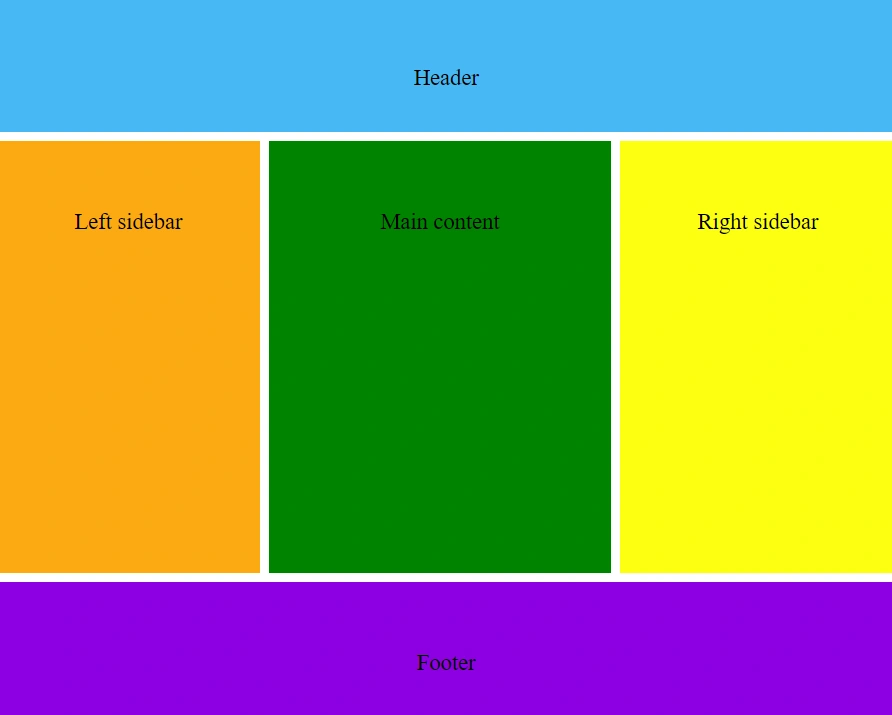
Output Image
Conclusion
CSS Grid provides a powerful and intuitive way to create responsive layouts on the web. By defining grid containers and items, designers can easily structure content and achieve complex layouts with minimal code. The example demonstrated here showcases how CSS Grid can be used to create a multi-column layout. CSS Grid is a valuable tool for modern web design.
Join the conversation! Your thoughts help the community grow.