

Before reading this article, I would like you to read the Part 1 of this article series:
Here's the second part of the series, where I will explain the StackPanel and Grid elements. Most of the time developers are confused about where to place controls inside a StackPanel or Grid element.
Let's learn about the StackPanel and Grid elements.
StackPanel elements are basically placed on top of a Grid or at the bottom of Grid elements. So, if you think about a simple web application where you place the page name inside title tag same as the working of Windows Phone apps StackPanel.
- <!--LayoutRoot is the root grid where all page content is placed-->
- <Grid x:Name="LayoutRoot" Background="Transparent">
- <Grid.RowDefinitions>
- <RowDefinition Height="Auto"/>
- <RowDefinition Height="*"/>
- </Grid.RowDefinitions>
- <!--TitlePanel contains the name of the application and page title-->
- <StackPanel x:Name="TitlePanel" Grid.Row="0" Margin="12,17,0,28">
- <TextBlock x:Name="ApplicationTitle" Text="MY APPLICATION" Style="{StaticResource PhoneTextNormalStyle}"/>
- <TextBlock x:Name="PageTitle" Text="StackPanel" Margin="9,-7,0,0" Style="{StaticResource PhoneTextTitle1Style}"/>
- </StackPanel>
- <!--ContentPanel - place additional content here-->
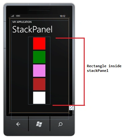
- <StackPanel Margin="150">
- <Rectangle Fill="Red" Width="100" Height="100" Margin="5" />
- <Rectangle Fill="Green" Width="100" Height="100" Margin="5" />
- <Rectangle Fill="Violet" Width="100" Height="100" Margin="5" />
- <Rectangle Fill="Firebrick" Width="100" Height="100" Margin="5" />
- <Rectangle Fill="White" Width="100" Height="100" Margin="5" />
- </StackPanel>
- </Grid>
Grid Element
A Grid Element provides more flexiblity to arrange a control in multiple rows or columns. In a Grid element you can set the row and column using these two RowDefinition and ColumnDefinition properties.You can set your control like Textblock, TextBox, Hyperlinkbutton and Image in a cell using row and column definitions.
The following XAML shows how to create a grid with four rows and two columns:
- The height of the first row that contains the text is set to auto.
- The height of the second row is set to 100px.
- The third and fourth row are set for the rest of the available height
- The width of the columns are set equally within the available container width using "*".
- <Grid x:Name="LayoutRoot" Background="Transparent">
- <Grid.RowDefinitions>
- <RowDefinition Height="*"/>
- <RowDefinition Height="100"/>
- <RowDefinition Height="*"/>
- <RowDefinition Height="*"></RowDefinition>
- </Grid.RowDefinitions>
- <Grid.ColumnDefinitions>
- <ColumnDefinition Width="*"></ColumnDefinition>
- <ColumnDefinition Width="*"></ColumnDefinition>
- </Grid.ColumnDefinitions>
- <!--TitlePanel contains the name of the application and page title-->
- <StackPanel x:Name="TitlePanel" Grid.ColumnSpan="2" Grid.Row="0"
- Margin="12,17,0,28">
- <TextBlock x:Name="ApplicationTitle" Text="MY APPLICATION"
- Style="{StaticResource PhoneTextNormalStyle}"/>
- <TextBlock x:Name="PageTitle" Text="page name" Margin="9,-7,0,0"
- Style="{StaticResource PhoneTextTitle1Style}"/>
- </StackPanel>
- <!--ContentPanel - place additional content here-->
- <Rectangle Fill="BLUE" Grid.Column="0" Grid.Row="1"></Rectangle>
- <Rectangle Fill="RED" Grid.Column="1" Grid.Row="1"></Rectangle>
- <Rectangle Fill="pink" Grid.Column="0" Grid.Row="2"></Rectangle>
- <Rectangle Fill="Aqua" Grid.Column="1" Grid.Row="2"></Rectangle>
- <Rectangle Fill="BlueViolet" Grid.Column="0" Grid.Row="3"></Rectangle>
- <Rectangle Fill="DarkMagenta" Grid.Column="1" Grid.Row="3"></Rectangle>
- </Grid>

Santhakumar MunuswamyPosted Jul 23, 2015, 2:55 PM
Thanks for nice article:)
Vipul MalhotraPosted Jul 23, 2015, 6:31 AM
Nice Article
Rahul Kumar SaxenaPosted Jul 22, 2015, 2:20 PM
Informative