

We can show and hide the modal using the methods provided by Bootstrap Modal plugin.
Description
We are using modal ('show') and modal ('hide') methods to show and hide the login modal.
Reference
Before this article you should go through my Introduction to Bootstrap. Show Bootstrap Image Using Asp.Net MVC http://www.c-sharpcorner.com/blogs/bootstrap-image-show-using-asp-net-mvc3
Steps
Create a controller class file called "HomeController.cs" and add controller action method called "ModalPopUp()";
- using System;
- using System.Collections.Generic;
- using System.Linq;
- using System.Web;
- using System.Web.Mvc;
- namespace SatyaMVCBootstrapImages.Controllers
- {
- public class HomeController : Controller
- {
- //
- // GET: /Home/
- public ActionResult Index()
- {
- return View();
- }
- public ActionResult ModalPopUp()
- {
- return View();
- }
- }
- }
- @{
- ViewBag.Title = "Satyaprakash Bootstrap PopUp";
- }
- <title>@ViewBag.Title</title>
- <link href="bootstrap/css/bootstrap.min.css" rel="stylesheet">
- <style>
- .button {
- background-color: #4CAF50; /* Green */
- border: none;
- color: white;
- padding: 15px 32px;
- text-align: center;
- text-decoration: none;
- display: inline-block;
- font-size: 16px;
- margin: 4px 2px;
- cursor: pointer;
- }
- .button1 {
- border-radius: 2px;
- }
- .button2 {
- border-radius: 4px;
- }
- .button3 {
- border-radius: 8px;
- }
- .button4 {
- border-radius: 12px;
- }
- .button5 {
- border-radius: 50%;
- }
- </style>
- <div>
- <h2 style="background-color: Yellow;color: Blue; text-align: center; font-style: oblique">Satyaprakash Bootstrap PopUp</h2>
- <fieldset>
- <legend style="color:orangered">Click On Satyaprakash Bootstrap PopUp</legend>
- <div class="container">
- <div class="row">
- <div class="col-xs-12">
- <button id="btnShowModal" type="button"
- class="btn btn-sm btn-default pull-left col-lg-11 button button4">
- Satya Modals
- </button>
- <div class="modal fade" tabindex="-1" id="loginModal"
- data-keyboard="false" data-backdrop="static">
- <div class="modal-dialog modal-lg">
- <div class="modal-content">
- <div class="modal-header">
- <button type="button" class="close" data-dismiss="modal">
- ×
- </button>
- <h4 class="modal-title">Satya Login</h4>
- </div>
- <div class="modal-body">
- <form>
- <div class="form-group">
- <input class="form-control" type="text"
- placeholder="Login Username" id="inputUserName" />
- </div>
- <div class="form-group">
- <input class="form-control" placeholder="Login Password"
- type="password" id="inputPassword" />
- </div>
- </form>
- </div>
- <div class="modal-footer">
- <button type="submit" class="btn btn-primary button button4">Sign</button>
- <button type="button" id="btnHideModal" class="btn btn-primary button button4">
- Hide
- </button>
- </div>
- </div>
- </div>
- </div>
- </div>
- </div>
- </div>
- </fieldset>
- </div>
- <footer>
- <p style="background-color: Yellow; font-weight: bold; color:blue; text-align: center; font-style: oblique">
- ©
- <script> document.write(new Date().toDateString()); </script>
- </p>
- </footer>
- <script src="https://ajax.googleapis.com/ajax/libs/jquery/1.11.3/jquery.min.js">
- </script>
- <script src="bootstrap/js/bootstrap.min.js"></script>
- <script type="text/javascript">
- $(document).ready(function () {
- $("#btnShowModal").click(function () {
- $("#loginModal").modal('show');
- });
- $("#btnHideModal").click(function () {
- $("#loginModal").modal('hide');
- });
- });
- </script>
add bootstrap features.
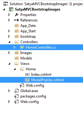
I have added code for a button to perform modal popup.
- <button id="btnShowModal" type="button"
- class="btn btn-sm btn-default pull-left col-lg-11 button button4">
- Satya Modals
- </button>
- <div class="modal fade" tabindex="-1" id="loginModal"
- data-keyboard="false" data-backdrop="static">
- <div class="modal-dialog modal-lg">
- <div class="modal-content">
- <div class="modal-header">
- <button type="button" class="close" data-dismiss="modal">
- ×
- </button>
- <h4 class="modal-title">Satya Login</h4>
- </div>
- <div class="modal-body">
- <form>
- <div class="form-group">
- <input class="form-control" type="text"
- placeholder="Login Username" id="inputUserName" />
- </div>
- <div class="form-group">
- <input class="form-control" placeholder="Login Password"
- type="password" id="inputPassword" />
- </div>
- </form>
- </div>
- <div class="modal-footer">
- <button type="submit" class="btn btn-primary button button4">Sign</button>
- <button type="button" id="btnHideModal" class="btn btn-primary button button4">
- Hide
- </button>
- </div>
- </div>
- <button type="button" class="close" data-dismiss="modal">
- ×
- </button>
- <div class="modal-header">
- <button type="button" class="close" data-dismiss="modal">
- ×
- </button>
- <h4 class="modal-title">Satya Login</h4>
- </div>
- <div class="modal-body">
- <form>
- <div class="form-group">
- <input class="form-control" type="text"
- placeholder="Login Username" id="inputUserName" />
- </div>
- <div class="form-group">
- <input class="form-control" placeholder="Login Password"
- type="password" id="inputPassword" />
- </div>
- </form>
- </div>
- <div class="modal-footer">
- <button type="submit" class="btn btn-primary button button4">Sign</button>
- <button type="button" id="btnHideModal" class="btn btn-primary button button4">
- Hide
- </button>
- </div>
- <script type="text/javascript">
- $(document).ready(function () {
- $("#btnShowModal").click(function () {
- $("#loginModal").modal('show');
- });
- $("#btnHideModal").click(function () {
- $("#loginModal").modal('hide');
- });
- });
- </script>
- <style>
- .button {
- background-color: #4CAF50; /* Green */
- border: none;
- color: white;
- padding: 15px 32px;
- text-align: center;
- text-decoration: none;
- display: inline-block;
- font-size: 16px;
- margin: 4px 2px;
- cursor: pointer;
- }
- .button1 {
- border-radius: 2px;
- }
- .button2 {
- border-radius: 4px;
- }
- .button3 {
- border-radius: 8px;
- }
- .button4 {
- border-radius: 12px;
- }
- .button5 {
- border-radius: 50%;
- }
- </style>
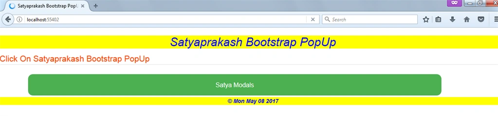
OUTPUT
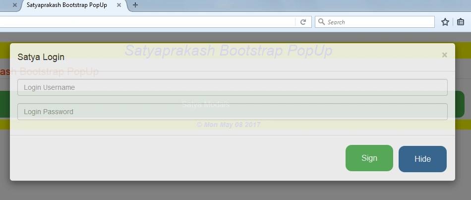
Desktop View
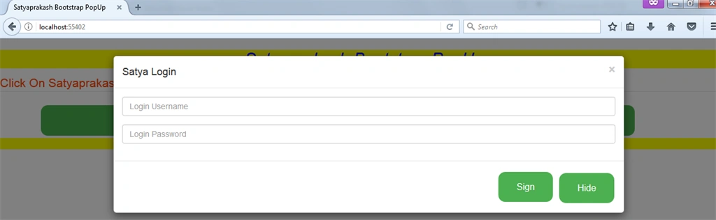
By clicking hide button Or Cross Mark on header it will be hidden.
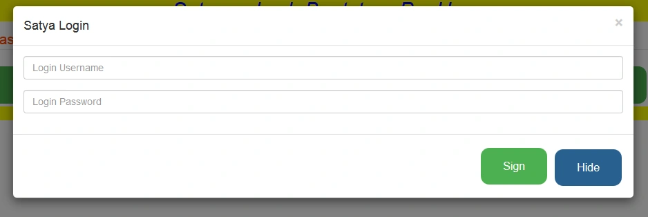
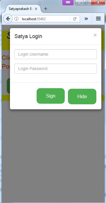
Mobile View
SUMMARY
We learned:
What is Modal Popup in bootstrap?
How to get it with Asp.net MVc.
What is Modal Popup in bootstrap?
How to get it with Asp.net MVc.
Ramandeep SinghPosted Apr 19, 2020, 3:53 PM
Hi, I am new in mvc. I have a question. What is role of Model in this popup page?
Jhunard RiveraPosted Jan 8, 2020, 9:29 PM
How about Editing Data from table sir ?
irene alvarezPosted Sep 17, 2019, 12:28 PM
Good man! thanks for the help!
saravanan NPosted Jul 12, 2017, 8:15 AM
Thanks for giving information
Prashant KansalPosted May 13, 2017, 8:01 AM
awesome sir ..........
Manav PandyaPosted May 11, 2017, 12:02 AM
Nice share ........
Saravanakumar SekaranPosted May 10, 2017, 3:16 AM
Really awesome awesome !!!!