

Open SharePoint site
Create a simple custom list named Products.
Create some custom columns in it.
| Column Name | Type |
| Title (By default) | Single line of text |
| Product | Single line of text |
| Year | Number |
| Sale Percentage | Number |
Now, the created list looks, as shown below.

Download Chart.min.js.
Upload it into the Site Assets library.

Now, open Sharepoint Designer. Create a simple HTML file and add some JSOM work to get the results and display HTML files, using CEWP(Content Editor Web Part).

Code
- <script src="…/…../SiteAssets/chart.min.js" type="text/javascript"></script>
- <script type="text/javascript">
- SP.SOD.executeOrDelayUntilScriptLoaded(pie, 'sp.js');
- /*Pie*/
- var collListItem; //ListItems
- var chartX = []; //X-Axis Labels
- var chartY = []; //Y-Axis Values
- /*Pie*/
- function pie() {
- var clientContext = new SP.ClientContext('/sites/dev/');
- var oList = clientContext.get_web().get_lists().getByTitle('Product');
- var camlQuery = new SP.CamlQuery();
- camlQuery.set_viewXml('<View></View>');
- this.collListItem = oList.getItems(camlQuery);
- clientContext.load(collListItem);
- clientContext.executeQueryAsync(
- Function.createDelegate(this, this.onQuerySucceeded),
- Function.createDelegate(this, this.onQueryFailed)
- );
- }
- function onQuerySucceeded()
- {
- console.log("pie success");
- var listItemEnumerator = collListItem.getEnumerator();
- //Create Points from ListData
- while (listItemEnumerator.moveNext()) {
- var oListItem = listItemEnumerator.get_current();
- chartX.push(oListItem.get_item('Year'));
- chartY.push(oListItem.get_item('Sales'));
- }
- //Load Chart JS
- //Generate Data
- var Piedata = {
- labels: this.chartX,
- datasets: [
- {
- percentageInnerCutout : 100,
- data: this.chartY,
- backgroundColor: [
- "#BAA378",
- "#C0A172",
- "#BAA378",
- "#382E1C",
- "#453823",
- "#2C2416",
- "#CC9900",
- "#663300",
- "#B67721",
- "#7F5417"
- ],
- borderWidth: 0,
- hoverBackgroundColor: [
- "#DAD9D5",
- "#E0E0E0",
- "#C8C0B5",
- "#998763"
- ]
- }
- ]
- };
- //Display Chart
- var ctxpie = document.getElementById('pie');
- var myNewpie = new Chart(ctxpie, { type: 'pie', data: Piedata, options: { legend: { display: false }} });
- }
- function onQueryFailed()
- {
- console.log("error");
- alert('Request failed. ' + args.get_message() +
- '\n' + args.get_stackTrace());
- }
- </script>
- <b></b>
- <h3>Sharepoint server 2013 Sales report by year basis</h3>
- </b>
- <canvas id="pie" width="100" height="30"></canvas>
Note
You can also create Doughnut and Bar charts by changing the type: Pie.
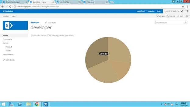
Here, the final result is given below.
Sasi dasariPosted Oct 8, 2019, 4:38 PM
I can only display this Sharepoint server 2013 Sales report by year basis. not the chart
Wayne JondlePosted Feb 15, 2019, 5:48 PM
I am trying this in sharepoint online and the chart is not rendering, but I get no errors
sameen hewagePosted Aug 31, 2017, 5:06 AM
Is this working for office 365 SharePoint Online??
sravan callurPosted Aug 7, 2017, 10:07 AM
Not working. I have followed the same steps shown.