Introduction
Themes are nothing but some predefined styles for each and every control. For example you want a Blue Theme for your Silverlight Application that is for all of your controls inside the application. Of course you can do your own templates for your own controls but in Silverlight 3, themes come by default. It makes your Silverlight Application look good in some few steps.
So in this article we are going to see how to use the Themes.
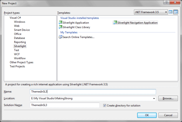
Crating Silverlight Project
Fire up Visual Studio 2008 and create a Silverlight Navigation Application. Name it as ThemesInSL3.
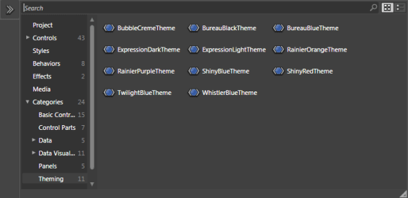
Open the Solution in Expression Blend 3.
In the Asset library if you look into it you will find several themes under the category Categories-> Theming.
Here is the idea about our application. As you know I have created a Silverlight Navigation Application, the reason I have used is to display all the themes in different page. If you implement all the themes in a single page the xap file will become too large and the Silverlight plug in will not be able to display your content. It will throw a java script error.
So I have decided to design a set of controls in home page without themes on, and other pages the respective themes will be applied.
For the requirement of the Application I have designed the application as follows:
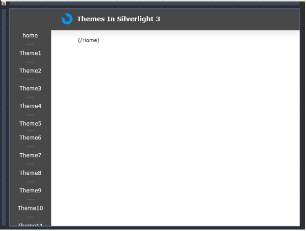
Now we all some controls into the home page and we will replicate all those controls in all our Theme Pages.
As we discussed earlier, I have replicated the above design in all the Theme Pages.
Now, how can we use the themes for a particular set of controls?
The themes control takes only one control to be inside it, whether it is a button control or a grid control. So you might have got the idea of putting the Grid inside the Theme. Yes, you are right.
Now select the theme for the page and add into the grid, then remove the content property of the theme and drag the Grid inside it. You can do it in design view and in xaml view as well.
The following xaml will help you following it.
<ScrollViewer x:Name="PageScrollViewer" Style="{StaticResource PageScrollViewerStyle}">
<bureauBlack:BureauBlackTheme Margin="0,0,8,0" VerticalAlignment="Top" d:LayoutOverrides="Width">
<Grid x:Name="ContentGrid" Height="479" Width="640">
<Grid.RowDefinitions>
<RowDefinition Height="0.071*"/>
<RowDefinition Height="0.19*"/>
<RowDefinition Height="0.203*"/>
<RowDefinition Height="0.537*"/>
</Grid.RowDefinitions>
<Grid.ColumnDefinitions>
<ColumnDefinition Width="0.18*"/>
<ColumnDefinition Width="0.203*"/>
<ColumnDefinition Width="0.194*"/>
<ColumnDefinition Width="0.202*"/>
<ColumnDefinition Width="0.222*"/>
</Grid.ColumnDefinitions>
<TextBlock HorizontalAlignment="Center" VerticalAlignment="Top" Text="TextBlock" TextWrapping="Wrap"/>
<TextBox Margin="15,0,15,10" Width="100" Grid.Column="1" Text="TextBox" TextWrapping="Wrap" d:LayoutOverrides="Height"/>
<Button HorizontalAlignment="Center" Margin="0,0,0,12" Width="100" Content="Button" Grid.Column="2" d:LayoutOverrides="Height"/>
<CheckBox HorizontalAlignment="Center" Margin="0" VerticalAlignment="Top" Content="CheckBox" Grid.Column="3"/>
<RadioButton HorizontalAlignment="Center" Margin="0" VerticalAlignment="Top" Content="RadioButton" Grid.Column="4"/>
<ComboBox Height="20" Margin="0" VerticalAlignment="Top" Grid.Row="1">
<ComboBoxItem Content="ComboBoxItem"/>
<ComboBoxItem Content="ComboBoxItem"/>
<ComboBoxItem Content="ComboBoxItem"/>
</ComboBox>
<Slider Margin="0,0,0,16" VerticalAlignment="Center" Grid.Column="1" Grid.ColumnSpan="2" Grid.Row="1" d:LayoutOverrides="Width, Height, GridBox"/>
<controls:Calendar HorizontalAlignment="Center" VerticalAlignment="Center" Grid.Column="3" Grid.ColumnSpan="4" Grid.Row="1" Grid.RowSpan="2" d:LayoutOverrides="Width, Height"/>
<inputToolkit:NumericUpDown HorizontalAlignment="Center" Margin="0,0,0,12" VerticalAlignment="Center" Grid.Column="2" Grid.Row="2"/>
<ListBox Margin="0" Grid.ColumnSpan="2" Grid.Row="2">
<ListBoxItem Content="ListBoxItem"/>
<ListBoxItem Content="ListBoxItem"/>
<ListBoxItem Content="ListBoxItem"/>
<ListBoxItem Content="ListBoxItem"/>
</ListBox>
<data:DataGrid Margin="0" Grid.Row="3" Grid.ColumnSpan="2">
<data:DataGrid.Columns>
<data:DataGridCheckBoxColumn/>
<data:DataGridTextColumn/>
</data:DataGrid.Columns>
</data:DataGrid>
<ProgressBar Height="30" Margin="0" VerticalAlignment="Center" Grid.Row="3" Grid.Column="2" Grid.ColumnSpan="3" IsIndeterminate="True"/>
</Grid>
</bureauBlack:BureauBlackTheme>
</ScrollViewer>
As we discussed, the above xaml displays the Grid inside the theme.
Now one more thing when you add a theme to the page an assembly is automatically added to the reference and if you go ahead and check your Navigation: Page section you will find it.
xmlns:bureauBlack="clr-namespace:System.Windows.Controls.Theming;assembly=System.Windows.Controls.Theming.BureauBlack
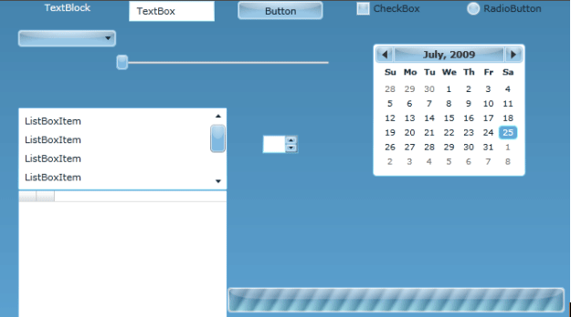
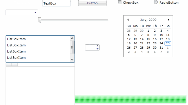
Now our application is ready to go, press F5 to run the application and browse through the pages to find out different themes. I am providing different screenshot for your reference.
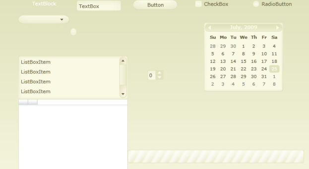
Theme: Bubble Creme
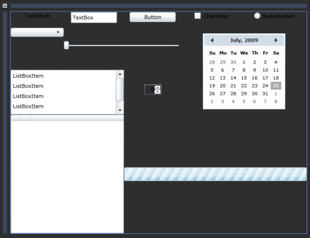
Theme: Bureau Black
Theme: Bureau Blue
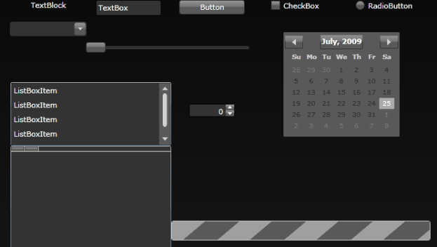
Theme: Expression Dark
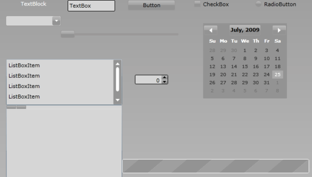
Theme: Expression Light
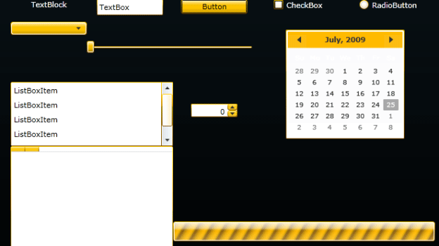
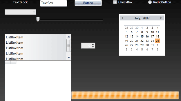
Theme: Rainier Orange
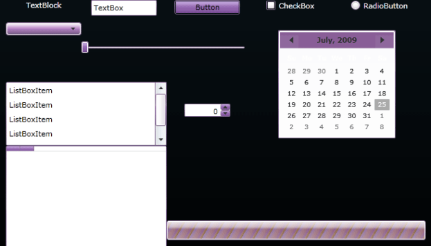
Theme: Rainier Purple
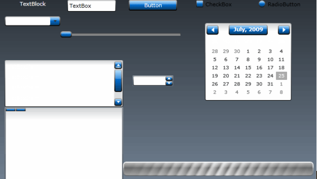
Theme: Shiny Blue
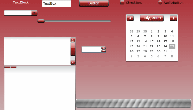
Theme: Shiny Red
Theme: Twilight Blue
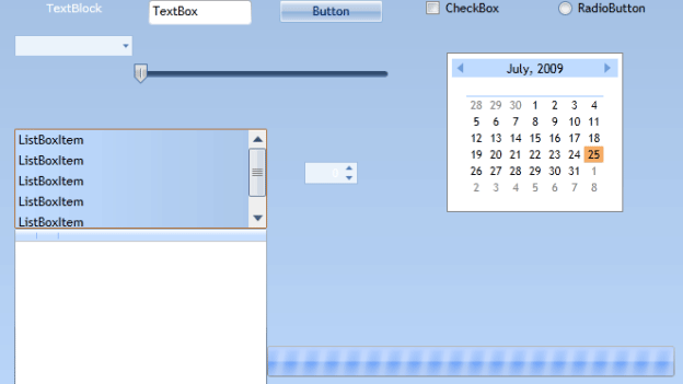
Theme: Whistler Blue
My personal favourite are the Shiny Red and Rainier Orange themes, go ahead and choose best for your application.
Enjoy Coding.