This article shows you how to create and use a ListBox control available in Silverlight 2.0.
ListBox
The ListBox tag represents a Silverlight ListBox control in XAML.
<ListBox></ListBox>
The Width and Height attributes represent the width and the height of a ListBox. The x:Name attribute represents the name of the control, which is a unique identifier of a control.
The following code snippet sets the name, height, and width of a ListBox control.
<ListBox x:Name="McListBox" Width="300" Height="200">
</ListBox>
Adding ListBox Items
A ListBox control hosts a collection of ListBoxItem. The following code snippet adds items to a ListBox control.
<ListBox x:Name="McListBox" Width="300" Height="200">
<ListBoxItem Content="Coffie"></ListBoxItem>
<ListBoxItem Content="Tea"></ListBoxItem>
<ListBoxItem Content="Orange Juice"></ListBoxItem>
<ListBoxItem Content="Milk"></ListBoxItem>
<ListBoxItem Content="Iced Tea"></ListBoxItem>
<ListBoxItem Content="Mango Shake"></ListBoxItem>
</ListBox>
The above code generates Figure 1.
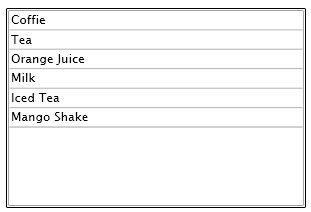
Figure 1. ListBox with items
Formatting ListBox Items
The Foreground and Background attributes of ListBoxItem represents the background and foreground colors of the item. The following code snippet sets background and foreground color of a ListBoxItem.
<ListBoxItem Background="LightCoral" Foreground="Red" Content="Coffie"></ListBoxItem>
The FontFamily, FontSize, and FontWeight are used to set a font of a ListBoxItem. The following code snippet sets font verdana, size 12, and bold of a ListBoxItem.
<ListBoxItem Background="LightCoral" Foreground="Red" Content="Coffie"
FontFamily="Verdana" FontSize="12" FontWeight="Bold"></ListBoxItem>
I set the following properties of ListBoxItems.
<ListBoxItem Background="LightCoral" Foreground="Red" Content="Coffie"
FontFamily="Verdana" FontSize="12" FontWeight="Bold"></ListBoxItem>
<ListBoxItem Background="LightGray" Foreground="Black" Content="Tea"
FontFamily="Georgia" FontSize="14" FontWeight="Bold"></ListBoxItem>
<ListBoxItem Background="LightBlue" Foreground="Purple" Content="Orange Juice"
FontFamily="Verdana" FontSize="12" FontWeight="Bold"></ListBoxItem>
<ListBoxItem Background="LightGreen" Foreground="Green" Content="Milk"
FontFamily="Georgia" FontSize="14" FontWeight="Bold"></ListBoxItem>
<ListBoxItem Background="LightBlue" Foreground="Blue" Content="Iced Tea"
FontFamily="Verdana" FontSize="12" FontWeight="Bold"></ListBoxItem>
<ListBoxItem Background="LightSlateGray" Foreground="Orange" Content="Mango Shake"
FontFamily="Georgia" FontSize="14" FontWeight="Bold"></ListBoxItem>
The new ListBox looks like Figure 2.
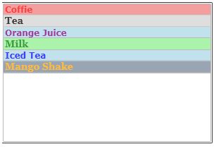
Figure 2. Formatted ListBox
Displaying Images in a ListBox
We can put any controls inside a ListBoxItem such as an image and text. To display an image side by side some text, I simply put an image and text block within a StackPanel. The following code snippet adds an image and text to a ListBoxItem.
<ListBoxItem>
<StackPanel Orientation="Horizontal">
<Image Source="BlueThumb.png"></Image>
<TextBlock Text="Blue Image"></TextBlock>
</StackPanel>
</ListBoxItem>
After changing my code for all 5 ListBoxItems, the ListBox looks like Figure 3.
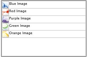
Figure 3. ListBoxItems with Image and text
ListBox with CheckBoxes
If you put a CheckBox control inside ListBoxItems, you generate a ListBox control with checkboxes in it. The following code snippet adds a CheckBox to a ListBoxItem.
<ListBoxItem>
<CheckBox x:Name="BlueCheckBox" Content="Blue Box"></CheckBox>
</ListBoxItem>
I change the code of ListBoxItems and add following CheckBoxes to the items. As you may see, I have set the name of the CheckBoxes using x:Name. IF you need to access these CheckBoxes, you may using their names.
<ListBoxItem>
<CheckBox x:Name="BlueCheckBox" Content="Blue Box"></CheckBox>
</ListBoxItem>
<ListBoxItem>
<CheckBox x:Name="RedCheckBox" Content="Red Box"></CheckBox>
</ListBoxItem>
<ListBoxItem>
<CheckBox x:Name="PurpleCheckBox" Content="Purple Box"></CheckBox>
</ListBoxItem>
<ListBoxItem>
<CheckBox x:Name="GreenCheckBox" Content="Green Box"></CheckBox>
</ListBoxItem>
<ListBoxItem>
<CheckBox x:Name="OrangeCheckBox" Content="Orange Box"></CheckBox>
</ListBoxItem>
Now, the new ListBox looks like Figure 4.
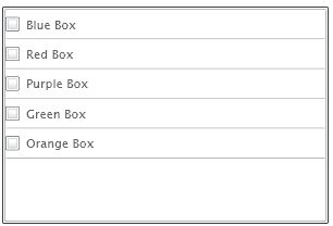
Figure 4. ListBox with CheckBoxes
Summary
In this article, I discussed how to create and use a ListBox control available in Silverlight 2.0. We also saw how we can add a ListBox items, change their properties, add images and add CheckBoxes to a ListBox.
I hope you enjoyed this article. All feedback and critics are most welcome. Feel free to post them at the bottom of this article.