This tutorial discusses how to create and use user controls in Silverlight 2.0 and Visual Studio 2008. The first part of the tutorial creates an ImageViewer user control and second part shows how to use this control in a Silverlight Web application.
Part 1: Creating a User Control
In this section, we create an ImageViewer custom control, which looks like Figure 1. The area inside the black rectangle is used to display an image in this control. The bottom area with orange background is used to set some built-in stretch property of the control.
![CCImg2[1].jpg](https://www.c-sharpcorner.com/UploadFile/mahesh/user-control-in-silverlight/Images/CCImg2[1].jpg)
Figure 1. The ImageViewer Custom Control
Get Started
Let's get started. Create a new project using Visual Studio 2008 and select Visual C# in the Project types in the left side and Silverlight Application in the right side Templates pane as shown in Figure 2.
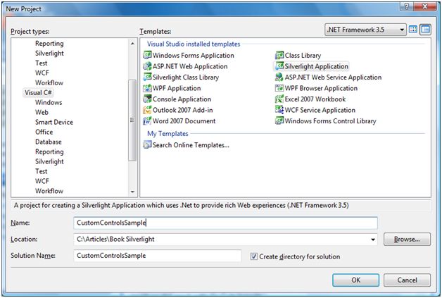
Figure 2. Silverlight Application
On next step, you will be asked to add a new Web to the solution. Just go ahead and keep the default (first radio button) selected and click OK button at the bottom of this dialog as shown in Figure 3.
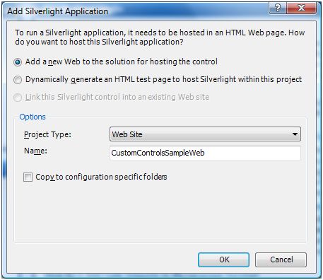
Figure 3.
Adding and Designing a User Control
Now let's add a user control to our application.
Right click on the project name in Solution Explorer and select Add New Item menu item. In the left side pane, select Silverlight and in the right pane, select Silverlight User Control option and enter ImageViewer.xaml as the name of the control and click Add as shown in Figure 4.
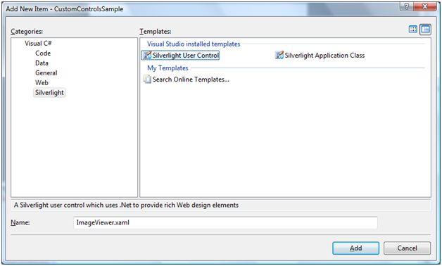
Figure 4. Adding a Silverlight User Control
One the user control class is added, let's go in the XAML editor and design the control the way you want. I design my control as displayed in Figure 1.
The XAML code in Listing 1 creates the UI.
<UserControl x:Class="CustomControlsSample.ImageViewer"
xmlns="http://schemas.microsoft.com/winfx/2006/xaml/presentation"
xmlns:x="http://schemas.microsoft.com/winfx/2006/xaml" >
<Grid x:Name="LayoutRoot" Background="Gray" Width="500" Height="400" >
<StackPanel Margin="10,10,10,10" Background="Black" Height="320" Width="480"
VerticalAlignment="Top" Orientation="Vertical" >
<StackPanel Margin="10,10,10,10" Height="300" Width="460" Background="Gray">
<Image x:Name="MCViewer">
</Image>
</StackPanel>
</StackPanel>
<StackPanel Margin="0,0,0,10" Background="Orange" Width="480" Height="50"
VerticalAlignment="Bottom" Orientation="Horizontal">
<TextBlock Margin="5,0,0,0">Stetch</TextBlock>
<RadioButton Margin="10,0,0,-20" GroupName="MCSites" Background="Yellow"
Foreground="Blue" Content="None" IsChecked="True">
</RadioButton>
<RadioButton Margin="10,0,0,-20" GroupName="MCSites" Background="Yellow"
Foreground="Black" Content="Fill" >
</RadioButton>
<RadioButton Margin="10,0,0,-20" GroupName="MCSites" Background="Yellow"
Foreground="Green" Content="Uniform">
</RadioButton>
<RadioButton Margin="10,0,0,-20" GroupName="MCSites" Background="Yellow"
Foreground="Purple" Content="UniformToFill">
</RadioButton>
</StackPanel>
</Grid>
</UserControl>
Listing 1. XAML UI
As you can see from the code listed in Listing 1, I add bunch of nested StackPanels with an Image control, TextBlock, and RadioButton controls.
The following code is the Image control.
<Image x:Name="MCViewer"></Image>
Adding User Control Properties and Methods
Now we are going to add properties and methods to our user control. These methods and properties are accessible from the applications that will use the ImageViewer control.
In our user control, we will add two user control members. One property called ImageUrl and one method called Refresh.
There are two ways you can add properties and methods to a class. You can either use the Class Designer tool available in Visual Studio 2008 or you can type class code by hand. Using Class Designer is a little bit tricky. If you are an experienced developer, I suggest you type your code by hand.
In our sample, we will use Class Designer to add properties and methods to our user control. To launch the Class Designer, click on View Class Diagram icon in the Solution Explorer as shown in Figure 5.
Note: View Class Diagram option is not available unless you are in the class code.
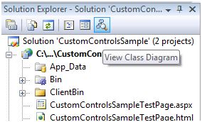
Figure 5. Class Designer
If you right click on the ImageViewer class, you will see many menu options and if you click on Add, you will see options to add a method a property, a field, an event, a constructor, a destructor, and a constant. See Figure 6. You simply need to pick a class member that you would like to add to your class.
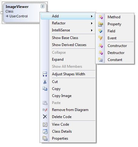
Figure 6. Class Designer Options
Now let's add a property ImageUrl and a method Refresh to the class. Right click on the Class Diagram , select Add >> Property and Add >> Method options.
After adding a property and a method, the class diagram looks like Figure 7.
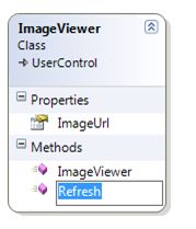
Figure 7. Class Designer with a property and a method
But we are not there yet.
Now right click on the property and select Class Details. It will open the Class Details designer where we can change the types and parameters of the class members. As shown in Figure 8, I change ImageUrl property to string from int.
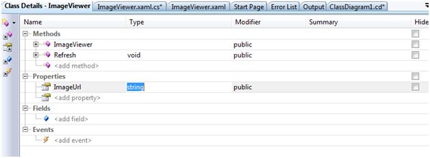
Figure 8. Class Details
Now let's review the code. Double click on the .cs file in the Solution Explorer, the code added by the designer looks like Listing 2.
public string ImageUrl
{
get
{
throw new System.NotImplementedException();
}
set
{
}
}
public void Refresh()
{
throw new System.NotImplementedException();
}
Listing 2
I change my code and the final code is listed in Listing 3. The code is pretty simple. The ImageUrl property simply gets and sets the imageURL field of the class. The Refresh method creates a BitmapImage, sets its UriSource property with the ImageUrl and sets Source property of Image control as the BitmapImage.
This action actually makes an image to be displayed in an Image control.
/// <summary>
/// Protected field.
/// </summary>
protected string imageURL;
/// <summary>
/// Public Property used to set the Image path/URL
/// </summary>
public string ImageUrl
{
get { return this.imageURL; }
set { this.imageURL = value; }
}
/// <summary>
/// Public method. Refreshes the control with current settings.
/// </summary>
public void Refresh()
{
BitmapImage bi = new BitmapImage();
bi.UriSource = new Uri(this.ImageUrl, UriKind.RelativeOrAbsolute);
MCViewer.Source = bi;
}
Listing 3
Build
Now build your project and you are all set.
Part 2: Using a Custom Control
Now we will create a Silverlight application that uses our ImageViewer control we created in the earlier step.
Let's create a new Silverlight application using the same steps we used in Part 1 of this tutorial. Once your application is created, add reference to CustomControlSample.dll we created in earlier step. To add reference to the custom control assembly, you right click on the Project and select Add Reference and browse to the DLL on your machine.
After the assembly is referenced, we need to import the namespace in XAML file using the following syntax.
xmlns:MyNms="clr-namespace:CustomControlsSample"
After you import the namespace and if you type MyNms and you should see the ImageViewer control in the Intellisense as shown in Figure 9.
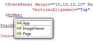
Figure 9. ImageViewer in Intellisense
Now we simply add the ImageViewer control as following:
<MyNms:ImageViewer x:Name="MyImageControl" ></MyNms:ImageViewer>
The final XAML page looks like Listing 4.
<UserControl x:Class="CustomControlsSample.Page"
xmlns="http://schemas.microsoft.com/winfx/2006/xaml/presentation"
xmlns:x="http://schemas.microsoft.com/winfx/2006/xaml"
xmlns:MyNms="clr-namespace:CustomControlsSample"
>
<StackPanel Margin="10,10,10,10" Background="White" Height="400" Width="500"
VerticalAlignment="Top" >
<MyNms:ImageViewer x:Name="MyImageControl" ></MyNms:ImageViewer>
</StackPanel>
</UserControl>
Listing 4
Now we are going to set the ImageViewer control properties and call its Refresh method at run-time. The following code snippet sets the ImageUrl property to a jpg file and calls the Refresh method of the control.
private void LaunchImageViewerControl()
{
MyImageControl.ImageUrl = "Dock.jpg";
MyImageControl.Refresh();
}
Now I call LaunchImageViewerControl method on the Page class constructor.
public Page()
{
InitializeComponent();
LaunchImageViewerControl();
}
If you run the application now, you will see the output displayed in Figure 10.
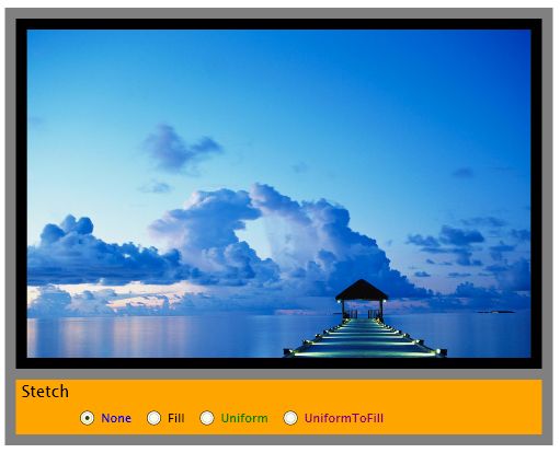
Figure 10. ImageViewer control in Action
Forthcoming
Once I have some free time, I will be adding many more features to this control including image stretch, opacity, zoom and others. If you have any idea, code changes or suggestions, please feel free to post them at the bottom of this article.
Summary
In the first part of this tutorial, I discussed how to create a custom control in Silverlight 2.0 that is used to view an image. The second part showed how to use a user control in a Silverlight application.
I hope you enjoyed this article. All feedback and critics are most welcome. Feel free to post them at the bottom of this article.