The Slider XAML element represents a slider control in XAML. A slider control's default minimum and maximum values are 0 and 10.
The Maximim and Minimum attributes are used to set minimum and maximum values of a slider control.
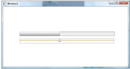
Now, let's create a sample where slider action will change the value of a ProgressBar control.
In the below code, the key is setting the Value property of ProgressBar to Bind with the value of the Slider using ElementName.
Value="{Binding Path=Value, ElementName=Slider
Here is the complete sample:
<Window
xmlns="http://schemas.microsoft.com/winfx/2006/xaml/presentation"
xmlns:x="http://schemas.microsoft.com/winfx/2006/xaml"
x:Class="SliderDB.Window1"
x:Name="Window"
Title="Window1"
Width="640" Height="480">
<Grid x:Name="LayoutRoot">
<Slider RenderTransformOrigin="0.501,0.622" Margin="81,161.66,66,0"
x:Name="Slider" Style="{DynamicResource SimpleSlider}"
VerticalAlignment="Top" Height="22" Maximum="100" Minimum="0" Value="0"
>
<Slider.RenderTransform>
<TransformGroup>
<ScaleTransform ScaleX="-1" ScaleY="-1"/>
<SkewTransform AngleX="0" AngleY="0"/>
<RotateTransform Angle="179.863"/>
<TranslateTransform X="-0.954" Y="-9.028"/>
</TransformGroup>
</Slider.RenderTransform>
<Slider.Background>
<LinearGradientBrush EndPoint="0,1" StartPoint="0,0">
<GradientStop Color="#FFFFFFFF" Offset="0"/>
<GradientStop Color="#FFF5A544" Offset="1"/>
</LinearGradientBrush>
</Slider.Background>
</Slider>
<ProgressBar Margin="80,119,63,0" Style="{DynamicResource SimpleProgressBar}"
VerticalAlignment="Top" Height="20"
Value="{Binding Path=Value, ElementName=Slider, Mode=Default}">
<ProgressBar.Background>
<LinearGradientBrush EndPoint="1,0" StartPoint="0,0">
<GradientStop Color="#FFBABABA" Offset="0"/>
<GradientStop Color="#FFC7C7C7" Offset="0.5"/>
<GradientStop Color="#FF5D9C1D" Offset="0.75"/>
</LinearGradientBrush>
</ProgressBar.Background>
</ProgressBar>
</Grid>
</Window>