

Today we will learn about Telerik Controls for Windows Store Apps using XAML. Telerik provides many UI controls to design apps more easily or effectively. I have used Telerik RadDateTime Picker Control for Windows Store Apps in a previous article. You can see it from here....
http://www.c-sharpcorner.com/UploadFile/99bb20/telerik-rad-datetime-picker-in-windows-store-apps-using-C-Sharp/
In this article I am going to use another Telerik RadControl which is most desirable for developing Windows Store Apps. The Control is Telerik RadHubTile in XAML. You can download Telerik RadControl from here:
http://www.telerik.com/products/windows-metro/overview.aspx
Introduction
RadHubTile is the most commonly used tile. It consists of a title, an image with text and a numeric count, a mosaic of smaller images, etc. It is a rectangular UI element designed specifically to update itself dynamically and show the latest up-to-date information from various services or apps even when they are not running.
Basic Properties of Telerik RadHubTile
- Title: It displays the title of the tile at the bottom-left of the tile.
- ImageSource: It specify the image that display at the middle of the tile.
- Message: Gets or sets the message to display at the upper-right corner of the tile.
- Notification: It specifies additional info to be displayed on the tile such as the latest count. It is displayed in the bottom-right corner of the control.
Now, we are going to use the Telerik RadHubTile control for Windows Store apps.
Step 1
To add a RadHubTile in a XAML page, you have to add the following namespace declaration in the XAML page:
xmlns:Input="using:Telerik.UI.Xaml.Controls.Input"
xmlns:telerikPrimitives="using:Telerik.UI.Xaml.Controls.Primitives"
Step 2
Here is the code for putting RadHubTile in a Windows Store application:
<telerikPrimitives:RadHubTile Width="300" Height="150" VerticalAlignment="Top"
Title="Links" ImageSource="../Images/links.png" Notification="5" FontSize="25" Background="#ADFA5530"/>
Similarly now, you can create as many RadHubTiles as you want with different sizes, titles, images etc. I have designed some tiles in my app.
Here is the full code:
<Page
x:Class="RedTelelrikControls.RadHubTile"
xmlns="http://schemas.microsoft.com/winfx/2006/xaml/presentation"
xmlns:x="http://schemas.microsoft.com/winfx/2006/xaml"
xmlns:local="using:RedTelelrikControls"
xmlns:d="http://schemas.microsoft.com/expression/blend/2008"
xmlns:mc="http://schemas.openxmlformats.org/markup-compatibility/2006"
xmlns:Input="using:Telerik.UI.Xaml.Controls.Input"
xmlns:telerikPrimitives="using:Telerik.UI.Xaml.Controls.Primitives"
mc:Ignorable="d">
<Grid >
<Grid.Background>
<LinearGradientBrush EndPoint="0.5,1" StartPoint="0.5,0">
<GradientStop Color="Black"/>
<GradientStop Color="#FFE63F3F" Offset="1"/>
<GradientStop Color="#FF982929" Offset="0.1"/>
<GradientStop Color="#FFF7EFEF" Offset="0.38"/>
</LinearGradientBrush>
</Grid.Background>
<StackPanel Orientation="Vertical">
<StackPanel Orientation="Horizontal" >
<StackPanel Orientation="Vertical" Margin="50,50">
<telerikPrimitives:RadHubTile Width="300" Height="300" VerticalAlignment="Top"
Title="Contacts" ImageSource="../Images/calls.png" Notification="2" Message="You have 2 New Contacts" FontSize="25" Background="#FFED1591"/>
<telerikPrimitives:RadHubTile Width="300" Height="150" VerticalAlignment="Top"
Title="Notice" ImageSource="../Images/featured.png" Notification="8" FontSize="25" Background="#FFEE1520"/>
<telerikPrimitives:RadHubTile Width="300" Height="150" VerticalAlignment="Top"
Title="Messages" ImageSource="../Images/mails.png" Notification="15" FontSize="25" Background="#EDFF1951"/>
</StackPanel>
<StackPanel Orientation="Vertical" Margin="-45,50,0,0">
<telerikPrimitives:RadHubTile Width="300" Height="150" VerticalAlignment="Top"
Title="News" ImageSource="../Images/news.png" Notification="7" FontSize="25" Background="#DDFFAA91" />
<telerikPrimitives:RadHubTile Width="300" Height="150" VerticalAlignment="Top"
Title="Links" ImageSource="../Images/links.png" Notification="5" FontSize="25" Background="#ADFA5530"/>
<telerikPrimitives:RadHubTile Width="300" Height="300" VerticalAlignment="Top"
Title="Activity" ImageSource="../Images/activities.png" Message="You have 7 New Activity" Notification="7" FontSize="25" Background="#BfFf5010"/>
</StackPanel>
</StackPanel>
<StackPanel Margin="50,-45,0,0">
<telerikPrimitives:RadHubTile Width="610" Height="300" FontSize="25" VerticalAlignment="Top"
Title="Members" ImageSource="../Images/member.png" Message="You have 3 New Request" Notification="3" Background="#BBFF2610"/>
</StackPanel>
</StackPanel>
</Grid>
</Page>
Output
Now, your app is ready, Press F5 to run it.
You will see that TileHub is displayed on your screen.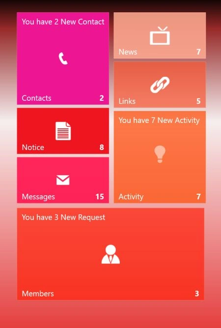
JustinPosted Aug 14, 2013, 4:18 PM
Question - what is the intent of this article? What you have laid out here is nothing more than what you could also accomplish by dragging the control from your toolbox to the page. You should provide more information on how the control could actually be used, simple things you can do in code, etc. As it is - there is no information in this article that seems helpful.
Gaurav GuptaPosted Oct 30, 2012, 5:28 AM
For now, I am not used any architecture model to develop application. I think this is the fine..
Praveen VRPosted Oct 30, 2012, 1:43 AM
Hi Gourav, What architecture you prefer to do windows store apps.Should MVVM fit to do all the actions associated different page templates?