

Introduction
Before reading further, read the following articles.
- Overview of Scalable Vector Graphics (SVG)
- Scalable Vector Graphics - Rectangle
- Scalable Vector Graphics - Circle
- Scalable Vector Graphics - Ellipse
- Scalable Vector Graphics - Line
- Scalable Vector Graphics - Polyline
- Scalable Vector Graphics - Polygon
- Scalable Vector Graphics - Path 1
- Scalable Vector Graphics - Path 2
- Scalable Vector Graphics - Path 3
- Scalable Vector Graphics - Text 1
- Scalable Vector Graphics - Text 2
- Scalable Vector Graphics - Filters 1
Now let's proceed to understand the Blur SVG filters.
SVG Blur effect
- <html>
- <body>
- <svg height="300" width="300">
- <defs>
- <filter id="Blur" y="-5" height="40">
- <feGaussianBlur in="SourceGraphic" stdDeviation="7" y="-"/>
- </filter>
- </defs>
- <circle cx="80" cy="80" r="50"
- style="stroke: none; fill: red; " />
- <circle cx="210" cy="80" r="50"
- style="stroke: none; fill: red; filter: url(#Blur);" />
- </svg>
- </body>
- </html>
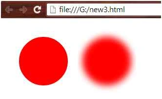
- The id attribute of the <filter> tag defines a unique name for the filter.
- The <feGaussianBlur> tag defines the blur effect.
- The in=”SourceGraphics” is used to define the effect on the entire element.
- The stdDeviation attribute defines the amount of the blur effect. The “s” is the standard deviation in the x-direction and “t” is the standard deviation in the y-direction. The value of stdDeviation can be one or two numbers. If one value is provided then that value will be used for both x & y and if two values are provided then one represents the x-direction and the other represents the y-direction.
- The filter attribute of the <circle> tag links the element to the “Blur” filter.
Example 2
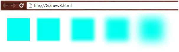
Various Blur amounts:
- <html>
- <body>
- <svg height="300" width="700">
- <defs>
- <filter id="Blur1" x="-20" y="-20" width="50" height="50">
- <feGaussianBlur in="SourceGraphic" stdDeviation="0" />
- </filter>
- <filter id="Blur2" x="-20" y="-20" width="50" height="50">
- <feGaussianBlur in="SourceGraphic" stdDeviation="3" />
- </filter>
- <filter id="Blur3" x="-20" y="-20" width="50" height="50">
- <feGaussianBlur in="SourceGraphic" stdDeviation="7" />
- </filter>
- <filter id="Blur4" x="-20" y="-20" width="50" height="50">
- <feGaussianBlur in="SourceGraphic" stdDeviation="12" />
- </filter>
- <filter id="Blur5" x="-20" y="-20" width="50" height="50">
- <feGaussianBlur in="SourceGraphic" stdDeviation="20" />
- </filter>
- </defs>
- <rect x="20" y="24" width="100" height="100"
- style="stroke: none; fill: #00fff0; filter: url(#Blur1);" />
- <rect x="150" y="24" width="100" height="100"
- style="stroke: none; fill: #00fff0; filter: url(#Blur2);" />
- <rect x="300" y="24" width="100" height="100"
- style="stroke: none; fill: #00fff0; filter: url(#Blur3);" />
- <rect x="450" y="24" width="100" height="100"
- style="stroke: none; fill: #00fff0; filter: url(#Blur4);" />
- <rect x="600" y="24" width="100" height="100"
- style="stroke: none; fill: #00fff0; filter: url(#Blur5);" />
- </svg>
- </body>
- </html>
- <html>
- <body>
- <svg height="300" width="700">
- <defs>
- <filter id="Blur1" y="-5" height="40">
- <feGaussianBlur in="SourceGraphic" stdDeviation="7" y="-"/>
- </filter>
- </defs>
- <circle cx="80" cy="80" r="50"
- style="stroke: none; fill: red; stroke: blue; stroke-width: 5" />
- <circle cx="220" cy="80" r="50"
- style="stroke: none; fill: red; stroke: blue; stroke-width: 5; filter: url(#Blur1);" />
- </svg>
- </body>
- </html>

- <html>
- <body>
- <svg height="300" width="700">
- <defs>
- <filter id="Blur1" x="0" y="0" height="50" width="50">
- <feGaussianBlur in="SourceGraphic" stdDeviation="0" />
- </filter>
- <filter id="Blur2" x="0" y="0" height="50" width="50">
- <feGaussianBlur in="SourceGraphic" stdDeviation="7" />
- </filter>
- </defs>
- <rect x="20" y="20" width="100" height="100" stroke="green" stroke-width="13"
- fill="orange" filter="url(#Blur1)" />
- <rect x="150" y="20" width="100" height="100" stroke="green" stroke-width="13"
- fill="orange" filter="url(#Blur2)" />
- </svg>
- </body>
- </html>
Blurring Alpha channel
- <html>
- <body>
- <svg height="300" width="700">
- <defs>
- <filter id="Blur1" x="0" y="0" height="50" width="50">
- <feGaussianBlur in="SourceGraphic" stdDeviation="0" />
- </filter>
- <filter id="Blur2" x="0" y="0" height="50" width="50">
- <feGaussianBlur in="SourceAlpha" stdDeviation="7" />
- </filter>
- <filter id="Blur3" x="0" y="0" height="50" width="50">
- <feGaussianBlur in="SourceGraphic" stdDeviation="0" />
- </filter>
- <filter id="Blur4" x="0" y="0" height="50" width="50">
- <feGaussianBlur in="SourceAlpha" stdDeviation="10" />
- </filter>
- </defs>
- <rect x="20" y="20" width="100" height="100" fill="lime" filter="url(#Blur1)" />
- <rect x="200" y="20" width="100" height="100" fill="lime" filter="url(#Blur2)" />
- <rect x="400" y="20" width="100" height="100" stroke="brown" stroke-width="13"
- fill="tomato" filter="url(#Blur3)" />
- <rect x="580" y="20" width="100" height="100" stroke="brown" stroke-width="13"
- fill="tomato" filter="url(#Blur4)" />
- </svg>
- </body>
- </html>

Want to learn more.
Summary
In this article, we learned about Scalable Vector Graphics - Filters 2.
Thank you, keep learning and sharing.
Prasanna MuraliPosted May 20, 2016, 11:25 AM
Nice one....
Santhakumar MunuswamyPosted Aug 18, 2015, 2:39 PM
Good one
Abhishek JaiswalPosted Aug 18, 2015, 11:40 AM
Interesting, keep sharing! :)
Gopi ChandPosted Aug 18, 2015, 11:15 AM
Thank you all once again for such appreciation
Chervine BhiwooPosted Aug 18, 2015, 11:01 AM
Good one!
Nilesh JadavPosted Aug 18, 2015, 2:48 AM
Good article sir
Rajeesh MenothPosted Aug 18, 2015, 12:32 AM
Nice One
Nilesh JadavPosted Aug 17, 2015, 4:23 AM
Wonderful share
Sibeesh VenuPosted Aug 17, 2015, 4:11 AM
Nice Share. Thank you.
Yashwanth MuthineniPosted Aug 17, 2015, 1:27 AM
Nice share ..
Ankit BansalPosted Aug 17, 2015, 1:25 AM
thanks for share...
Vaikesh K PPosted Aug 17, 2015, 12:35 AM
Nice series ... :)
Karthikeyan KPosted Aug 16, 2015, 11:19 PM
Good one...