ScrollViewer control in Silverlight 3
Imagine that you just clicked a picture with a digital camera or cellphone. Now you decide to create an image for it using the Image control of Silverlight 3. But if your image is really large (most cameras and cellphones these days offer great megapixel capabilities) then the Image control alone would not be sufficient to display the content of the picture. Because when the image is rendered, only part of it would be visible in the UI. To be able to see the image in its entirety, you need a control that can allow you to scroll, either horizontally, or vertically or in both directions. Luckily for you, such a control is provided by Silverlight 3 and is named as the ScrollViewer control.
This control in Silverlight 3 enables you to scroll through its child controls, which could be an Image or a TextBlock or any such UI control. The ScrollViewer control provides support to include a HorizontalScrollBar and/or a VerticalScrollBar. You can decide which ones to use by specifying the Visibility property of each. For example, HorizontalScrollBarVisibility if set to Visible indicates that the HorizontalScrollBar would be visible.
Create a Silverlight 3 application and drag and drop the ScrollViewer control from the Toolbox into your XAML code (between the Grid tags). Also drag and drop an Image control.
Configure the properties of the controls as shown below.
<UserControl x:Class="ScrollViewerDemo.MainPage"
xmlns="http://schemas.microsoft.com/winfx/2006/xaml/presentation"
xmlns:x="http://schemas.microsoft.com/winfx/2006/xaml"
xmlns:d="http://schemas.microsoft.com/expression/blend/2008" xmlns:mc="http://schemas.openxmlformats.org/markup-compatibility/2006"
mc:Ignorable="d" d:DesignWidth="640" d:DesignHeight="480">
<Grid x:Name="LayoutRoot">
<ScrollViewer Width="200" Height="200" VerticalScrollBarVisibility="Visible" HorizontalScrollBarVisibility="Visible" >
<Image Source="flower1.jpg" Stretch="Fill" Width="400" Height="400" >
</Image>
</ScrollViewer>
</Grid>
</UserControl>
The code is quite simple. We create the ScrollViewer, set the scrollbars for both horizontal as well as vertical scrolling and set the height and width of the control.
Then within this ScrollViewer, we create a child element, an Image, whose source is set to "flower1". (You can change this to your own image name).
And that's it. It's as simple as that. When you execute the application and view it in the browser, you will be able to view your image completely by scrolling in both directions.
Image before scrolling:
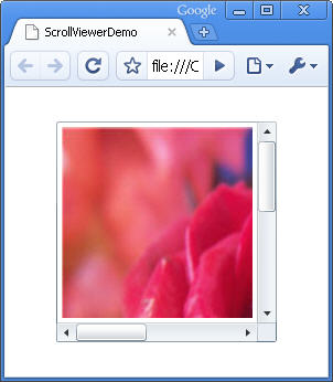
Figure 1
Image after scrolling horizontally:
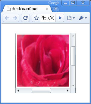
Figure 2
If you create some runtime logic and want to check dynamically whether a scrollbar is visible, you can use the properties of the ScrollViewer class. For example, the property ComputedHorizontalScrollBarVisibility can tell you whether the horizontal scroll bar is visible or not. It returns a value of type Visibility, which is an enumeration having two members: Visible or Collapsed. And that will tell you exactly what you need to know- whether the scrollbar is visible or collapsed. So, using this property at runtime, you can then decide which scrollbar to make visible (if in case it is not).