One of the new exciting features in Silverlight 3 is pixel shader effects. These effects can be applied to any user interface element on the Silverlight UI.
Introduction:
Pixel shader effects allow you to add effects, such as grayscale, red eye removal, pixel brightness, and shadows, to rendered objects. You can use the pixel shader effects built in with the Silverlight runtime or if you wish, you can create your own.
There are two pixel shader effects that are available in Silverlight 3 namely, DropShadowEffect and BlurEffect. You can apply only one effect directly to an element at a time. For example, you cannot apply both BlurEffect and a DropShadowEffect to the same element directly.
Here we shall examine the DropShadow Effect using a simple example.
The DropShadowEffect has several important properties that determine characteristics of the drop shadow:
| Property Name |
Description |
| Color |
Specifies the color of the drop shadow. The default is black. |
| ShadowDepth |
Specifies how much the shadow will be displaced from the object that is casting the shadow. The default is 5. |
| Direction |
Specifies in what direction the shadow is cast from the object. It is an angle between 0 and 360 with 0 starting on the right hand side and moving counter-clockwise around the object. The default is 315. |
| BlurRadius |
Specifies how blurred the shadow is. Typical range is between 0 and 1. The default is 5. |
| Opacity |
Specifies how transparent the shadow is. Typical range is between 0 and 1, where 1 means fully opaque and 0 means fully transparent (not visible). The default is 1. |
Table 1: Properties of the DropShadowEffect
To start with, let us create a new Silverlight 3 application using Visual Web Developer 2008. If you have worked with Silverlight 2, you will find that the new project window is almost the same with just some minor changes (the template Silverlight Navigation Application is new):
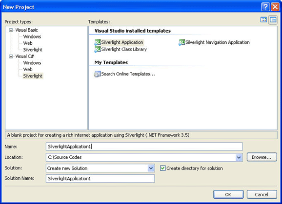
Figure 1: New Project window
The default XAML page is now called MainPage instead of Page as it used to be called earlier in Silverlight 2.
The default code in this XAML file will be seen as follows:
<UserControl x:Class="SilverlightApplication2.MainPage"
xmlns="http://schemas.microsoft.com/winfx/2006/xaml/presentation"
xmlns:x="http://schemas.microsoft.com/winfx/2006/xaml"
xmlns:d="http://schemas.microsoft.com/expression/blend/2008" xmlns:mc="http://schemas.openxmlformats.org/markup-compatibility/2006"
mc:Ignorable="d" d:DesignWidth="640" d:DesignHeight="480">
<Grid x:Name="LayoutRoot">
</Grid>
</UserControl>
Observe the new namespaces included in the code. For more information on the same, refer the MSDN library.
Add a StackPanel control from the Toolbox into the XAML code between the <Grid></Grid> tags:
<UserControl x:Class="SilverlightApp.MainPage"
xmlns="http://schemas.microsoft.com/winfx/2006/xaml/presentation"
xmlns:x="http://schemas.microsoft.com/winfx/2006/xaml"
xmlns:d="http://schemas.microsoft.com/expression/blend/2008" xmlns:mc="http://schemas.openxmlformats.org/markup-compatibility/2006"
mc:Ignorable="d" d:DesignWidth="640" d:DesignHeight="480">
<Grid x:Name="LayoutRoot">}
<StackPanel>
</StackPanel>
</Grid>
</UserControl>
The StackPanel is a layout control that allows you to organize child controls in a horizontal or vertical fashion.
Next, add a button control between the StackPanel tags and configure it as shown below:
<UserControl x:Class="SilverlightApp.MainPage"
xmlns="http://schemas.microsoft.com/winfx/2006/xaml/presentation"
xmlns:x="http://schemas.microsoft.com/winfx/2006/xaml"
xmlns:d="http://schemas.microsoft.com/expression/blend/2008" xmlns:mc="http://schemas.openxmlformats.org/markup-compatibility/2006"
mc:Ignorable="d" d:DesignWidth="640" d:DesignHeight="480">
<Grid x:Name="LayoutRoot">
<StackPanel>
<Button Content="New Pixel Effect Demo"
Width="200" Margin="5" Background="Orchid">
</Button>
</StackPanel>
</Grid>
</UserControl>
Finally, add the new pixel effects as follows: (this code is to be added between the <Button></Button> tags.
<Button.Effect>
<DropShadowEffect Color="DarkMagenta" Direction="320" ShadowDepth="25" BlurRadius="5" Opacity="0.5" />
</Button.Effect>
The final MainPage.xaml will look as follows:
<UserControl x:Class="SilverlightApp.MainPage"
xmlns="http://schemas.microsoft.com/winfx/2006/xaml/presentation"
xmlns:x="http://schemas.microsoft.com/winfx/2006/xaml"
xmlns:d="http://schemas.microsoft.com/expression/blend/2008" xmlns:mc="http://schemas.openxmlformats.org/markup-compatibility/2006"
mc:Ignorable="d" d:DesignWidth="640" d:DesignHeight="480">
<Grid x:Name="LayoutRoot">
<StackPanel>
<Button Content="New Pixel Effect Demo"
Width="200" Margin="5" Background="Orchid">
<Button.Effect>
<DropShadowEffect Color="DarkMagenta" Direction="320" ShadowDepth="25"
BlurRadius="5" Opacity="0.5" />
</Button.Effect>
</Button>
</StackPanel>
</Grid>
</UserControl>
When you finally, run the application, you will see the output as follows:
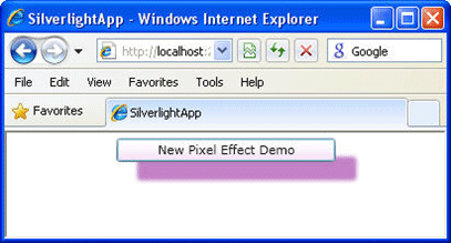
Figure 2: Output
Conclusion: This article explored how to use pixel shader effects in Silverlight 3.