How is possible to conclude it?
Each icon means something, for example, the symbol * in each item means it is private. The best way to understand the differences between each icon is to create a sample with each possible case.
Let's see a fake class created for this purpose.
Show Base Class
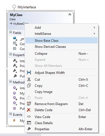
When we select the shape and open the context menu we have options that allow showing/hiding various details.
Let's see the case to show the base class.
Then after expanding the shape for MyBaseClass we will have something like:
At this moment, there is one point that is important to be defined. To show the diagram, what is the most important information that should be shown in the diagram?
It depends on what each developer likes or wants to see, but in general, we can define it as a pattern. We should show only public properties, methods, and events and hide all others (in some cases it can be useful to show everything defined as internal or protected).
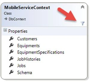
Hide compartment
Selecting the shape and then the item we want to hide is possible and we can do that using the context menu, as in the following;
The option “Show all members” will revert it, but in some cases, it is better to use the Class Details to revert it, because we can have other items hidden that we want to keep hidden.
Each shape hides some item that will show the icon that it means, here is an example.
Apply associations
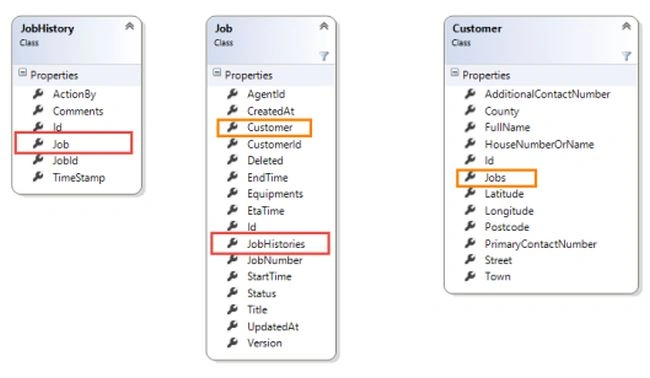
Returning to the Field Engineer Sample and choosing the class JobHistory, Job and Customer we will find that each one has a relationship with each other, let's highlight it using a red and orange rectangle, as in the following:
Let's see how to show the association for properties and for collections.
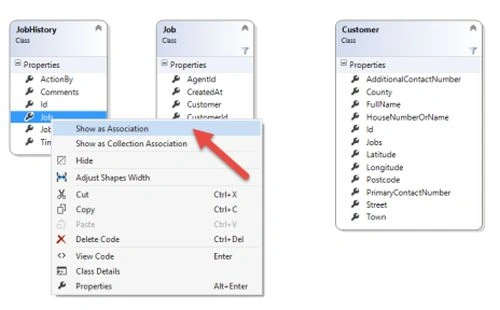
Show as Association
For properties that the data type is another class we can select the property in the shape and in the context menu we should select the option “Show as Association” as in the following:
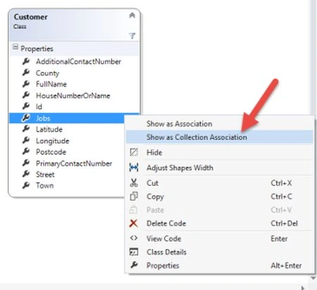
Show as a Collection Association
For properties that are collections/lists we can choose the option “Show as Collection Association” as in the following:
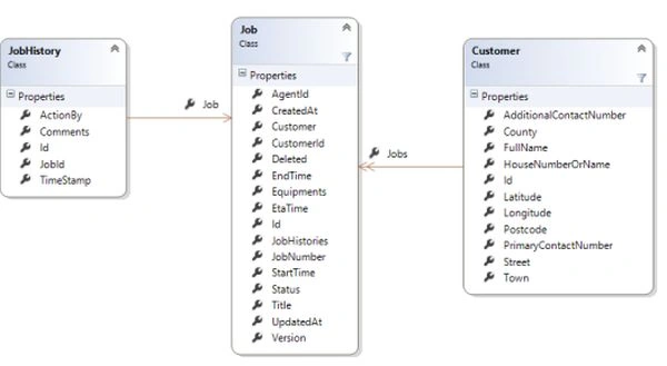
And the result will be something like:
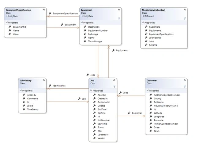
The number of arrows will define it as a property or a collection, but using a good name can be enough to see the differences.
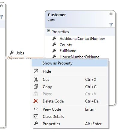
Show as Property
By selecting in the arrow it is possible to revert it, using the option “Show as property”.
The final class diagram
After defining all the arrows for all the associations and organizing the shapes we will have something as in the following:
For this diagram, we can understand that the model has five classes and the
MobileServiceContext is defined by these classes. The relationship among the classes is clear (for example).
A similar determination can be done for Equipment and Equipment Specifications.
Note: it is possible to create arrows for the MobileServiceContext's properties but that will only make some noise and it is not important in this case to see these associations.
Each developer should customize the class diagram and there are no fixed rules for it. With this kind of diagram, it is very simple to understand the model and in some cases find mistakes like wrong names, wrong relationships, or even missed features.




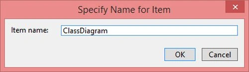
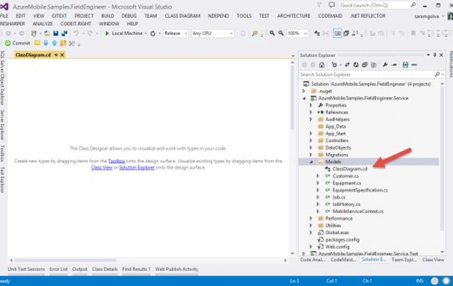

 And the result will be:
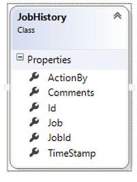 The Class Details
If we open the context menu under the shape we can select the “Class Details”.
The Class Details
If we open the context menu under the shape we can select the “Class Details”.
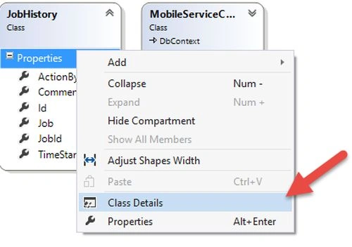 The result will be something like the following:
 With this a user interface is possible. To see more details about the class and it is possible to create/edit/delete/hide each property, method, event, and so on without coding.
Understanding various icons
After expanding all the shapes we will find that some shapes show the Fields, Properties, and Methods (and can show events, nested classes, and so on).
Let's see the case of the MobileServiceContext.
With this a user interface is possible. To see more details about the class and it is possible to create/edit/delete/hide each property, method, event, and so on without coding.
Understanding various icons
After expanding all the shapes we will find that some shapes show the Fields, Properties, and Methods (and can show events, nested classes, and so on).
Let's see the case of the MobileServiceContext.
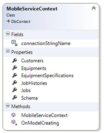 Looking at the image we can conclude: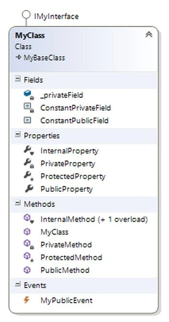


Afzaal Ahmad ZeeshanPosted Aug 5, 2015, 11:50 AM
A very much interesting and helpful post. Thank you Sara.
SharadPosted Jul 17, 2015, 3:58 AM
good one...
Rui RodriguesPosted May 31, 2015, 7:52 PM
and you can detect structure errors, or improvements to the architecture. I think this feature is limited to some visual studio versions :(
Gowtham RajamanickamPosted May 28, 2015, 10:43 AM
good one...
Sara SilvaPosted Jan 1, 2015, 9:19 AM
Thanks guys! :D
Vithal WadjePosted Dec 31, 2014, 1:30 PM
great one
Krishna Rajput SinghPosted Dec 31, 2014, 10:12 AM
grt article
Manish Kumar ChoudharyPosted Dec 7, 2014, 11:22 PM
Nice one..