

Introduction
Hi folks, if you remember, recently I published a website for COVID 19 Tracker with React. How about we explore our strengths in WPF.
Almost everything is different in these 2 projects. They follow different implementation techniques with respect to their technologies.
Let's create a WPF application with an attractive UI. This project is for education purposes only.
I can't attach source code here due to the maximum size limit, but you can directly download it from Github.
Find the following Github repositories for both, and feel free to tag along on Github, leave a star if you like.
Here is a sneak peek:

Features of the app:
- Attractive UI
- Easy to use
- Charts & numbers speak more than text
- Real-time data
- Using a material design with WPF to enhance the user experience
- Creating styles for a specific page or application-wide
- Calling Web-API in any C# backed project with a HttpClient
- Binding ViewModel Properties with View using MVVM architecture.
We will learn each of these steps one by one.
Open Visual Studio & create a new WPF app, Name it as you wish.
First, we are going to add some basic panels.
- <Window x:Class="Covid19Tracker.MainWindow"
- xmlns="http://schemas.microsoft.com/winfx/2006/xaml/presentation"
- xmlns:x="http://schemas.microsoft.com/winfx/2006/xaml"
- xmlns:d="http://schemas.microsoft.com/expression/blend/2008"
- xmlns:mc="http://schemas.openxmlformats.org/markup-compatibility/2006"
- xmlns:local="clr-namespace:Covid19Tracker"
- mc:Ignorable="d"
- Title="Covid19 Tracker" Height="900" Width="1024" ResizeMode="NoResize" WindowStyle="None">
- <Grid x:Name="OuterGrid">
- <Grid.ColumnDefinitions>
- <ColumnDefinition Width="179*"/>
- <ColumnDefinition Width="845*"/>
- </Grid.ColumnDefinitions>
- <Grid.RowDefinitions>
- <RowDefinition Height="2*"/>
- <RowDefinition Height="43*"/>
- </Grid.RowDefinitions>
- <Grid x:Name="Header"
- Grid.ColumnSpan="2"
- Background="#b71c1c">
- </Grid>
- </Grid>
- </Window>
Now, we need the beauty for our project. Let's add Material.Design.
Go to NuGet Package Manager & do the necessary requirements.
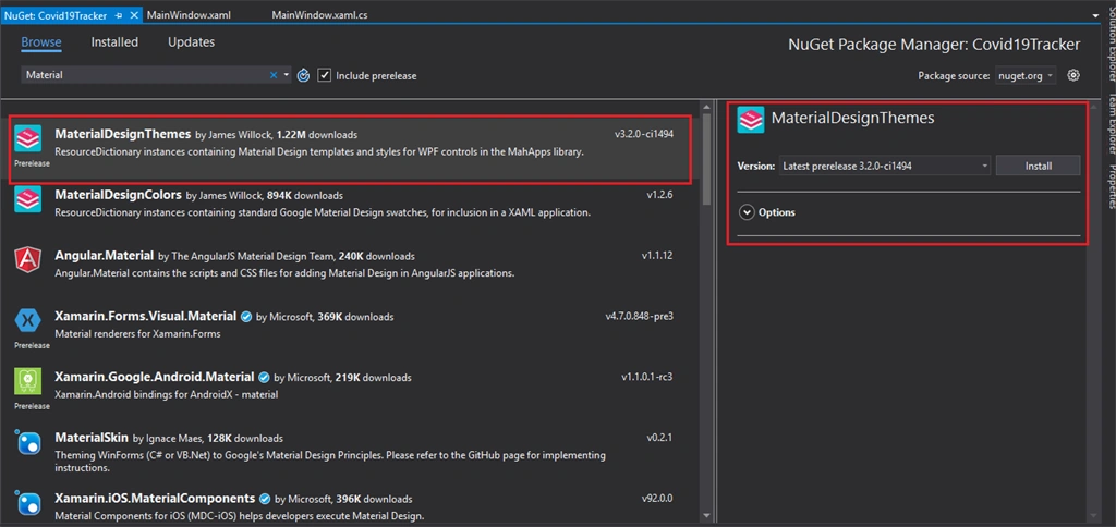
Now that we have added Material design in your project, we still need to import some of the styles. We can directly add them to App.xaml so that they will be available across the application.
- <Application x:Class="Covid19Tracker.App"
- xmlns="http://schemas.microsoft.com/winfx/2006/xaml/presentation"
- xmlns:x="http://schemas.microsoft.com/winfx/2006/xaml"
- xmlns:local="clr-namespace:Covid19Tracker"
- StartupUri="MainWindow.xaml">
- <Application.Resources>
- <ResourceDictionary>
- <ResourceDictionary.MergedDictionaries>
- <ResourceDictionary Source="pack://application:,,,/MaterialDesignThemes.Wpf;component/Themes/MaterialDesignTheme.Light.xaml" />
- <ResourceDictionary Source="pack://application:,,,/MaterialDesignThemes.Wpf;component/Themes/MaterialDesignTheme.Defaults.xaml" />
- <ResourceDictionary Source="pack://application:,,,/MaterialDesignColors;component/Themes/Recommended/Primary/MaterialDesignColor.DeepPurple.xaml" />
- <ResourceDictionary Source="pack://application:,,,/MaterialDesignColors;component/Themes/Recommended/Accent/MaterialDesignColor.Lime.xaml" />
- </ResourceDictionary.MergedDictionaries>
- </ResourceDictionary>
- </Application.Resources>
- </Application>
Now let us begin with looks.
Adding header & a shutdown button.
- <Grid x:Name="Header"
- Background="{StaticResource HeaderColor}"
- Grid.ColumnSpan="2">
- <StackPanel x:Name="HeaderStackPanel">
- <Button x:Name="ButtonExit"
- Style="{StaticResource MaterialDesignFloatingActionMiniAccentButton}"
- BorderBrush="{x:Null}"
- Background="{x:Null}"
- HorizontalAlignment="Right"
- Foreground="White"
- Height="35"
- Width="35"
- Click="ButtonExit_Click">
- <materialUI:PackIcon Kind="Power"/>
- </Button>
- </StackPanel>
- </Grid>
This is the code behind the add ButtonExit_Click method to add following code:
- private void ButtonExit_Click(object sender, RoutedEventArgs e)
- {
- Application.Current.Shutdown();
- }
Now let's add ResourceDictionary in our project, Simply right-click on project & select ResouceDictionary. Name as a Styles.xaml
This is where we are going to keep all styles.
Note
Add this entry in App.xaml as well.
- Styles.xaml<ResourceDictionary xmlns="http://schemas.microsoft.com/winfx/2006/xaml/presentation"
- xmlns:x="http://schemas.microsoft.com/winfx/2006/xaml">
- <!-- Title Style -->
- <Style x:Key="TitleTextBlockStyle"
- BasedOn="{StaticResource {x:Type TextBlock}}"
- TargetType="TextBlock">
- <Setter Property="HorizontalAlignment" Value="Right"/>
- <Setter Property="FontFamily" Value="Champagne & Limousines"/>
- <Setter Property="Margin" Value="5"/>
- <Setter Property="VerticalAlignment" Value="Top"/>
- <Setter Property="Foreground" Value="Gray"/>
- <Setter Property="FontSize" Value="15"/>
- </Style>
- <!-- Tracker Style -->
- <Style x:Key="ScrollThumbs" TargetType="{x:Type Thumb}">
- <Setter Property="Template">
- <Setter.Value>
- <ControlTemplate TargetType="{x:Type Thumb}">
- <Grid x:Name="Grid">
- <Rectangle HorizontalAlignment="Stretch" VerticalAlignment="Stretch" Width="Auto" Height="Auto" Fill="Transparent" />
- <Border x:Name="Rectangle1" CornerRadius="10" HorizontalAlignment="Stretch" VerticalAlignment="Stretch" Width="Auto" Height="Auto" Background="{TemplateBinding Background}" />
- </Grid>
- <ControlTemplate.Triggers>
- <Trigger Property="Tag" Value="Horizontal">
- <Setter TargetName="Rectangle1" Property="Width" Value="Auto" />
- <Setter TargetName="Rectangle1" Property="Height" Value="7" />
- </Trigger>
- </ControlTemplate.Triggers>
- </ControlTemplate>
- </Setter.Value>
- </Setter>
- </Style>
- <!--ScrollBar Style-->
- <Style x:Key="{x:Type ScrollBar}" TargetType="{x:Type ScrollBar}">
- <Setter Property="Stylus.IsFlicksEnabled" Value="false" />
- <Setter Property="Foreground" Value="LightGray" />
- <Setter Property="Background" Value="DarkGray" />
- <Setter Property="Width" Value="10" />
- <Setter Property="Template">
- <Setter.Value>
- <ControlTemplate TargetType="{x:Type ScrollBar}">
- <Grid x:Name="GridTrack"
- Background="{x:Null}"
- Width="19">
- <Track x:Name="TrackScroll"
- Grid.Row="0"
- IsDirectionReversed="true" Focusable="false">
- <Track.Thumb>
- <Thumb x:Name="Thumb" Background="{TemplateBinding Foreground}" Style="{DynamicResource ScrollThumbs}" />
- </Track.Thumb>
- <Track.IncreaseRepeatButton>
- <RepeatButton x:Name="PageUp" Command="ScrollBar.PageDownCommand" Opacity="0" Focusable="false" />
- </Track.IncreaseRepeatButton>
- <Track.DecreaseRepeatButton>
- <RepeatButton x:Name="PageDown" Command="ScrollBar.PageUpCommand" Opacity="0" Focusable="false" />
- </Track.DecreaseRepeatButton>
- </Track>
- </Grid>
- <ControlTemplate.Triggers>
- <Trigger SourceName="Thumb" Property="IsMouseOver" Value="true">
- <Setter Value="{DynamicResource ButtonSelectBrush}" TargetName="Thumb" Property="Background" />
- </Trigger>
- <Trigger SourceName="Thumb" Property="IsDragging" Value="true">
- <Setter Value="{DynamicResource DarkBrush}" TargetName="Thumb" Property="Background" />
- </Trigger>
- <Trigger Property="IsEnabled" Value="false">
- <Setter TargetName="Thumb" Property="Visibility" Value="Collapsed" />
- </Trigger>
- <Trigger Property="Orientation" Value="Horizontal">
- <Setter TargetName="GridTrack" Property="LayoutTransform">
- <Setter.Value>
- <RotateTransform Angle="-90" />
- </Setter.Value>
- </Setter>
- <Setter TargetName="TrackScroll" Property="LayoutTransform">
- <Setter.Value>
- <RotateTransform Angle="-90" />
- </Setter.Value>
- </Setter>
- <Setter Property="Width" Value="Auto" />
- <Setter Property="Height" Value="12" />
- <Setter TargetName="Thumb" Property="Tag" Value="Horizontal" />
- <Setter TargetName="PageDown" Property="Command" Value="ScrollBar.PageLeftCommand" />
- <Setter TargetName="PageUp" Property="Command" Value="ScrollBar.PageRightCommand" />
- </Trigger>
- </ControlTemplate.Triggers>
- </ControlTemplate>
- </Setter.Value>
- </Setter>
- </Style>
- </ResourceDictionary>
We have divided our page into 3 sections, header which we already added, now we need...
Left Panel
The left panel is kind of navigation control across your entire application.
- <StackPanel x:Name="LeftPanel"
- Background="{StaticResource LeftPanelColor}"
- Orientation="Vertical"
- Grid.Row="1"
- Grid.RowSpan="2">
- <Grid x:Name="GridLeftPanel">
- <TextBlock x:Name="CovidStatus"
- FontSize="16"
- FontFamily="WS Simple Gallifreyan"
- Foreground="#FFBC96EA"
- HorizontalAlignment="Center"
- Text="Covid-19 Status"
- VerticalAlignment="Center" >
- </TextBlock>
- </Grid>
- <Button x:Name="ButtonCovidDashBoard"
- Margin="10">
- <Grid x:Name="CovidDashBoard"
- Height="20"
- Width="150">
- <materialUIDesign:PackIcon Kind="ViewDashboard"/>
- <TextBlock x:Name="TextBlockDASHBOARD"
- HorizontalAlignment="Right"
- FontFamily="Champagne & Limousines"
- Text="DASHBOARD" />
- </Grid>
- </Button>
- <Button Margin="10">
- <Grid x:Name="Graph"
- Height="20"
- Width="150">
- <materialUIDesign:PackIcon Kind="ContentPaste"/>
- <TextBlock x:Name="TextBlockGRAPH"
- FontFamily="Champagne & Limousines"
- HorizontalAlignment="Right"
- Text="GRAPH" />
- </Grid>
- </Button>
- </StackPanel>
Right Panel
The right panel is where all 3 cards for confirmed, recovered & deaths count will be displayed, Plus the data of the last updated date & our attractive doughnut charts specifying recovery & fatality rate.
- <Grid x:Name="RightPanel"
- Background="{StaticResource RightPanelColor}"
- Grid.Column="1"
- Grid.Row="1">
- <ScrollViewer>
- <Grid>
- <Grid.RowDefinitions>
- <RowDefinition Height="Auto"/>
- <RowDefinition Height="Auto"/>
- <RowDefinition Height="Auto"/>
- <RowDefinition Height="*"/>
- </Grid.RowDefinitions>
- <Grid.ColumnDefinitions>
- <ColumnDefinition Width="5*"/>
- <ColumnDefinition Width="5*"/>
- <ColumnDefinition Width="5*"/>
- </Grid.ColumnDefinitions>
- <Grid x:Name="GridlabelConfirmed"
- Grid.Column="0">
- <Rectangle Height="120" Margin="20" Fill="White" RadiusY="10" RadiusX="10" >
- <Rectangle.Effect>
- <DropShadowEffect BlurRadius="20" Color="#FFDEDEDE" RenderingBias="Quality" ShadowDepth="1"/>
- </Rectangle.Effect>
- </Rectangle>
- <Grid Margin="25" Height="120">
- <Grid Width="35" Height="50" Background="#ff6f00" HorizontalAlignment="Left" VerticalAlignment="Top" Margin="20 0">
- <Grid.Effect>
- <DropShadowEffect BlurRadius="20" Color="#FFECECEC" RenderingBias="Quality" ShadowDepth="1"/>
- </Grid.Effect>
- <materialUIDesign:PackIcon Kind="BacteriaOutline" HorizontalAlignment="Center" VerticalAlignment="Bottom" Margin="5" Foreground="White" Width="20" Height="20"/>
- </Grid>
- <TextBlock x:Name="TextBlockCONFIRMED"
- Style="{StaticResource TitleTextBlockStyle}"
- Foreground="#ff6f00"
- Text="CONFIRMED" />
- <StackPanel x:Name="StackPanelMessageTC"
- HorizontalAlignment="Right"
- Margin="10 30"
- Orientation="Horizontal"
- VerticalAlignment="Top" >
- <materialUIDesign:PackIcon
- Foreground="#ff6d00"
- Kind="Hope"
- Height="15"
- Margin="5 0"
- VerticalAlignment="Center"
- Width="15" />
- <TextBlock x:Name="TextBlockTC"
- Foreground="#ff6d00"
- FontSize="12"
- Margin="5 0"
- Text="TAKE CARE" />
- </StackPanel>
- <StackPanel
- Orientation="Horizontal"
- VerticalAlignment="Bottom"
- Margin="20"
- Cursor="Hand">
- <TextBlock x:Name="TextBlockNumbers"
- Text="{Binding CovidDetails.confirmed.value, StringFormat='{}{0:0,0}'}"
- FontFamily="Champagne & Limousines"
- VerticalAlignment="Center"
- Foreground="Gray"
- FontSize="30"/>
- </StackPanel>
- </Grid>
- </Grid>
- <Grid x:Name="GridlabelRecorvered"
- Grid.Column="1">
- <Rectangle Height="120" Margin="20" Fill="White" RadiusY="10" RadiusX="10" >
- <Rectangle.Effect>
- <DropShadowEffect BlurRadius="20" Color="#FFDEDEDE" RenderingBias="Quality" ShadowDepth="1"/>
- </Rectangle.Effect>
- </Rectangle>
- <Grid Margin="25" Height="120">
- <Grid Width="35" Height="50" Background="#FF41A43C" HorizontalAlignment="Left" VerticalAlignment="Top" Margin="20 0">
- <Grid.Effect>
- <DropShadowEffect BlurRadius="20" Color="#FFECECEC" RenderingBias="Quality" ShadowDepth="1"/>
- </Grid.Effect>
- <materialUIDesign:PackIcon Kind="HealthPotion" HorizontalAlignment="Center" VerticalAlignment="Bottom" Margin="5" Foreground="White" Width="20" Height="20"/>
- </Grid>
- <TextBlock x:Name="TextBlockRECORVERED"
- Style="{StaticResource TitleTextBlockStyle}"
- Foreground="#FF41A43C"
- Text="RECORVERED" />
- <StackPanel x:Name="StackPanelMessageSH"
- HorizontalAlignment="Right"
- Orientation="Horizontal"
- Margin="10 30"
- VerticalAlignment="Top" >
- <materialUIDesign:PackIcon
- Kind="Home"
- Height="15"
- Foreground="#388e3c"
- Margin="5 0"
- VerticalAlignment="Center"
- Width="15" />
- <TextBlock
- FontSize="12"
- Foreground="#388e3c"
- Text="STAY HOME" />
- </StackPanel>
- <StackPanel Orientation="Horizontal" VerticalAlignment="Bottom" Margin="20">
- <TextBlock
- Text="{Binding CovidDetails.recovered.value,StringFormat='{}{0:0,0}'}"
- FontFamily="Champagne & Limousines"
- VerticalAlignment="Center"
- Foreground="Gray"
- FontSize="30"/>
- </StackPanel>
- </Grid>
- </Grid>
- <Grid x:Name="GridlabelDeaths"
- Grid.Column="2">
- <Rectangle Height="120" Margin="20" Fill="White" RadiusY="10" RadiusX="10" >
- <Rectangle.Effect>
- <DropShadowEffect BlurRadius="20" Color="#FFDEDEDE" RenderingBias="Quality" ShadowDepth="1"/>
- </Rectangle.Effect>
- </Rectangle>
- <Grid Margin="25" Height="120">
- <Grid Width="35" Height="50" Background="#FFCF1F1F" HorizontalAlignment="Left" VerticalAlignment="Top" Margin="20 0">
- <Grid.Effect>
- <DropShadowEffect BlurRadius="20" Color="#FFECECEC" RenderingBias="Quality" ShadowDepth="1"/>
- </Grid.Effect>
- <materialUIDesign:PackIcon Kind="Cross" HorizontalAlignment="Center" VerticalAlignment="Bottom" Margin="5" Foreground="White" Width="20" Height="20"/>
- </Grid>
- <TextBlock x:Name="TextBlockDEATHS"
- Style="{StaticResource TitleTextBlockStyle}"
- Foreground="#FFCF1F1F"
- Text="DEATHS" />
- <StackPanel Orientation="Horizontal" HorizontalAlignment="Right" VerticalAlignment="Top" Margin="10 30">
- <materialUIDesign:PackIcon
- Kind="MedicalBag"
- Foreground="#d50000"
- Width="15"
- Height="15"
- VerticalAlignment="Center"
- Margin="5 0"/>
- <TextBlock
- Text="R.I.P."
- FontSize="15"
- Foreground="#d50000"/>
- </StackPanel>
- <StackPanel Orientation="Horizontal" VerticalAlignment="Bottom" Margin="20">
- <TextBlock
- Text="{Binding CovidDetails.deaths.value , StringFormat='{}{0:0,0}'}"
- FontFamily="Champagne & Limousines"
- VerticalAlignment="Center"
- Foreground="Gray"
- FontSize="30"/>
- </StackPanel>
- </Grid>
- </Grid>
- <Grid x:Name="GridlabelDate"
- Grid.RowSpan="2"
- Grid.ColumnSpan="3"
- Grid.Column="0"
- Grid.Row="1">
- <Rectangle Height="40" Margin="20" Fill="White" RadiusY="10" RadiusX="10" >
- <Rectangle.Effect>
- <DropShadowEffect BlurRadius="20" Color="#FFDEDEDE" RenderingBias="Quality" ShadowDepth="1"/>
- </Rectangle.Effect>
- </Rectangle>
- <Grid Margin="25" Height="40">
- <Grid Width="25" Height="30" Background="#311b92" HorizontalAlignment="Left" VerticalAlignment="Top" Margin="20 0">
- <Grid.Effect>
- <DropShadowEffect BlurRadius="20" Color="#FFECECEC" RenderingBias="Quality" ShadowDepth="1"/>
- </Grid.Effect>
- <materialUIDesign:PackIcon
- Kind="Calendar"
- HorizontalAlignment="Center"
- VerticalAlignment="Bottom"
- Margin="5"
- Foreground="White"
- Width="20"
- Height="20"/>
- </Grid>
- <TextBlock x:Name="TextBlockDATE"
- Style="{StaticResource TitleTextBlockStyle}"
- Foreground="#311b92"
- FontSize="20"
- HorizontalAlignment="Left"
- Margin="50 5 0 0"
- Text="LAST UPDATED DATE" />
- <TextBlock
- Text="{Binding CovidDetails.lastUpdate}"
- FontFamily="Champagne & Limousines"
- VerticalAlignment="Center"
- Foreground="Gray"
- FontSize="20"
- Margin="300 5 0 0"/>
- </Grid>
- </Grid>
- <Grid x:Name="GridLabelRatios"
- Grid.Row="3"
- Grid.RowSpan="2"
- Grid.ColumnSpan="3"
- HorizontalAlignment="Center"
- Width="800"
- Height="400">
- <Grid
- Background="White"
- Margin="20 25 15 10">
- <Grid.OpacityMask>
- <VisualBrush Visual="{ Binding ElementName=BorderG1 }"/>
- </Grid.OpacityMask>
- <Border x:Name="BorderG1" CornerRadius="5" Background="White" Margin="0,0,0,119"/>
- <StackPanel
- VerticalAlignment="Bottom" >
- <StackPanel
- Orientation="Horizontal"
- Margin="20 5"/>
- <StackPanel
- Orientation="Horizontal"
- Margin="10 5"/>
- </StackPanel>
- </Grid>
- <Grid Margin="50 0 30 20">
- <Grid.OpacityMask>
- <VisualBrush Visual="{ Binding ElementName=BorderG2 }"/>
- </Grid.OpacityMask>
- <Border x:Name="BorderG2" CornerRadius="15" Background="#FF340051"/>
- <MetroChart:RadialGaugeChart
- Background="{x:Null}"
- ChartTitle="Ratio:"
- Foreground="LightGray"
- Margin="50 0 0 0">
- <MetroChart:RadialGaugeChart.Series>
- <MetroChart:ChartSeries
- DisplayMember="Description"
- ItemsSource="{Binding ChartdetailsList}"
- SeriesTitle="Description"
- ValueMember="Value"
- HorizontalAlignment="Center"/>
- </MetroChart:RadialGaugeChart.Series>
- </MetroChart:RadialGaugeChart>
- </Grid>
- </Grid>
- </Grid>
- </ScrollViewer>
- </Grid>
Here is the complete screen,
All things combined here.
- <Window x:Class="Covid19Tracker.MainWindow"
- xmlns="http://schemas.microsoft.com/winfx/2006/xaml/presentation"
- xmlns:materialUIDesign="http://materialdesigninxaml.net/winfx/xaml/themes"
- xmlns:d="http://schemas.microsoft.com/expression/blend/2008"
- xmlns:x="http://schemas.microsoft.com/winfx/2006/xaml"
- xmlns:mc="http://schemas.openxmlformats.org/markup-compatibility/2006"
- xmlns:MetroChart="clr-namespace:De.TorstenMandelkow.MetroChart;assembly=De.TorstenMandelkow.MetroChart"
- mc:Ignorable="d"
- Title="Covid19 Tracker" Height="700" Width="1024" WindowStyle="None" WindowStartupLocation="CenterScreen">
- <Window.Resources>
- <ResourceDictionary>
- <SolidColorBrush x:Key="HeaderColor">#512da8</SolidColorBrush>
- <SolidColorBrush x:Key="LeftPanelColor">#4a148c</SolidColorBrush>
- <SolidColorBrush x:Key="RightPanelColor">#d1c4e9</SolidColorBrush>
- </ResourceDictionary>
- </Window.Resources>
- <Grid x:Name="OuterGrid">
- <Grid.ColumnDefinitions>
- <ColumnDefinition Width="2*"/>
- <ColumnDefinition Width="8*"/>
- </Grid.ColumnDefinitions>
- <Grid.RowDefinitions>
- <RowDefinition Height="Auto"/>
- <RowDefinition Height="*"/>
- </Grid.RowDefinitions>
- <Grid x:Name="Header"
- Background="{StaticResource HeaderColor}"
- Grid.ColumnSpan="2">
- <StackPanel x:Name="HeaderStackPanel">
- <Button x:Name="ButtonExit"
- Style="{StaticResource MaterialDesignFloatingActionMiniAccentButton}"
- BorderBrush="{x:Null}"
- Background="{x:Null}"
- Click="ButtonExit_Click"
- Foreground="White"
- Height="35"
- HorizontalAlignment="Right"
- VerticalAlignment="Top"
- Width="35">
- <materialUIDesign:PackIcon Kind="Power"/>
- </Button>
- </StackPanel>
- </Grid>
- <StackPanel x:Name="LeftPanel"
- Background="{StaticResource LeftPanelColor}"
- Orientation="Vertical"
- Grid.Row="1"
- Grid.RowSpan="2">
- <Grid x:Name="GridLeftPanel">
- <TextBlock x:Name="CovidStatus"
- FontSize="16"
- FontFamily="WS Simple Gallifreyan"
- Foreground="#FFBC96EA"
- HorizontalAlignment="Center"
- Text="Covid-19 Status"
- VerticalAlignment="Center" >
- </TextBlock>
- </Grid>
- <Button x:Name="ButtonCovidDashBoard"
- Margin="10">
- <Grid x:Name="CovidDashBoard"
- Height="20"
- Width="150">
- <materialUIDesign:PackIcon Kind="ViewDashboard"/>
- <TextBlock x:Name="TextBlockDASHBOARD"
- HorizontalAlignment="Right"
- FontFamily="Champagne & Limousines"
- Text="DASHBOARD" />
- </Grid>
- </Button>
- <Button Margin="10">
- <Grid x:Name="Graph"
- Height="20"
- Width="150">
- <materialUIDesign:PackIcon Kind="ContentPaste"/>
- <TextBlock x:Name="TextBlockGRAPH"
- FontFamily="Champagne & Limousines"
- HorizontalAlignment="Right"
- Text="GRAPH" />
- </Grid>
- </Button>
- </StackPanel>
- <Grid x:Name="RightPanel"
- Background="{StaticResource RightPanelColor}"
- Grid.Column="1"
- Grid.Row="1">
- <ScrollViewer>
- <Grid>
- <Grid.RowDefinitions>
- <RowDefinition Height="Auto"/>
- <RowDefinition Height="Auto"/>
- <RowDefinition Height="Auto"/>
- <RowDefinition Height="*"/>
- </Grid.RowDefinitions>
- <Grid.ColumnDefinitions>
- <ColumnDefinition Width="5*"/>
- <ColumnDefinition Width="5*"/>
- <ColumnDefinition Width="5*"/>
- </Grid.ColumnDefinitions>
- <Grid x:Name="GridlabelConfirmed"
- Grid.Column="0">
- <Rectangle Height="120" Margin="20" Fill="White" RadiusY="10" RadiusX="10" >
- <Rectangle.Effect>
- <DropShadowEffect BlurRadius="20" Color="#FFDEDEDE" RenderingBias="Quality" ShadowDepth="1"/>
- </Rectangle.Effect>
- </Rectangle>
- <Grid Margin="25" Height="120">
- <Grid Width="35" Height="50" Background="#ff6f00" HorizontalAlignment="Left" VerticalAlignment="Top" Margin="20 0">
- <Grid.Effect>
- <DropShadowEffect BlurRadius="20" Color="#FFECECEC" RenderingBias="Quality" ShadowDepth="1"/>
- </Grid.Effect>
- <materialUIDesign:PackIcon Kind="BacteriaOutline" HorizontalAlignment="Center" VerticalAlignment="Bottom" Margin="5" Foreground="White" Width="20" Height="20"/>
- </Grid>
- <TextBlock x:Name="TextBlockCONFIRMED"
- Style="{StaticResource TitleTextBlockStyle}"
- Foreground="#ff6f00"
- Text="CONFIRMED" />
- <StackPanel x:Name="StackPanelMessageTC"
- HorizontalAlignment="Right"
- Margin="10 30"
- Orientation="Horizontal"
- VerticalAlignment="Top" >
- <materialUIDesign:PackIcon
- Foreground="#ff6d00"
- Kind="Hope"
- Height="15"
- Margin="5 0"
- VerticalAlignment="Center"
- Width="15" />
- <TextBlock x:Name="TextBlockTC"
- Foreground="#ff6d00"
- FontSize="12"
- Margin="5 0"
- Text="TAKE CARE" />
- </StackPanel>
- <StackPanel
- Orientation="Horizontal"
- VerticalAlignment="Bottom"
- Margin="20"
- Cursor="Hand">
- <TextBlock x:Name="TextBlockNumbers"
- Text="{Binding CovidDetails.confirmed.value, StringFormat='{}{0:0,0}'}"
- FontFamily="Champagne & Limousines"
- VerticalAlignment="Center"
- Foreground="Gray"
- FontSize="30"/>
- </StackPanel>
- </Grid>
- </Grid>
- <Grid x:Name="GridlabelRecorvered"
- Grid.Column="1">
- <Rectangle Height="120" Margin="20" Fill="White" RadiusY="10" RadiusX="10" >
- <Rectangle.Effect>
- <DropShadowEffect BlurRadius="20" Color="#FFDEDEDE" RenderingBias="Quality" ShadowDepth="1"/>
- </Rectangle.Effect>
- </Rectangle>
- <Grid Margin="25" Height="120">
- <Grid Width="35" Height="50" Background="#FF41A43C" HorizontalAlignment="Left" VerticalAlignment="Top" Margin="20 0">
- <Grid.Effect>
- <DropShadowEffect BlurRadius="20" Color="#FFECECEC" RenderingBias="Quality" ShadowDepth="1"/>
- </Grid.Effect>
- <materialUIDesign:PackIcon Kind="HealthPotion" HorizontalAlignment="Center" VerticalAlignment="Bottom" Margin="5" Foreground="White" Width="20" Height="20"/>
- </Grid>
- <TextBlock x:Name="TextBlockRECORVERED"
- Style="{StaticResource TitleTextBlockStyle}"
- Foreground="#FF41A43C"
- Text="RECORVERED" />
- <StackPanel x:Name="StackPanelMessageSH"
- HorizontalAlignment="Right"
- Orientation="Horizontal"
- Margin="10 30"
- VerticalAlignment="Top" >
- <materialUIDesign:PackIcon
- Kind="Home"
- Height="15"
- Foreground="#388e3c"
- Margin="5 0"
- VerticalAlignment="Center"
- Width="15" />
- <TextBlock
- FontSize="12"
- Foreground="#388e3c"
- Text="STAY HOME" />
- </StackPanel>
- <StackPanel Orientation="Horizontal" VerticalAlignment="Bottom" Margin="20">
- <TextBlock
- Text="{Binding CovidDetails.recovered.value,StringFormat='{}{0:0,0}'}"
- FontFamily="Champagne & Limousines"
- VerticalAlignment="Center"
- Foreground="Gray"
- FontSize="30"/>
- </StackPanel>
- </Grid>
- </Grid>
- <Grid x:Name="GridlabelDeaths"
- Grid.Column="2">
- <Rectangle Height="120" Margin="20" Fill="White" RadiusY="10" RadiusX="10" >
- <Rectangle.Effect>
- <DropShadowEffect BlurRadius="20" Color="#FFDEDEDE" RenderingBias="Quality" ShadowDepth="1"/>
- </Rectangle.Effect>
- </Rectangle>
- <Grid Margin="25" Height="120">
- <Grid Width="35" Height="50" Background="#FFCF1F1F" HorizontalAlignment="Left" VerticalAlignment="Top" Margin="20 0">
- <Grid.Effect>
- <DropShadowEffect BlurRadius="20" Color="#FFECECEC" RenderingBias="Quality" ShadowDepth="1"/>
- </Grid.Effect>
- <materialUIDesign:PackIcon Kind="Cross" HorizontalAlignment="Center" VerticalAlignment="Bottom" Margin="5" Foreground="White" Width="20" Height="20"/>
- </Grid>
- <TextBlock x:Name="TextBlockDEATHS"
- Style="{StaticResource TitleTextBlockStyle}"
- Foreground="#FFCF1F1F"
- Text="DEATHS" />
- <StackPanel Orientation="Horizontal" HorizontalAlignment="Right" VerticalAlignment="Top" Margin="10 30">
- <materialUIDesign:PackIcon
- Kind="MedicalBag"
- Foreground="#d50000"
- Width="15"
- Height="15"
- VerticalAlignment="Center"
- Margin="5 0"/>
- <TextBlock
- Text="R.I.P."
- FontSize="15"
- Foreground="#d50000"/>
- </StackPanel>
- <StackPanel Orientation="Horizontal" VerticalAlignment="Bottom" Margin="20">
- <TextBlock
- Text="{Binding CovidDetails.deaths.value , StringFormat='{}{0:0,0}'}"
- FontFamily="Champagne & Limousines"
- VerticalAlignment="Center"
- Foreground="Gray"
- FontSize="30"/>
- </StackPanel>
- </Grid>
- </Grid>
- <Grid x:Name="GridlabelDate"
- Grid.RowSpan="2"
- Grid.ColumnSpan="3"
- Grid.Column="0"
- Grid.Row="1">
- <Rectangle Height="40" Margin="20" Fill="White" RadiusY="10" RadiusX="10" >
- <Rectangle.Effect>
- <DropShadowEffect BlurRadius="20" Color="#FFDEDEDE" RenderingBias="Quality" ShadowDepth="1"/>
- </Rectangle.Effect>
- </Rectangle>
- <Grid Margin="25" Height="40">
- <Grid Width="25" Height="30" Background="#311b92" HorizontalAlignment="Left" VerticalAlignment="Top" Margin="20 0">
- <Grid.Effect>
- <DropShadowEffect BlurRadius="20" Color="#FFECECEC" RenderingBias="Quality" ShadowDepth="1"/>
- </Grid.Effect>
- <materialUIDesign:PackIcon
- Kind="Calendar"
- HorizontalAlignment="Center"
- VerticalAlignment="Bottom"
- Margin="5"
- Foreground="White"
- Width="20"
- Height="20"/>
- </Grid>
- <TextBlock x:Name="TextBlockDATE"
- Style="{StaticResource TitleTextBlockStyle}"
- Foreground="#311b92"
- FontSize="20"
- HorizontalAlignment="Left"
- Margin="50 5 0 0"
- Text="LAST UPDATED DATE" />
- <TextBlock
- Text="{Binding CovidDetails.lastUpdate}"
- FontFamily="Champagne & Limousines"
- VerticalAlignment="Center"
- Foreground="Gray"
- FontSize="20"
- Margin="300 5 0 0"/>
- </Grid>
- </Grid>
- <Grid x:Name="GridLabelRatios"
- Grid.Row="3"
- Grid.RowSpan="2"
- Grid.ColumnSpan="3"
- HorizontalAlignment="Center"
- Width="800"
- Height="400">
- <Grid
- Background="White"
- Margin="20 25 15 10">
- <Grid.OpacityMask>
- <VisualBrush Visual="{ Binding ElementName=BorderG1 }"/>
- </Grid.OpacityMask>
- <Border x:Name="BorderG1" CornerRadius="5" Background="White" Margin="0,0,0,119"/>
- <StackPanel
- VerticalAlignment="Bottom" >
- <StackPanel
- Orientation="Horizontal"
- Margin="20 5"/>
- <StackPanel
- Orientation="Horizontal"
- Margin="10 5"/>
- </StackPanel>
- </Grid>
- <Grid Margin="50 0 30 20">
- <Grid.OpacityMask>
- <VisualBrush Visual="{ Binding ElementName=BorderG2 }"/>
- </Grid.OpacityMask>
- <Border x:Name="BorderG2" CornerRadius="15" Background="#FF340051"/>
- <MetroChart:RadialGaugeChart
- Background="{x:Null}"
- ChartTitle="Ratio:"
- Foreground="LightGray"
- Margin="50 0 0 0">
- <MetroChart:RadialGaugeChart.Series>
- <MetroChart:ChartSeries
- DisplayMember="Description"
- ItemsSource="{Binding ChartdetailsList}"
- SeriesTitle="Description"
- ValueMember="Value"
- HorizontalAlignment="Center"/>
- </MetroChart:RadialGaugeChart.Series>
- </MetroChart:RadialGaugeChart>
- </Grid>
- </Grid>
- </Grid>
- </ScrollViewer>
- </Grid>
- </Grid>
- </Window>
Now that we are done with designing a UI, Let's move further ahead and add that API class in your project:
class WebAPI
We are going to use WebAPI class to make a call to API, For now, we are only using the get method.
This class is responsible for getting our data.
- using System;
- using System.Net;
- using System.Net.Http;
- using System.Net.Http.Headers;
- using System.Threading.Tasks;
- namespace Covid19Tracker
- {
- class WebAPI
- {
- public static Task<HttpResponseMessage> GetCall()
- {
- try
- {
- ServicePointManager.SecurityProtocol = SecurityProtocolType.Tls12;
- var baseAdress = "https://covid19.mathdro.id/api";
- string apiUrl = baseAdress;
- using (HttpClient client = new HttpClient())
- {
- client.BaseAddress = new Uri(baseAdress);
- client.Timeout = TimeSpan.FromSeconds(900);
- client.DefaultRequestHeaders.Accept.Clear();
- client.DefaultRequestHeaders.Accept.Add(new MediaTypeWithQualityHeaderValue("application/json"));
- var response = client.GetAsync(apiUrl);
- response.Wait();
- return response;
- }
- }
- catch (Exception ex)
- {
- throw;
- }
- }
- }
- }
Of course, we are going to follow MVVM architecture. Let's add DataContext for our MainWindow.xaml.
- using System;
- using System.Collections.Generic;
- using System.Linq;
- using System.Text;
- using System.Threading.Tasks;
- using System.Windows;
- using System.Windows.Controls;
- using System.Windows.Data;
- using System.Windows.Documents;
- using System.Windows.Input;
- using System.Windows.Media;
- using System.Windows.Media.Imaging;
- using System.Windows.Navigation;
- using System.Windows.Shapes;
- namespace Covid19Tracker
- {
- /// <summary>
- /// Interaction logic for MainWindow.xaml
- /// </summary>
- public partial class MainWindow : Window
- {
- public MainWindow()
- {
- InitializeComponent();
- this.DataContext = new MainWindowViewModel();
- }
- private void ButtonExit_Click(object sender, RoutedEventArgs e)
- {
- Application.Current.Shutdown();
- }
- }
- }
class StatusDetails
StatusDetails is responsible for storing our API's response. We need to have the same property name as the JSON response that we get from our API.
For now, we are concerned about 4 specific properties:
- Confirmed
class to represent nested JSON object
- Recovered
class to represent nested JSON object
- Deaths
class to represent nested JSON object
- LastUpdate
DateTime to represent the nested date
- using System;
- namespace Covid19Tracker
- {
- public class StatusDetails
- {
- #region Properties
- public ConfirmedCases confirmed { get; set; }
- public RecoveredCases recovered { get; set; }
- public Deaths deaths { get; set; }
- public DateTime lastUpdate { get; set; }
- #endregion
- #region Constructor
- public StatusDetails()
- {
- }
- #endregion
- #region Internal classes
- public class ConfirmedCases
- {
- public long value { get; set; }
- }
- public class RecoveredCases
- {
- public long value { get; set; }
- }
- public class Deaths
- {
- public long value { get; set; }
- }
- public class DailySummary
- {
- public long value { get; set; }
- }
- #endregion
- }
- }
MainViewModel
This class acts as a controller. This is where your UI gets its data & functionalities.
- using Covid19Tracker.DTOClasses;
- using Prism.Mvvm;
- using System.Collections.Generic;
- using System.Net.Http;
- namespace Covid19Tracker
- {
- public class MainWindowViewModel : BindableBase
- {
- private StatusDetails _covidDetails;
- public StatusDetails CovidDetails
- {
- get { return _covidDetails; }
- set { SetProperty(ref _covidDetails , value); }
- }
- public MainWindowViewModel()
- {
- var response = WebAPI.GetCall();
- if (response.Result.StatusCode == System.Net.HttpStatusCode.OK)
- {
- CovidDetails = response.Result.Content.ReadAsAsync<StatusDetails>().Result;
- }
- }
- }
- }
Well, that's just beautiful. Hold on though, we are still missing something.
We forgot to add Itemsource for our Doughnut charts!
The doughnut is partitioned based on numbers and every number has its description associated with it, We need to have a class who can fulfill these needs.
class ChartData
We are going bind 2 properties of this class:
- Description
It shows if the doughnut is showing a recovery rate or fatality rate.
- Value
It is calculated based on the parameter that we will pass from our ViewModel. This value not only describes the recovery rate but also the fatality rate.
- namespace Covid19Tracker.DTOClasses
- {
- public class ChartData
- {
- #region Properties
- public string Description { get; set; }
- public decimal Value { get; set; }
- public decimal ConfirmedCases { get; set; }
- public decimal RecorveredOrDeaths { get; set; }
- #endregion
- #region Constructor
- public ChartData(string description, decimal recorveredOrDeaths, decimal confirmedCases)
- {
- this.Description = description;
- this.RecorveredOrDeaths = recorveredOrDeaths;
- this.ConfirmedCases = confirmedCases;
- Value = CalculateFatalityOrRecoveryPercentage();
- }
- #endregion
- #region Methods
- private decimal CalculateFatalityOrRecoveryPercentage()
- {
- return (RecorveredOrDeaths / ConfirmedCases) * 100;
- }
- #endregion
- }
- }
Finished MainWindowViewModel
We are sending numbers that we received from API to doughnut chart to calculate the recovery & fatality rate:
- using Covid19Tracker.DTOClasses;
- using Prism.Mvvm;
- using System.Collections.Generic;
- using System.Net.Http;
- namespace Covid19Tracker
- {
- public class MainWindowViewModel : BindableBase
- {
- private List<ChartData> _chartdetailsList;
- public List<ChartData> ChartdetailsList
- {
- get { return _chartdetailsList; }
- set { SetProperty(ref _chartdetailsList , value); }
- }
- private StatusDetails _covidDetails;
- public StatusDetails CovidDetails
- {
- get { return _covidDetails; }
- set { SetProperty(ref _covidDetails , value); }
- }
- public MainWindowViewModel()
- {
- var response = WebAPI.GetCall();
- if (response.Result.StatusCode == System.Net.HttpStatusCode.OK)
- {
- CovidDetails = response.Result.Content.ReadAsAsync<StatusDetails>().Result;
- ChartdetailsList = new List<ChartData>()
- {
- new ChartData("Recovery Rate",CovidDetails.recovered.value, CovidDetails.confirmed.value),
- new ChartData("Fatality Rate",CovidDetails.deaths.value, CovidDetails.confirmed.value)
- };
- }
- }
- }
- }
Very well done, guys!
So far so good. Now just hit that Start button & embrace the happiness of successfully implementing Covid-19 tracker with WPF & Material design.
Here is the final outcome of your hard work:
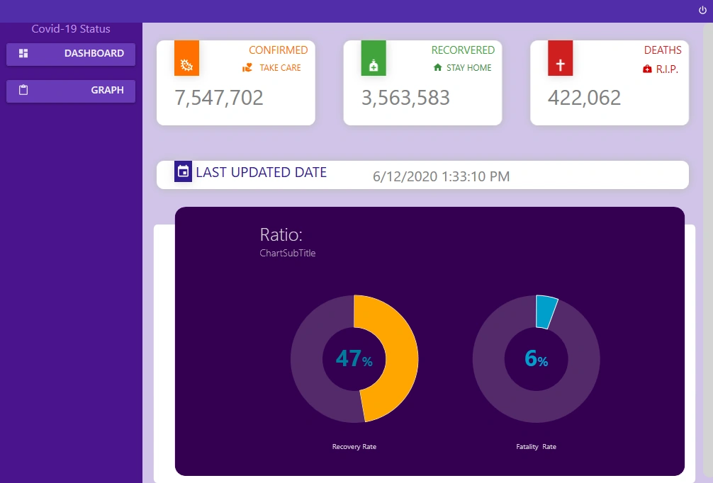
We are not done yet, in the future, we will update our left panel and add more screens on the right panel.
This is going to be a good project if you desire to learn WPF.
Conclusion
In this article, we learned how to develop a WPF application with Material design and how to use WebAPI & How to bind properties to UI.
It features reusable styles plus a smooth user experience.
I really hope you have come away from this with a real grasp on how to develop a WPF application.
Thank you all, and I wish you the very best. Keep Learning & Keep Coding!
You can find me @
Rikam PalkarPosted Jun 15, 2020, 8:15 PM
Https://covid-19-apis.postman.com/ follow Api as per your desire.
Rikam PalkarPosted Jun 15, 2020, 8:11 PM
Hello, Api only updates once a day at the provided time. If you're looking for data which refreshes every minute. You can refer any other sources. It has been selected for simplicity purpose. Goal here is the UI.
rd sboaPosted Jun 15, 2020, 11:52 AM
can you reply why did not u mention 3 chat for 3 scenarios
rd sboaPosted Jun 15, 2020, 11:49 AM
I have referred your api and articl steps and I compared the covid 19 status with Google data but your api does not provide appropriate and it shows delay wrong data