

Introduction
Before reading this article, please go through the following article:
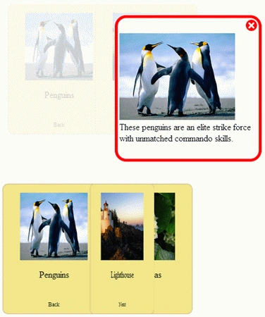
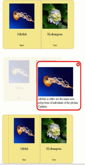
Now we will discuss how to create a simple Page Turner with Overlay using JavaScript, CSS, and HTML. Like this:
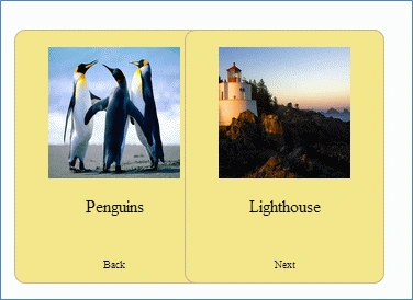 When we click on the image:
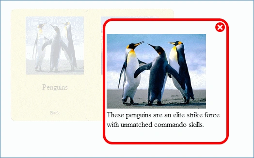 So when we click on the image the Overlay screen will be visible with the image and other data. Here we turn the page by clicking on the "Back" and the "Next" button like this:
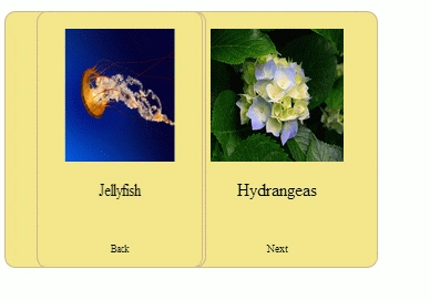 Step 1: First we use two <div> tags, one for the Overlay screen (Light) and the other for the Back part (black) like this:
Here we will specify the tags (<img> and <p>) to show our information in the overlay screen. Now we will set the style of both the screens like this:
Here we set the Opacity and the z-index, which creates the overlay screen.
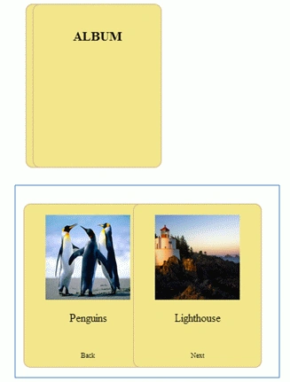
Step 2: Now we will use our first div tag to show the Album like this:
Now we will set its CSS property like this:
Here we will set the Animation Time Like this
-webkit-transition: -webkit-transform 1.2s;
The following line is used to hide the page turns when it is flipped over:
Step 1: First we use two <div> tags, one for the Overlay screen (Light) and the other for the Back part (black) like this:
Here we will specify the tags (<img> and <p>) to show our information in the overlay screen. Now we will set the style of both the screens like this:
Here we set the Opacity and the z-index, which creates the overlay screen.
Step 2: Now we will use our first div tag to show the Album like this:
Now we will set its CSS property like this:
Here we will set the Animation Time Like this
-webkit-transition: -webkit-transform 1.2s;
The following line is used to hide the page turns when it is flipped over:
- <div id="light" class="overlay">
- <table width="100%">
- <tr>
- <td align="right">
- <img src="Close.jpg" width="20px" onclick="document.getElementById('fade').style.display='block';
- document.getElementById('fade').style.opacity='1';document.getElementById('light').style.display='none';" /></td>
- </tr>
- <tr>
- <td>
- <img id="imgMain" src="Penguins.jpg" height="20%" />
- </td>
- </tr>
- <tr>
- <td>
- <p id="info">These penguins are an elite strike force with unmatched commando skills.</p>
- </td>
- </tr>
- </table>
- </div>
- <div id="fade" class="black">
- </div>
- <style>
- .black {
- position: absolute;
- top: 0%;
- left: 0%;
- width: 50%;
- height: 50%;
- background-color: White;
- z-index: 1001;
- -moz-opacity: 0.8;
- filter: alpha(opacity=80);
- }
- .overlay {
- display: none;
- position: absolute;
- -webkit-border-radius: 20px;
- border: 5px solid red;
- background-color: white;
- z-index: 1002;
- overflow: auto;
- }
- </style>
- <div id="backpageTurnermain" class="pageTurner back">
- <img src="Penguins.jpg" id="img1" height="120px" width="120px" onclick="Show();document.getElementById('light').style.display='block';
- document.getElementById('fade').style.opacity='0.2';" />
- <p>Penguins</p>
- <br />
- <a id="a1" style="font-size: 10px;" onclick="flop()">Back</a>
- </div>
- <div class="pageTurner frontPageTurner" id="frontPageTurnerpageTurner">
- <h3>ALBUM </h3>
- </div>
- .pageTurner {
- position: absolute;
- top: 100;
- height: 200;
- width: 150;
- background-color: Khaki;
- padding: 15;
- border-radius: 10;
- border: 1px solid Tan;
- -webkit-transition: -webkit-transform 1.2s;
- -webkit-backface-visibility: hidden;\
- }
- .frontPageTurner {
- left: 225;
- -webkit-transform-origin: 0px 0px;
- z-index: 1;
- }
-webkit-backface-visibility: hidden;
It defines whether or not an element should be visible when not facing the screen. This property is not supported by Opera.
Here we used the z-index property to set the <div> like this:
.frontPageTurner { left: 225; -webkit-transform-origin: 0px 0px;z-index:1;}
Now we will write the JavaScript code like this:
We define the main() function in the <body> tag like this:
- <script type="text/javascript">
- function flip() {
- document.getElementById("frontPageTurnerpageTurner").style.webkitTransform = "rotateY(-180deg)";
- document.getElementById("backpageTurner").style.webkitTransform = "rotateY(0deg)";
- }
- function flop() {
- document.getElementById("frontPageTurnerpageTurner").style.webkitTransform = "rotateY(0deg)";
- document.getElementById("backpageTurner").style.webkitTransform = "rotateY(180deg)";
- }
- function main() {
- document.getElementById("frontPageTurnerpageTurner").addEventListener("click", flip, false);
- document.getElementById("backpageTurner").addEventListener("click", flop, false);
- }
- </script>
Mahak GuptaPosted Nov 26, 2013, 11:04 AM
Thanks
sridhar goshikaPosted Aug 6, 2013, 7:20 AM
nice article