

Here are the steps:
- Open a blank app and add a toggle button either using toolbox or by coding xaml.
- Add two smiley images to your assets folder (for ex a: sad smiley for unchecked state and happy smiley for checked state of toggle button).
- In Solution Explorer right click on your xaml page and select "Open with Blend."
- Once the solution is opened in Blend in Object and Timeline section right click on your toggle button and select 'Edit Template', then 'Edit a Copy'.
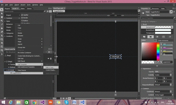
- Enter name for your style resource and click OK.
- Remove Border present inside parent grid as we will be designing a toggle button with images.
- Add two image controls to your grid from toolbox.
- Set height and width for both image controls.
- Set source of both images to sad and happy smiley respectively.
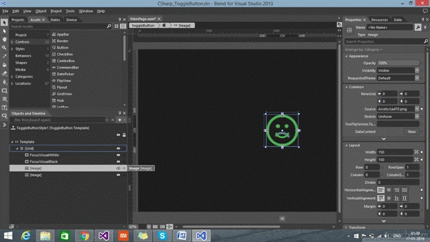
- Set visibility of your happy smiley to collapsed.
- From states section click on "checked state," present under common states, and set visibility of your sad image control to collapsed and happy image to visible.
- Do the same for CheckedPointerOver state as well.
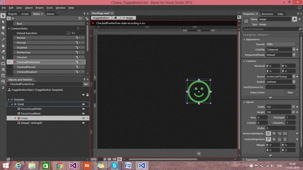
- Save xaml page and go back to visual studio and run.

Checked State

Style for toggle button
- <Style x:Key="ToggleButtonStyle1" TargetType="ToggleButton">
- <Setter Property="Background" Value="{ThemeResource ToggleButtonBackgroundThemeBrush}"/>
- <Setter Property="Foreground" Value="{ThemeResource ToggleButtonForegroundThemeBrush}"/>
- <Setter Property="BorderBrush" Value="{ThemeResource ToggleButtonBorderThemeBrush}"/>
- <Setter Property="BorderThickness" Value="{ThemeResource ToggleButtonBorderThemeThickness}"/>
- <Setter Property="Padding" Value="12,4,12,5"/>
- <Setter Property="HorizontalAlignment" Value="Left"/>
- <Setter Property="VerticalAlignment" Value="Center"/>
- <Setter Property="FontFamily" Value="{ThemeResource ContentControlThemeFontFamily}"/>
- <Setter Property="FontWeight" Value="SemiBold"/>
- <Setter Property="FontSize" Value="{ThemeResource ControlContentThemeFontSize}"/>
- <Setter Property="Template">
- <Setter.Value>
- <ControlTemplate TargetType="ToggleButton">
- <Grid>
- <VisualStateManager.VisualStateGroups>
- <VisualStateGroup x:Name="CommonStates">
- <VisualState x:Name="Normal"/>
- <VisualState x:Name="PointerOver"/>
- <VisualState x:Name="Pressed"/>
- <VisualState x:Name="Disabled"/>
- <VisualState x:Name="Checked">
- <Storyboard>
- <ObjectAnimationUsingKeyFrames Storyboard.TargetProperty="(UIElement.Visibility)" Storyboard.TargetName="image">
- <DiscreteObjectKeyFrame KeyTime="0">
- <DiscreteObjectKeyFrame.Value>
- <Visibility>Visible</Visibility>
- </DiscreteObjectKeyFrame.Value>
- </DiscreteObjectKeyFrame>
- </ObjectAnimationUsingKeyFrames>
- <ObjectAnimationUsingKeyFrames Storyboard.TargetProperty="(UIElement.Visibility)" Storyboard.TargetName="image1">
- <DiscreteObjectKeyFrame KeyTime="0">
- <DiscreteObjectKeyFrame.Value>
- <Visibility>Collapsed</Visibility>
- </DiscreteObjectKeyFrame.Value>
- </DiscreteObjectKeyFrame>
- </ObjectAnimationUsingKeyFrames>
- </Storyboard>
- </VisualState>
- <VisualState x:Name="CheckedPointerOver">
- <Storyboard>
- <ObjectAnimationUsingKeyFrames Storyboard.TargetProperty="(UIElement.Visibility)" Storyboard.TargetName="image">
- <DiscreteObjectKeyFrame KeyTime="0">
- <DiscreteObjectKeyFrame.Value>
- <Visibility>Visible</Visibility>
- </DiscreteObjectKeyFrame.Value>
- </DiscreteObjectKeyFrame>
- </ObjectAnimationUsingKeyFrames>
- <ObjectAnimationUsingKeyFrames Storyboard.TargetProperty="(UIElement.Visibility)" Storyboard.TargetName="image1">
- <DiscreteObjectKeyFrame KeyTime="0">
- <DiscreteObjectKeyFrame.Value>
- <Visibility>Collapsed</Visibility>
- </DiscreteObjectKeyFrame.Value>
- </DiscreteObjectKeyFrame>
- </ObjectAnimationUsingKeyFrames>
- </Storyboard>
- </VisualState>
- <VisualState x:Name="CheckedPressed"/>
- <VisualState x:Name="CheckedDisabled"/>
- <VisualState x:Name="Indeterminate"/>
- <VisualState x:Name="IndeterminatePointerOver"/>
- <VisualState x:Name="IndeterminatePressed"/>
- <VisualState x:Name="IndeterminateDisabled"/>
- </VisualStateGroup>
- <VisualStateGroup x:Name="FocusStates">
- <VisualState x:Name="Focused">
- <Storyboard>
- <DoubleAnimation Duration="0" To="1" Storyboard.TargetProperty="Opacity" Storyboard.TargetName="FocusVisualWhite"/>
- <DoubleAnimation Duration="0" To="1" Storyboard.TargetProperty="Opacity" Storyboard.TargetName="FocusVisualBlack"/>
- </Storyboard>
- </VisualState>
- <VisualState x:Name="Unfocused"/>
- <VisualState x:Name="PointerFocused"/>
- </VisualStateGroup>
- </VisualStateManager.VisualStateGroups>
- <Rectangle x:Name="FocusVisualWhite" IsHitTestVisible="False" Opacity="0" StrokeDashOffset="1.5" StrokeEndLineCap="Square" Stroke="{ThemeResource FocusVisualWhiteStrokeThemeBrush}" StrokeDashArray="1,1"/>
- <Rectangle x:Name="FocusVisualBlack" IsHitTestVisible="False" Opacity="0" StrokeDashOffset="0.5" StrokeEndLineCap="Square" Stroke="{ThemeResource FocusVisualBlackStrokeThemeBrush}" StrokeDashArray="1,1"/>
- <Image x:Name="image1" HorizontalAlignment="Left" Height="150" VerticalAlignment="Top" Width="150" Source="Assets/sad70.png"/>
- <Image x:Name="image" HorizontalAlignment="Left" Height="150" VerticalAlignment="Top" Width="150" Source="Assets/smiling36.png" Visibility="Collapsed"/>
- </Grid>
- </ControlTemplate>
- </Setter.Value>
- </Setter>
- </Style>
Sourabh SoniPosted Jul 11, 2016, 2:22 PM
Awesome article Aman to jumpstart with Blend.
Mohammed IbrahimPosted Jan 18, 2016, 8:59 AM
nice
Ankit BansalPosted Jan 18, 2016, 12:34 AM
Really helpful..
Santhakumar MunuswamyPosted Jan 17, 2016, 2:02 PM
Thanks for nice share