

Introduction
Data visualization is a powerful tool for making sense of complex data. Microsoft Power BI has emerged as a leader in this domain, providing users with an intuitive platform for creating stunning visualizations. But creating the visualizations is just the first step. To truly harness the power of your data, you need to control how these visuals interact with each other. In this blog, we will explore the art of editing visualization interactions in Power BI and how it can help you uncover valuable insights.
Understanding Visualizations Interactions
Power BI offers a variety of visualizations, from simple bar charts to intricate heat maps. When you have multiple visualizations on a report page, they can interact with each other in several ways. These interactions allow you to highlight patterns, correlations, and outliers in your data. Understanding these interaction options is key to making the most of Power BI.
- Filtering: Filtering is the most fundamental form of interaction. It allows you to select data points in one visualization, which in turn filters or highlights related data points in other visuals on the same page.
- Highlighting: Highlighting helps you focus on specific data points while dimming others. When you select an element in one visualization, the other visuals adjust their appearance to emphasize the selected data point while de-emphasizing the rest.
- Cross-highlighting: Cross-highlighting combines filtering and highlighting. When you select a data point in one visualization, other visuals display the selected data prominently, and non-selected data points are filtered out.
- Cross-filtering: This interaction mode allows you to filter multiple visualizations simultaneously. When you select a data point in one visualization, all other visuals on the page are filtered to display data related to the selection.
Editing Interactions in Power BI
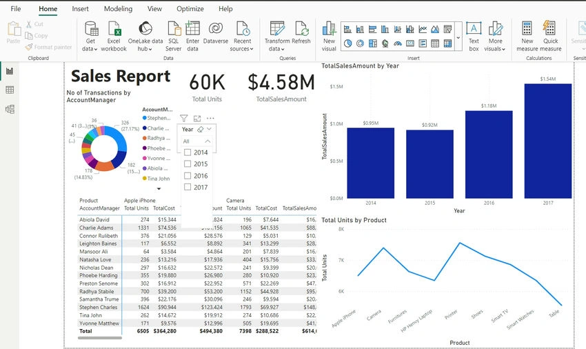
Now, let's dive into the practical aspects of editing interactions in Power BI. In the screenshot below, we've got a Power BI report with different visualizations that work interactively upon filtering any of the visuals.
From the screenshot below, we used the slicer to filter for years 2014, 2015, and 2016, and sure enough, all the visuals responded to the slicing, including the clustered column.
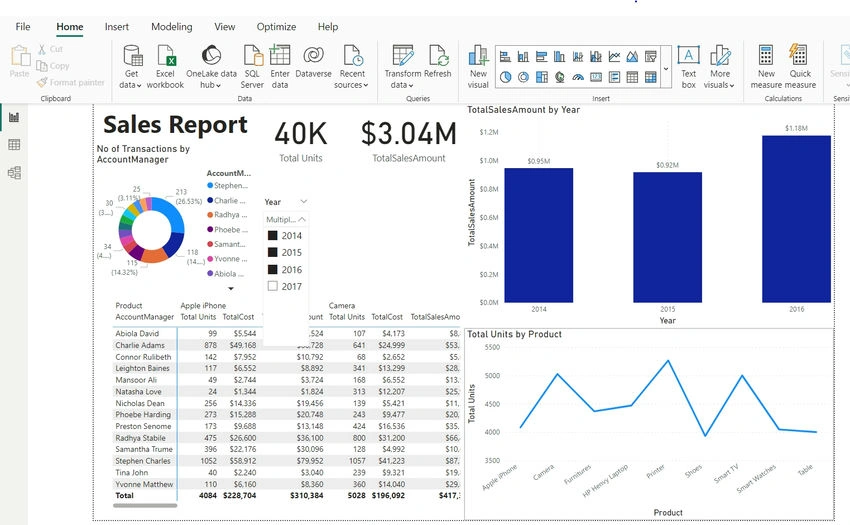
However, we want to edit the clustered column visual interactivity so that when we filter any year from the slicer, the clustered column chart will not respond to the filtering. To achieve that:
- Click on the Slicer, and that turns on the Format contextual ribbon tab that houses the Edit Interaction
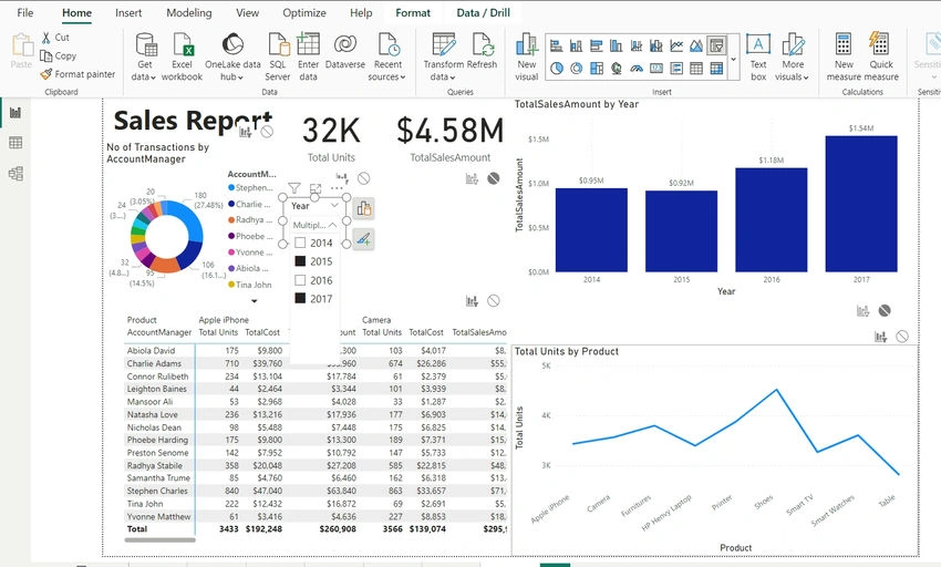
- In the Interactions group of the Format ribbon tab, click on Edit Interaction, located at the top left corner of the screen. Upon the click, edit interactions circles are attached to each of the visualizations.
- To disconnect the clustered column visual, click on the circle close to that visual
- Next, we used the slicer to filter for years 2015 and 2017, and due to the edit interactions we applied, the clustered column did not respond to the interactions, while other visuals responded to the filtering in the slicer, as seen in the screenshot below
Conclusion
Editing visualization interactions in Power BI allows you to control the interactivity that exists in your Power BI report.
Join the conversation! Your thoughts help the community grow.