

Hello Geeks,
I am here with the second day of my journey with bootstrap, today we learn Bootstrap's Grid system. If you have not read my first day's journey with Bootstrap then please first read that from here: Journey With Bootstrap: Day 1.
My first day's journey explained what Bootstrap is, its advantages, history and so on.
Now let's start the second day's journey.
Bootstrap's Grid System
We discussed previously that Bootstrap has the cool feature of being able to resize automatically based on the screen size of devices. We can organize content in multiple columns when using large screen devices but when we are using small-screen devices we need to customize the columns to prevent loss of content and also to look good of our applications or websites.
We have four types of screens:
- col-xs extra small screen size device such as smartphones (<768 px).
- col-sm small screen size device such as tablets (>=768 px).
- col-md medium screen size devices such as laptops (>=992 px).
- col-lg large screen size devices such as computers (>=1200 px).
Bootstrap's grid system are responsive and the columns are re-arranged depending on screen size.
Example of grid system
- <!DOCTYPE html>
- <html>
- <head>
- <title>grid system</title>
- <link rel="stylesheet" href="css/bootstrap.min.css">
- <script src="js/bootstrap.min.js"></script>
- <meta name="viewport" content="width=device-width, initial-scale=1">
- <style>
- #border
- {
- text-align:center;
- color:#FFF;
- }
- #border1
- {
- background-color:#0C9;
- }
- #border2
- {
- background-color:#99F;
- }
- #border3
- {
- background-color:#F3C;
- }
- #border4
- {
- background-color:#9C0;
- }
- #border5
- {
- background-color:#609;
- }
- h3
- {
- color:#006;
- }
- </style>
- </head>
- <body id="border">
- <h3> Equal Size Column (Medium screens)</h3>
- <div class="container" >
- <div class="row" id="border1">
- <div class="col-md-1">part 1 (size 1)</div>
- <div class="col-md-1">part 2 (size 1)</div>
- <div class="col-md-1">part 3 (size 1)</div>
- <div class="col-md-1">part 4 (size 1)</div>
- <div class="col-md-1">part 5 (size 1)</div>
- <div class="col-md-1">part 6 (size 1)</div>
- <div class="col-md-1">part 7 (size 1)</div>
- <div class="col-md-1">part 8 (size 1)</div>
- <div class="col-md-1">part 9 (size 1)</div>
- <div class="col-md-1">part 10 (size 1)</div>
- <div class="col-md-1">part 11 (size 1)</div>
- <div class="col-md-1">part 12 (size 1)</div>
- </div>
- </div>
- <div class="container" id="border2">
- <div class="row">
- <div class="col-md-3">part 1 (size 3)</div>
- <div class="col-md-3">part 2 (size 3)</div>
- <div class="col-md-3">part 3 (size 3)</div>
- <div class="col-md-3">part 4 (size 3)</div>
- </div>
- </div>
- <div class="container" id="border3">
- <div class="row">
- <div class="col-md-4">part 1 (size 4)</div>
- <div class="col-md-4">part 2 (size 4)</div>
- <div class="col-md-4">part 3 (size 4)</div>
- </div>
- </div>
- <div class="container" id="border4">
- <div class="row">
- <div class="col-md-6">part 1(size 6)</div>
- <div class="col-md-6">part 2(size 6)</div>
- </div>
- </div>
- <div class="container" id="border5">
- <div class="row">
- <div class="col-md-12">part 1(size 12)</div>
- </div>
- </div>
- <br>
- <h3> Different Size Column</h3>
- <div class="container" >
- <div class="row" id="border1">
- <div class="col-md-8">part 1 (size 8)</div>
- <div class="col-md-4">part 2 (size 4)</div>
- </div>
- </div>
- <div class="container" >
- <div class="row" id="border4">
- <div class="col-md-5">part 1 (size 5)</div>
- <div class="col-md-4">part 2 (size 4)</div>
- <div class="col-md-3">part 3 (size 3) </div>
- </div>
- </div>
- <h3> Equal Size Column (small screens)</h3>
- <div class="container" >
- <div class="row" id="border3">
- <div class="col-xs-4">part 1 (size 5)</div>
- <div class="col-xs-4">part 2 (size 4)</div>
- <div class="col-xs-4">part 3 (size 3) </div>
- </div>
- </div>
- </body>
- </html>

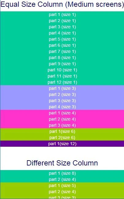

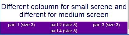
SubashPosted Sep 19, 2016, 7:55 AM
Very nice
Madhuram SrivastavaPosted Jan 5, 2015, 11:05 AM
nicely done Sanjay singh... gud
Vithal WadjePosted Jan 5, 2015, 9:55 AM
Great work,Keep it up
Manish Kumar ChoudharyPosted Jan 5, 2015, 9:19 AM
Nice one...
Praveen KumarPosted Jan 5, 2015, 7:29 AM
It's very good!
kamlesh yadavPosted Jan 5, 2015, 1:57 AM
Ohh its really helpfull...
Vikas RaiPosted Jan 5, 2015, 1:47 AM
Its really helpfull for beginners.. Good luck... Carry on wid such interesting article... We hope more.
Mahesh ChandPosted Jan 4, 2015, 10:45 PM
Good start Sanjay. You probably want to change the colors in your sample code. Colors you have are too much contrast. Try to use some cooler colors :) to give your UI more professional look :). Cheers!