

Introduction
In this article we will talk about the Popup control in Metro style apps. The purpose of the popup control is to make a visual control associated with some of action such as button click, mouse click etc. Generally we use a popup control to get the user's attention to a specific action such as to give some error messages, suggestions messages or to describe provide information.
Here we will use a popup control to give the details of an image on a button click event. Doing this we will add a button and write the code on the click event of the button in the BlankPage.cs file.
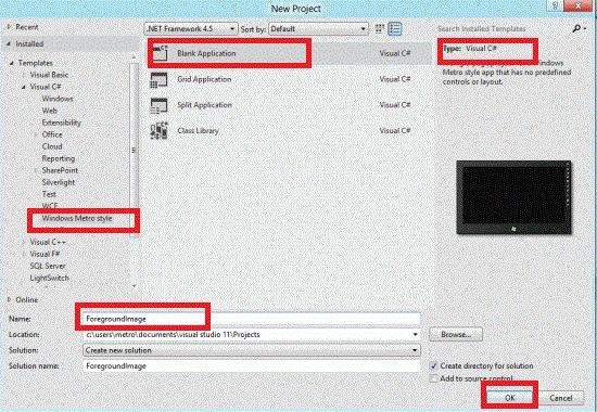
Step 1 : First of all you will create a new Metro Style Application. Let us see the description with images of how you will create it.
- Open Visual Studio 2011
- File -> New -> Project
- Choose Template -> Visual C# -> Metro Style Application
- Rename this Application
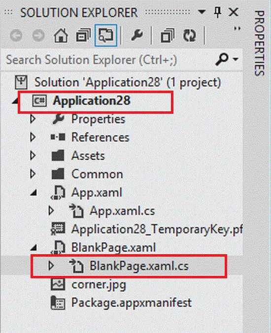
Step 2 : In the Solution Explorer there are two files that we will primarily work with; BlankPage.xaml and BlankPage.xaml.cs files.
Step 3 : The BlankPage.xaml file is as in the following code:
Code :
<Page
x:Class="Application28.BlankPage"
xmlns="http://schemas.microsoft.com/winfx/2006/xaml/presentation"
xmlns:x="http://schemas.microsoft.com/winfx/2006/xaml"
xmlns:local="using:Application28"
xmlns:d="http://schemas.microsoft.com/expression/blend/2008"
xmlns:mc="http://schemas.openxmlformats.org/markup-compatibility/2006"
mc:Ignorable="d">
<Grid Background="{StaticResource ApplicationPageBackgroundBrush}">
<Grid x:Name="ContentRoot" Background="LimeGreen" Margin="100,20,100,20">
<Grid.RowDefinitions>
<RowDefinition Height="Auto"/>
<RowDefinition Height="*"/>
<RowDefinition Height="Auto"/>
</Grid.RowDefinitions>
<!-- Content -->
<Grid HorizontalAlignment="Center" VerticalAlignment="Top">
<StackPanel>
<TextBlock Text="Popup Control " Foreground="Red" FontSize="50" ></TextBlock>
<Image Source="corner.jpg" Width="400"></Image>
<Button x:Name="PopUpButton" Content="Detail..." Height="50" Width="100" Background="Gray" Click="PopUpButton_Click" />
<Popup x:Name="myPopup" Margin="-34,0,-31,0" Grid.Row="2" Grid.Column="1" Height="100" VerticalAlignment="Bottom" >
<Border CornerRadius="10" Background="Red" BorderThickness="2" BorderBrush="Black">
<StackPanel Margin="10">
<TextBlock x:Name="PopUpText" Height="Auto" Width="Auto" FontSize="20"/>
</StackPanel>
</Border>
</Popup>
</StackPanel>
</Grid>
</Grid>
</Grid>
</Page>
Step 3 : The BlankPage.xaml.cs file is as in the following code:
Code :
using System;
using System.Collections.Generic;
using System.IO;
using System.Linq;
using Windows.Foundation;
using Windows.Foundation.Collections;
using Windows.UI.Xaml;
using Windows.UI.Xaml.Controls;
using Windows.UI.Xaml.Controls.Primitives;
using Windows.UI.Xaml.Data;
using Windows.UI.Xaml.Input;
using Windows.UI.Xaml.Media;
using Windows.UI.Xaml.Media.Animation;
using Windows.UI.Xaml.Navigation;
namespace Application28
{
public sealed partial class BlankPage : Page
{
public BlankPage()
{
this.InitializeComponent();
}
protected override void OnNavigatedTo(NavigationEventArgs e)
{
}
private void PopUpButton_Click(object sender, RoutedEventArgs e)
{
myPopup.IsOpen = true;
PopUpText.Text = "Free c# articles, c# tutorials, news, blogs, resources, forum for C# programming. ";
}
}
}
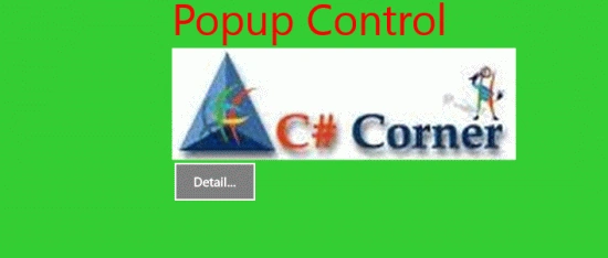
Step 4 : After running this code the output will look like this:
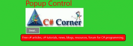
Click on the Detail button.
Join the conversation! Your thoughts help the community grow.