

Web and mobile apps often require a confirmation of an activity or operation and there are several ways to achieve this. A traditional method of a confirmation is to show a popup message or a text message. However, today’s browsers, devices, and platforms can provide modern and creative ways to notify a user about the operation. Angular Snack Bar is one of those controls.
The Ignite UI for Angular Snack Bar component provides feedback about an operation with a single-line message, which can include a link to an action such as Undo. The Snack Bar message appears above all other screen elements, located at the bottom of a mobile device screen or at the lower left of larger device screens.
This article is an introduction to Angular Snack Bar component and how to use it in a working demo app.
Let's get started.
Note
If you do not have IgniteUI for Angular installed, check out Ignite UI for Angular, download, and install it.
Once you’re all set with Ignite UI for Angular, open VS Code or your favorite code editor and create a new project.
In my case, I use VS Code and create a new project:
“ng new SnackbarDemo”
Once the project is created, open app.module.ts and add the following code:
- import { IgxSnackbarModule } from 'igniteui-angular';
- import { BrowserAnimationsModule } from '@angular/platform-browser/animations';
- imports : [
- BrowserModule,
- BrowserAnimationsModule,
- IgxSnackbarModule
- ]
The above code imports IgniteUI Snackbar Module.
For this demo project, we will not create a separate component for Snackbar, instead, we are going to code in app.component.
Next go to the app.component.html and paste the following code. This code adds a button and a Snackbar component to the page.
- <div style="margin: 20px">
- <button igxButton="raised" class="btn btn-success" (click)="snackbar.show()">Show SnackBar</button>
- <div style="width: 30%; margin-top: 10px">
- <igx-snackbar #snackbar message="Snackbar show"></igx-snackbar>
- </div>
- </div>
Listing 3
Now, go to the VS Code terminal and run the following command.
“ng serve --o”
The final output will be like the following figure. That’s the default Snackbar component.
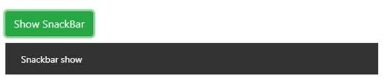
Snackbar with manually close button
The Snackbar message appears and disappears after some time. The default display time is 4 sec. We can customize this behavior by setting its property “Autohide” to false. To do this go to the app.component.html file and paste the following code.
- <button igxButton="raised" (click)="snackbar.show()">Show Snackbar</button>
- <div>
- <igx-snackbar #snackbar message="Snackbar shows. Click close button to close the snackbar" [autoHide]="false" actionText="CLOSE" (onAction)="close(snackbar)"></igx-snackbar>
- </div>
The above code sets the autoHide property to false.
See the onAction method we define in snackbar. Now we need to create an action in the app.component.ts file. This method simply takes the snackbar as a variable and calls the hide function.
- public close(element) {
- element.hide();
- }
Now, the new UI looks like the following. As you can see from this below figure, the CLOSE button appears and clicking on it will hide the control.

Snack bar visible duration
Join the conversation! Your thoughts help the community grow.