

Overview
After using the PnP reusable React controls, I am privileged to implement a TreeView control along with my colleague Siddharth Vaghasia, guided by Alex Terentiev and Elio Struyf.
This graphical control allows presenting a hierarchical view of information. Each tree item can have a number of subitems. This is often visualized by an indentation in a list. A tree item can be expanded to reveal subitems (if exist), and collapsed to hide subitems.
During this article, we will explore the TreeView control implementation, how to use it in your SPFx solutions.
The Implementation
The solution structure of this control is as follows:
| treeView |–– ITreeItem.ts |–– TreeView.tsx |–– TreeItem.tsx |–– TreeItemActionsControl.tsx |–– ButtonTreeItemAction.tsx |–– DropdownTreeItemAction.tsx |
Now, let us explore these important components of the solution:
ITreeItem.ts
This represents the public properties of the Tree Item, which can be set by an end-user.
TreeView.tsx
Main React component which renders the tree structure by calling the first tree item to render, which eventually renders the nested items. The events exposed from control (e.g. onSelect, onExpandCollapse, onRenderItem) are passed to the TreeItem component as a parent callback function.
TreeItem.tsx
Renders the controls for TreeItem component. This internally uses Checkbox and Label controls to render the layout of the tree item.
TreeItemActionsControl.tsx
Renders the controls for the TreeItem action component. We can set treeItemActionsDisplayMode on TreeView to render action (contextual menu) against tree item. The supported modes are Dropdown and Button.
ButtonTreeItemAction.tsx
Renders the context menu as Button action for TreeItem component, when treeItemActionsDisplayMode is set to Button.
DropdownTreeItemAction.tsx
Renders the context menu as Dropdown action for TreeItem component, when treeItemActionsDisplayMode is set to Dropdown.
Set up SPFx Solution
1. Open a command prompt. Create a directory for the SPFx solution.
- md spfx-react-treeview-control
2. Navigate to the above created directory.
- cd spfx-react-treeview-control
3. Run the Yeoman SharePoint Generator to create the solution.
- yo @microsoft/sharepoint
4. Yeoman generator will present you with the wizard by asking questions about the solution to be created.
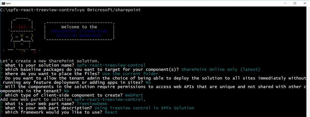
When prompted:
- Accept the default spfx-react-treeview-control as your solution name, and then select Enter.
- Select SharePoint Online only (latest), and then select Enter.
- Select Use the current folder as the location for the files.
- Select N to allow the solution to be deployed to all sites immediately.
- Select N on the question if the solution contains unique permissions.
- Select WebPart as the client-side component type to be created.
- Name the web part as TreeViewDemo.
- Provide the description as Using TreeView control in SPFx Solution.
- Select the framework to use as React.
5. Yeoman generator will perform the scaffolding process to generate the solution. The scaffolding process will take a significant amount of time.
6. Once the scaffolding process is completed, on the command prompt type below command to open the solution in the code editor of your choice.
- code .
NPM Package
@pnp/spfx-controls-react (https://sharepoint.github.io/sp-dev-fx-controls-react/)
On the command prompt, run below command to include the npm package.
- npm install @pnp/spfx-controls-react --save
Using TreeView control in SPFx Solution
1. Open the React component file at “src\webparts\treeViewDemo\components\TreeViewDemo.tsx”
2. Add below imports.
- import { TreeView, ITreeItem, TreeViewSelectionMode, TreeItemActionsDisplayMode } from "@pnp/spfx-controls-react/lib/TreeView";
- private treeItems = [
- {
- key: "R1",
- label: "Root",
- subLabel: "This is a sub label for node",
- iconProps: {
- iconName: 'SkypeCheck'
- },
- actions: [{
- title: "Get item",
- iconProps: {
- iconName: 'Warning',
- style: {
- color: 'salmon',
- },
- },
- id: "GetItem",
- actionCallback: async (treeItem: ITreeItem) => {
- console.log(treeItem);
- }
- }],
- children: [
- {
- key: "1",
- label: "Parent 1",
- selectable: false,
- children: [
- {
- key: "3",
- label: "Child 1",
- subLabel: "This is a sub label for node",
- actions: [{
- title: "Share",
- iconProps: {
- iconName: 'Share'
- },
- id: "GetItem",
- actionCallback: async (treeItem: ITreeItem) => {
- console.log(treeItem);
- }
- }],
- children: [
- {
- key: "gc1",
- label: "Grand Child 1",
- actions: [{
- title: "Get Grand Child item",
- iconProps: {
- iconName: 'Mail'
- },
- id: "GetItem",
- actionCallback: async (treeItem: ITreeItem) => {
- console.log(treeItem);
- }
- }]
- }
- ]
- },
- {
- key: "4",
- label: "Child 2",
- iconProps: {
- iconName: 'SkypeCheck'
- }
- }
- ]
- },
- {
- key: "2",
- label: "Parent 2"
- },
- {
- key: "5",
- label: "Parent 3",
- disabled: true
- },
- {
- key: "6",
- label: "Parent 4",
- selectable: true
- }
- ]
- },
- {
- key: "R2",
- label: "Root 2",
- children: [
- {
- key: "8",
- label: "Parent 5"
- }
- ]
- }
- ];
- public render(): React.ReactElement<ITreeViewDemoProps> {
- return (
- <div className={styles.treeViewDemo}>
- <div className={styles.container}>
- <div className={styles.row}>
- <div className={styles.column}>
- <span className={styles.title}>Tree View PnP Control</span>
- <TreeView
- items={this.treeItems}
- defaultExpanded={false}
- selectionMode={TreeViewSelectionMode.Multiple}
- selectChildrenIfParentSelected={true}
- showCheckboxes={true}
- treeItemActionsDisplayMode={TreeItemActionsDisplayMode.ContextualMenu}
- defaultSelectedKeys={['R2', '6']}
- onExpandCollapse={this.onExpandCollapseTree}
- onSelect={this.onItemSelected} />
- </div>
- </div>
- </div>
- </div>
- );
- }
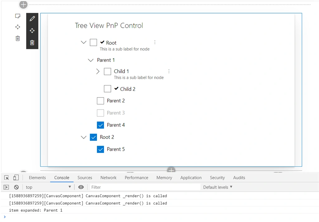
5. Implement onExpandCollapse to get the expanded and collapsed tree item.
- private onExpandCollapseTree(item: ITreeItem, isExpanded: boolean) {
- console.log((isExpanded ? "item expanded: " : "item collapsed: ") + item);
- }
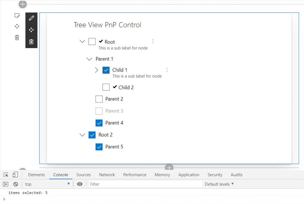
- private onItemSelected(items: ITreeItem[]) {
- console.log("items selected: " + items.length);
- }
Custom Rendering
You can fully customize how tree items are rendered by providing the onRenderItem callback function and returning whatever JSX.Element you want.
- <TreeView
- items={this.treeItems}
- defaultExpanded={false}
- selectionMode={TreeViewSelectionMode.Multiple}
- selectChildrenIfParentSelected={true}
- showCheckboxes={true}
- treeItemActionsDisplayMode={TreeItemActionsDisplayMode.ContextualMenu}
- defaultSelectedKeys={['R2', '6']}
- onExpandCollapse={this.onExpandCollapseTree}
- onSelect={this.onItemSelected}
- onRenderItem={this.renderCustomTreeItem} />
- private renderCustomTreeItem(item: ITreeItem): JSX.Element {
- return (
- <span>
- {
- item.iconProps &&
- <i className={"ms-Icon ms-Icon--" + item.iconProps.iconName} style={{ paddingRight: '4px' }} />
- }
- {item.label}
- </span>
- );
- }
Selection Modes
The selection mode can be set by using property TreeViewSelectionMode. The possible values are Single, Multiple, None.
Summary
In this article, we explored the implementation and practical use of TreeView control in the SPFx web part. Hope this reusable control will help you in your future solutions. Share your feedback!
Code Download
The code implemented during this article can be found at: https://github.com/nanddeepn/code-samples/tree/master/SPFx/WebParts/spfx-react-treeview-control
References
- PnP TreeView control (https://pnp.github.io/sp-dev-fx-controls-react/controls/TreeView/)
- Git code repo (https://github.com/pnp/sp-dev-fx-controls-react/tree/master/src/controls/treeView)
Karthik RamasubramanianPosted Aug 28, 2020, 11:19 AM
Hi Nandeep, the article was very helpful and I have successfully managed to use the tree view in my SPFx webpart. But have a few issues. 1. The chevronRight and chevronDown icons are not displaying on a SP2016 on prem site, but is working fine in my spo tenant. Any suggestions on what might be causing this issue and how i can fix it? 2. when a root item is expanded, all children and sub children under it are also expanded. i want to ensure that only the selected level is expanded? looking forward to your suggestions..
Vaithishwari DevarajanPosted Jul 28, 2020, 12:14 AM
Hi Nandeep, I am trying to render this control and i have a requirement to rerender the treeview with some dynamic key as selected. As this treeview has only defaultselected keys and no "Selectedkeys" i am unable to set as like office ui fabric controls. Is there any workaround for that
mohammed jaseefarPosted Jul 6, 2020, 5:39 AM
Hello. i have dynamic data to show in review.created a function that returning a string having the same structure of you mentioned array. how can i set to state array. or can i send array form back end. please explain while it is working with api... [email protected]
djmrkyPosted May 12, 2020, 4:20 AM
Hello Nanddeep, This is a great SPFx control ... I have a couple of questions: 1. Is it possible to make it initially render with all nodes collapsed? I noticed that the first level of subitems is always expanded? I want to see only the root level items in the tree initially. 2. When I set the "defaultSelectedKeys", can this part of the tree be expanded by default to be visible? 3. Is there a possibility to control the expand/collapse of the nodes with code (this would practically solve questions 1. and 2. ? Thanks