

A split view control in the UAP is used to load multiple views in a single page.
A split view control is divided into the following two main areas.
- Pane area.
- Content area.
For example:
- <SplitView DisplayMode="CompactOverlay" PaneBackground="LightGray" Background="LightSkyBlue">
- <SplitView.Pane>
- <Button Content="Hey am Pane"/>
- </SplitView.Pane>
- <SplitView.Content>
- <TextBlock Text="Content View Area" FontSize="35" Foreground="White"
- HorizontalAlignment="Center" VerticalAlignment="Center"/>
- </SplitView.Content>
- </SplitView>
The Background property changes the background color of the split view area.
Display Mode of Split view control
- Overlay.
- CompactOverlay.
- Inline.
- Compactinline.
CompactOverlay mode: Overlay into the view area, it is good to use for Mobile version or small size window. For example, PC (Calculator app).
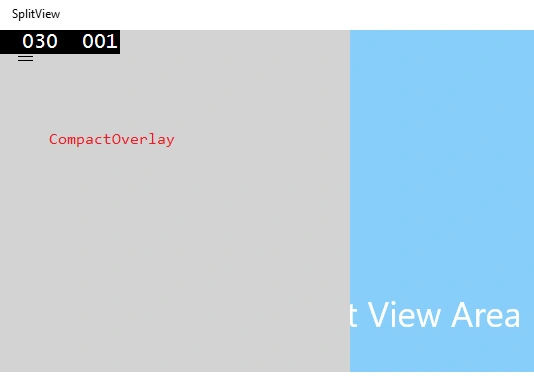
Figure 1: CompactOverlay
CompactInline mode: Is divided into a split view area and it's good to use for a PC version.
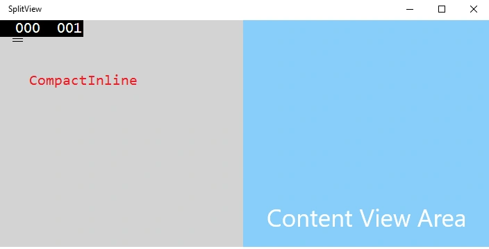
Figure 2: CompactInline
Inline and Overlay are used to Hide the pane area.
Hide the pane area properties are usually used in the mobile version or small size window.
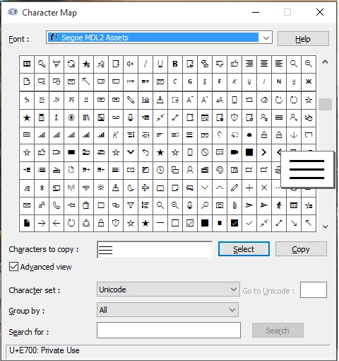
For example, in a Calculator app the Pane area is hidden. When you click the Hamburger button (“?“) , the CompactOverlay mode pane will open in the app.
Pane
The Pane area is generally used to display the menu items for Navigation to load various items into the content area.
The following are some of the important properties.
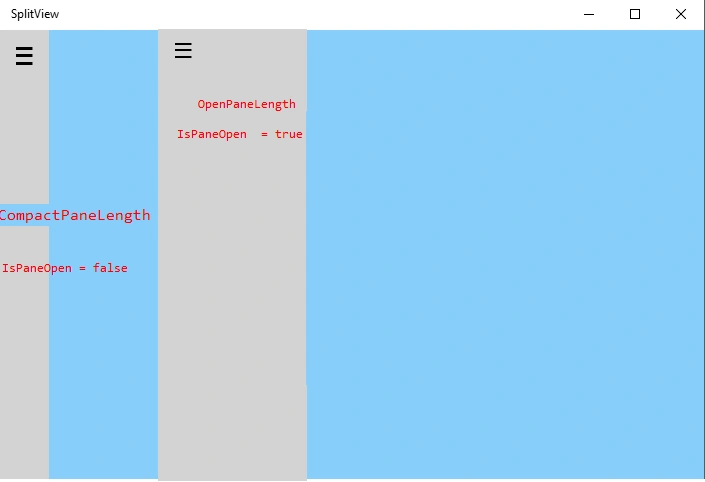
- CompactPaneLength: Normal display width of the pane area.
- OpenPaneLength: User interact in the pane, change the display of the width.
- IsPaneOpen: Find pane in CompactPaneLength or OpenPaneLength mode.
Hashim ShafiqPosted Aug 30, 2015, 9:45 PM
nice
Vinoth RajendranPosted Aug 29, 2015, 6:11 AM
Thanks
Yashwanth MuthineniPosted Aug 29, 2015, 5:38 AM
Nice Share
Santhakumar MunuswamyPosted Aug 29, 2015, 5:16 AM
Nice article. Thanks for sharing
Vinoth RajendranPosted Aug 27, 2015, 11:12 AM
Thanks folks
Gowtham RajamanickamPosted Aug 27, 2015, 9:50 AM
good
Ankit BansalPosted Aug 27, 2015, 2:22 AM
Good one..Thanks for sharing..
Rajeesh MenothPosted Aug 27, 2015, 1:13 AM
Good One
Mohammed IbrahimPosted Aug 27, 2015, 12:08 AM
nice
Gowtham KPosted Aug 26, 2015, 11:07 AM
Good one
Rajeesh MenothPosted Aug 26, 2015, 6:30 AM
Nice Share :)
Karthikeyan KPosted Aug 26, 2015, 6:21 AM
Good one..Thanks for share