

Note: Some XAML object elements may not have the Content property available directly. It must be set through a property.
The code snippet in Listing 1 creates a Button control and sets its Content property to a string “Hello XAML”. The output looks as in Figure 1.
- <Button Height="50" Margin="10,10,350,310" Content="Hello XAML" />
Listing 1
Listing 2 is an alternative way to set the Content property of a Button.
- <Button Height="50" Margin="10,10,350,310">Hello XAML</Button>
Listing 2
The output of Listing 2 looks the same as in Figure 1.
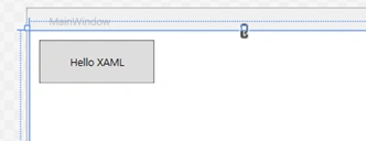
Figure 1
A Button element can display other child elements as its content. The code listed in Listing 3 sets a Rectangle element as the content of the Button.
- <Button Height="80" Margin="10,80,300,170">
- <Rectangle Height="60" Width="120" Fill="Green"/>
- </Button>
Listing 3
The output of Listing 3 looks as in Figure 2.
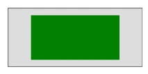
Figure 2
Content property can also be a container or a parent element hosting child elements. The code listed in Listing 4 sets a StackPanel container with 5 child elements as the content of the Button.
- <Button Margin="10,201,100,40">
- <StackPanel Orientation="Horizontal">
- <Ellipse Height="60" Width="60" Fill="Red"/>
- <TextBlock TextAlignment="Center"><Run Text=" Red Circle"/></TextBlock>
- <TextBlock TextAlignment="Center"><Run Text=" "/></TextBlock>
- <Rectangle Height="60" Width="120" Fill="Green"></Rectangle>
- <TextBlock TextAlignment="Center"><Run Text=" Green Rectangle"/></TextBlock>
- </StackPanel>
- </Button>
Listing 4
The output of Listing 4 looks as in Figure 3.
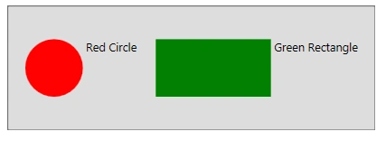
Figure 3
The final XAML code is listed in Listing 5.
- <Window x:Class="ContentPropertySample.MainWindow"
- xmlns="http://schemas.microsoft.com/winfx/2006/xaml/presentation"
- xmlns:x="http://schemas.microsoft.com/winfx/2006/xaml"
- Title="MainWindow" Height="400" Width="500" >
- <Grid x:Name="ParentGrid">
- <Button Height="50" Margin="10,10,350,310" Content="Hello XAML" />
- <Button Height="80" Margin="10,80,300,170">
- <Rectangle Height="60" Width="120" Fill="Green"></Rectangle>
- </Button>
- <Button Margin="10,201,100,40">
- <StackPanel Orientation="Horizontal">
- <Ellipse Height="60" Width="60" Fill="Red"/>
- <TextBlock TextAlignment="Center"><Run Text=" Red Circle"/></TextBlock>
- <TextBlock TextAlignment="Center"><Run Text=" "/></TextBlock>
- <Rectangle Height="60" Width="120" Fill="Green"></Rectangle>
- <TextBlock TextAlignment="Center"><Run Text=" Green Rectangle"/></TextBlock>
- </StackPanel>
- </Button>
- </Grid>
- </Window>
Listing 5
The output of Listing 5 looks as in Figure 4.
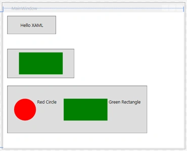
Figure 4
As you can imagine from the preceding examples, you can pretty much host any user interfaces as content of a XAML element.
The code listed in Listing 6 creates the preceding Button controls dynamically in the code and sets their Content properties to a string, a Rectangle and a StackPanel respectively.
- // Button with string content
- Button helloButton = new Button();
- helloButton.Margin = new Thickness(10,10,350,310);
- helloButton.Content = "Hello XAML";
- // Button with a UIElement
- Button buttonWithRectangle = new Button();
- buttonWithRectangle.Height = 80;
- buttonWithRectangle.Margin = new Thickness(10, 80, 300, 170);
- // Create a Rectangle
- Rectangle greenRectangle = new Rectangle();
- greenRectangle.Height = 60;
- greenRectangle.Width = 120;
- greenRectangle.Fill = Brushes.Green;
- // Set Rectangle as Button.Content
- buttonWithRectangle.Content = greenRectangle;
- // Button with a Container, StackPanel
- Button buttonWithStackPanel = new Button();
- buttonWithStackPanel.Margin = new Thickness(10, 10, 350, 310);
- // Create a StackPanel and set its orinetation to horizontal
- StackPanel stackPanel = new StackPanel();
- stackPanel.Orientation = Orientation.Horizontal;
- // Create an Ellipse
- Ellipse redEllipse = new Ellipse();
- redEllipse.Width = 60;
- redEllipse.Height = 60;
- redEllipse.Fill = Brushes.Red;
- // Add to StackPanel
- stackPanel.Children.Add(redEllipse);
- // Create a TextBlock
- TextBlock textBlock1 = new TextBlock();
- textBlock1.TextAlignment = TextAlignment.Left;
- textBlock1.Text = "Red Circle";
- // Add to StackPanel
- stackPanel.Children.Add(textBlock1);
- // Create a TextBlock
- TextBlock space = new TextBlock();
- space.TextAlignment = TextAlignment.Center;
- space.Text = " ";
- // Add to StackPanel
- stackPanel.Children.Add(space);
- // Create a Rectangle
- Rectangle greenRectangle2 = new Rectangle();
- greenRectangle2.Height = 60;
- greenRectangle2.Width = 120;
- greenRectangle2.Fill = Brushes.Green;
- // Add to StackPanel
- stackPanel.Children.Add(greenRectangle2);
- // Create a TextBlock
- TextBlock textBlock2 = new TextBlock();
- textBlock2.TextAlignment = TextAlignment.Left;
- textBlock2.Text = "Green Rectangle";
- // Add to StackPanel
- stackPanel.Children.Add(textBlock2);
- // Set StackPaenl as Button.Content
- buttonWithStackPanel.Content = stackPanel;
- // Add dynamic button controls to the Window
- ParentGrid.Children.Add(helloButton);
- ParentGrid.Children.Add(buttonWithRectangle);
- ParentGrid.Children.Add(buttonWithStackPanel);
Listing 6
Summary
Vithal WadjePosted Sep 8, 2014, 1:19 PM
very useful,thanks
Sandeep Singh ShekhawatPosted Sep 8, 2014, 12:20 AM
Nice one !! I am continue touch with your WPF articles and looking a book on WPF from your side. That book also include MVVM pattern !! Cheers !!