This chapter is taken from book "Programming Windows Phone 7" by Charles Petzold published by Microsoft press. http://www.charlespetzold.com/phone/index.html
Suppose you want to let the user interact with a Slider but you also want a TextBlock to display its current value, such as in the ColorScroll program. Tasks such as this are so common that Silverlight provides a streamlined mechanism to perform them. This is called a data binding, or just binding. A data binding is a link between two properties of two objects, so that when one property changes, the other is updated with that change. Data bindings are most easily demonstrated using two visual elements such as a Slider and a TextBlock.
Source and Target
In a typical data binding, a property of one object is updated automatically from a property of another object. The source of a data binding is usually given a name:
<Slider Name="slider"... />
You can break out the target property as a property element and assign to it an object of type Binding:
<TextBlock … >
<TextBlock.Text>
<Binding ElementName="slider" Path="Value" />
</TextBlock.Text>
</TextBlock>
Use the ElementName property to indicate the name of the source element; use the Path property for the name of the source property, which is the Value property of the Slider. The SliderBindings program includes this binding and lets you experiment with some variations. Everything is in the XAML file:
<Grid x:Name="ContentPanel" Grid.Row="1" Margin="12,0,12,0">
<Grid.RowDefinitions>
<RowDefinition Height="*" />
<RowDefinition Height="*" />
<RowDefinition Height="*" />
</Grid.RowDefinitions>
<Slider Name="slider"
Value="90"
Grid.Row="0"
Maximum="180"
Margin="24" />
<TextBlock Name="txtblk"
Text="{Binding ElementName=slider, Path=Value}"
Grid.Row="1"
FontSize="48"
HorizontalAlignment="Center"
VerticalAlignment="Center" />
<Rectangle Grid.Row="2"
Width="{Binding ElementName=slider, Path=Value}"
RenderTransformOrigin="0.5 0.5"
Fill="Blue">
<Rectangle.RenderTransform>
<RotateTransform x:Name="rotate"
Angle="90" />
</Rectangle.RenderTransform>
</Rectangle>
</Grid>
</Grid>
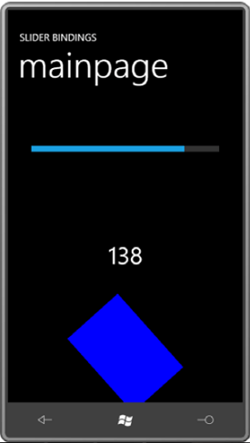
As you manipulate the Slider, the TextBlock displays the current value and the Rectangle height decreases and increases. (The Binding targets the Width property of the Rectangle but the Rectangle is rotated 90 degree)
Binding Converters
Perhaps as you were playing around with the SliderBindings program (or as you gaped in amazement at that screenshot), you were started to see that the TextBlock displays the Slider value sometimes as an integer, sometimes with one or two decimal points, but mostly in the full 15-digit glory of double-precision floating point.
To add a simple converter to SliderBindings, add a new class to the project and call it TruncationConverter. Actually the class is already in the project, and here it is:
namespace SliderBindings
{
public class TruncationConverter : IValueConverter
{
public object Convert(object value, Type targetType,
object parameter, CultureInfo culture)
{
if (value is double)
return Math.Round((double)value);
return value;
}
public object ConvertBack(object value, Type targetType,
object parameter, CultureInfo culture)s
{
return value;
}
}
}
The value argument to the Convert method is the object passing from the source to the target. This method just checks if it's a double. If so, it explicitly casts it to a double for the Math.Round method.
You'll need to reference this class in MainPage.xaml, which means you'll need an XML namespace declaration:
xmlns:local="clr-namespace:SliderBindings"
The TruncationConverter class is then made a resource:
<phone:PhoneApplicationPage.Resources>
<local:TruncationConverter x:Key="truncate" />
...
</phone:PhoneApplicationPage.Resources>
You'll find these additions already in the MainPage.xaml file of the SliderBindings project.
The Binding markup extension then references this resource:
<TextBlock Name="txtblk"
Text="{Binding ElementName=slider, Path=Value, Converter={StaticResource truncate}}" .../>
I've split the markup extension into three lines so the components are clearly visible. Notice that the StaticResource is another markup extension embedded in the first markup extension so the entire expression concludes with a pair of curly braces.
And now the number displayed by the TextBlock is truncated:
Relative Source
The third type of binding is called RelativeSource. In the Windows Presentation Foundation, RelativeSource is much more flexible than the version in Silverlight, so you may not be very impressed with this option. One of the purposes of RelativeSource is in connection with templates, as you'll see in Chapter 16. The only other option allows you to define a binding that references a property of the same element, known as Self. The following program shows the syntax:
<Grid x:Name="ContentPanel" Grid.Row="1" Margin="12,0,12,0">
<StackPanel Orientation="Horizontal"
HorizontalAlignment="Center"
VerticalAlignment="Center">
<TextBlock Text="{Binding RelativeSource={RelativeSource Self},
Path=FontFamily}" />
<TextBlock Text=" - " />
<TextBlock Text="{Binding RelativeSource={RelativeSource Self},
Path=FontSize}" />
<TextBlock Text=" pixels" />
</StackPanel>
</Grid>
The property RelativeSource is set to another markup extension containing RelativeSource and Self. The Path then refers to another property of the same element. Thus, the TextBlock elements display the FontFamily and FontSize of the TextBlock.
Notification Mechanisms
For data bindings to work, the binding source must implement some kind of notification mechanism. This notification mechanism signals when the property value has changed so the new value can be retrieved from the source and transferred to the target. When you bind the Value property of a Slider to the Text property of a TextBlock, you're dealing with two dependency properties. Although you can't see it in the public programming interfaces, dependency properties provide this notification mechanism.
A Simple Binding Server
I sometimes think of business objects that are intended to be referenced in XAML files through bindings as binding servers. They expose public properties and fire PropertyChanged events when these properties change.
As you know, there already is a structure in .NET that has properties with the names Year, Month, Day, and so forth. It's called DateTime. Although DateTime is essential for writing the Clock class, it's not quite satisfactory for our purposes because the properties in DateTime don't dynamically change. Each DateTime object represents a particular immutable date and time. In contrast, the Clock class I'll show you has properties that change to reflect the current moment, and it will notify the external world about these changes through the PropertyChanged event
This Clock class is in the Petzold.Phone.Silverlight library. you can see in source code: Project: Petzold.Phone.Silverlight File: Clock.cs
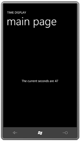
This approach is demonstrated in the TimeDisplay project, which uses a horizontal StackPanel to concatenate text:
<Grid x:Name="ContentPanel" Grid.Row="1" Margin="12,0,12,0">
<StackPanel Orientation="Horizontal"
HorizontalAlignment="Center"
VerticalAlignment="Center">
<TextBlock Text="The current seconds are " />
<TextBlock Text="{Binding Source={StaticResource clock},
Path=Second}" />
</StackPanel>
</Grid>
Setting the DataContext
FrameworkElement defines a property named DataContext that you can set to pretty much any object (in code) or generally a binding (in XAML). The DataContext is one of those properties that propagates down through the visual tree, at which point it can be combined with more local bindings. At the very least, the DataContext gives you a way to simplify individual bindings by eliminating repetition. In the broader view, DataContext is how you associate data with visual trees.
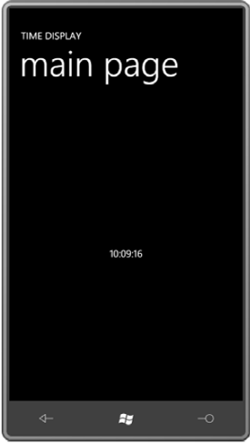
In this particular example, you can set the DataContext property on any element that is an ancestor to the TextBlock elements. Let's set it on the most immediate ancestor, which is the StackPanel:
<Grid x:Name="ContentPanel" Grid.Row="1" Margin="12,0,12,0">
<StackPanel DataContext="{Binding Source={StaticResource clock}}" Orientation="Horizontal" HorizontalAlignment="Center" VerticalAlignment="Center">
<TextBlock Text="{Binding Path=Hour}" />
<TextBlock Text="{Binding Path=Minute, Converter={StaticResource stringFormat}, ConverterParameter=':{0:D2}'}" />
<TextBlock Text="{Binding Path=Second, Converter={StaticResource stringFormat}, ConverterParameter=':{0:D2}'}" />
</StackPanel>
</Grid>
Remember that the "Path=" part of the Binding markup extension can be removed only if the Path is the first item. Each of the bindings now seems to reference a particular property of the DataContext:
<TextBlock Text="{Binding Hour}" />
Here's the resultant display:
The DataContext is extremely useful when a page or a control is devoted to displaying the properties of a particular class. The DataContext can be set by code to switch between various instances of that class.
Although certainly not as common, you can also use DataContext with ElementName bindings. Here's the visual tree from the BorderText.xaml file you saw earlier:
<Border Background="{Binding ElementName=this, Path=Background}" BorderBrush="{Binding ElementName=this, Path=BorderBrush}" BorderThickness="{Binding ElementName=this,
Path=BorderThickness}" CornerRadius="{Binding ElementName=this, Path=CornerRadius}" Padding="{Binding ElementName=this, Path=Padding}">
<TextBlock Text="{Binding ElementName=this, Path=Text}"
TextAlignment="{Binding ElementName=this, Path=TextAlignment}"
TextDecorations="{Binding ElementName=this, Path=TextDecorations}"
TextWrapping="{Binding ElementName=this, Path=TextWrapping}" />
</Border>
Back to Clock: You may have noticed that I got a little lazy when coding the class and didn't define properties for the various components of the date, such as Month and Year. Instead, I simply defined a property named Date of type DateTime. The OnTimerTick handler assigns to that property the static property DateTime.Today, which is a DateTime object with the time set to midnight. That means that this Date property is not firing off PropertyChanged events every tenth second. It's only firing one at startup and then at the stroke of every midnight.
You can reference the individual properties of the Date property Or, you can set a DataContext on the StackPanel as before and eliminate the "Path=" part of the bindings:
<Grid x:Name="ContentPanel" Grid.Row="1" Margin="12,0,12,0">
<StackPanel DataContext="{StaticResource clock}" HorizontalAlignment="Center" VerticalAlignment="Center">
<StackPanel Orientation="Horizontal">
<TextBlock Text="It's day number " />
<TextBlock Text="{Binding Date.Day}" />
<TextBlock Text=" of month " />
<TextBlock Text="{Binding Date.Month}" />
</StackPanel>
<StackPanel Orientation="Horizontal">
<TextBlock Text=" of the year " />
<TextBlock Text="{Binding Date.Year}" />
<TextBlock Text=", a " />
<TextBlock Text="{Binding Date.DayOfWeek}" />
<TextBlock Text="." />
</StackPanel>
</StackPanel>
</Grid>
Either version displays two lines of text:
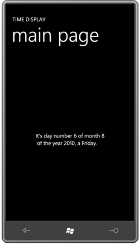
Date is a property of Clock of type DateTime, and Day, Month, Year, and DayOfWeek are all properties of DateTime. There is no formatting here beyond that provided by default calls to ToString. The Day, Month, and Year properties are displayed as numbers. The DayOfWeek property is of a member of the DayOfWeek enumeration, so you'll see actual text, such as Wednesday, but the text won't be localized. The DayOfWeek member names are in English so that's what's displayed.