We are now going to have a look at how you can create a DataGrid control. The DataGrid control consists of three intrinsic controls; DataGrid, GridRow and GridColumn. DataGrid is the container that displays the columns and rows. GridColumn is a single column that will be used multiple times In a StackPanel to generate the column headers in the DataGrid. GridRow is an expander control that consists of two areas; a header area for the column data and a footer area for additional data. The footer area will be expandable and collapsible by clicking on a button on the row. It is also possible to choose if the header area will display the expand/collapse button. It is also possible to use alternating colors on the GridRows using brushes.
A template will be used to define appearances and template bindings for the controls. Using templates makes it easier to redefine the appearances if you want to reuse the controls or want potential buyers to be able to change the appearances of the controls. All you need to do to change the appearance of a control is to define a new template for the control. The original template will be created in a template file called generic.xaml that must be placed in a folder called Themes.
This version of the SpecialDataGrid control won't be data driven, and as such you will have to manually fill the controls with data. In an upcoming tutorial the control will be made data driven using a WebService.
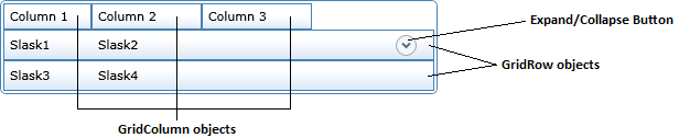
Collapsed rows in the DataGrid control
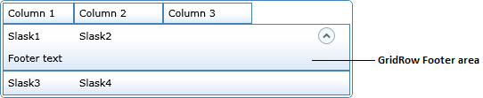
Expanded row in the DataGrid control
Creating the Silverlight application
Let's start by creating a new Silverlight application that will host our control.
- Open Visual Studio 8 and create a new Silverlight project called SpecialDataGrid.
- Make sure that the Add a new ASP.NET Web project to the solution to host Silverlight option is selected. Make sure the Project Type dropdown is set to ASP.NET Web Application Project, then click OK.
Two projects will be added to the solution. The SpecialDataGrid project is the Silverlight application project and the SpecialDataGrid.Web project is the ASP.NET application hosting the Silverlight application. The SpecialDataGrid.Web project contains one .aspx and one .html page, which one you choose to use as the container is up to you; in this example however we will use the SpecialDataGridTestPage.aspx page, so make sure it is set as the start page. You can collapse the SpecialDataGrid.Web project in the solution explorer; we won't be making any further alterations to it in this example.
The page.axml page is the main page in the Silverlight application, and it should contain the basic framework for hosting Silverlight controls. We will later use this page to test our DataGrid control.
The GridColumn control
Adding the generic.xaml template file to the Silverlight application.
When we use a replaceable template to define a control we place the original template information in a .xaml document named generic.xaml. This document must be placed in a folder named Themes. This template can then be replaced by user created templates to alter the appearance of the control. You might for instance want to change the background or the button style; to avoid having to create a new control you simply change the template and all the underlying functionality will continue to work without any changes. We will template all the controls in this example.
- Create a new folder named Themes in the SpecialDataGrid project by right clicking on the SpecialDataGrid project and select Add-New Folder.
- Create the generic.xaml document by right clicking on the Themes folder and select Add-New Item.
- Choose XML File in the object list and name it generic.xaml.
- Delete the contents in the generic.xaml document. Create a <ResourceDictionary> node and add the following namespaces to it. This node will contain the template definitions for the controls as well as styles and setters. The first two namespaces are default namespaces used by Silverlight and the third is the namespace of the SpecialDataGrid.
<ResourceDictionary
xmlns=http://schemas.microsoft.com/client/2007
xmlns:x="http://schemas.microsoft.com/winfx/2006/xaml"
xmlns:local="clr-namespace:SpecialDataGrid">
</ResourceDictionary>
Adding the GridColumn style to the template file.
Add a style with a TargetType set to GridColumn. Add a setter with its Property value set to Template. Within this setter we need to create a ControlTemplate node that defines the structure and behavior of the control. The ControlTemplate can be used across multiple instances of the control. Set the ControlTemplates' TargetType to GridColumn. Add a grid inside the ControlTemplate to act as the canvas for the control. This is the beginning of the templates that we will build throughout the example.
GridColumn template
<Style TargetType="local:GridColumn">
<Setter Property="Template">
<Setter.Value>
<ControlTemplate TargetType="local:GridColumn">
<Grid>
</Grid>
</ControlTemplate>
</Setter.Value>
</Setter>
</Style>
ColumnStyle
This style will be used later to set the style of the column objects. You can add contents if you like.
<Style x:Key="ColumnStyle" TargetType="Border">
<Setter Property="Background">
<Setter.Value>
<LinearGradientBrush StartPoint="0.547587,0.322135"
EndPoint="0.547587,0.992095">
<GradientStop Color="#00FFFFFF" Offset="0"/>
<GradientStop Color="#FFDCEAF9" Offset="1"/>
</LinearGradientBrush>
</Setter.Value>
</Setter>
<Setter Property="Margin" Value="0"></Setter>
</Style>
Adding the GridColumn class to the project
Because we want to create a control from scratch we won't use the UserControl control, but the ContentControl. The content control is the base class of the UserControl and is less specialized. This makes it a great candidate for user defined controls built from the ground up. The UserControl is great when creating more complex composite controls. It is entirely possible to create the GridColumn control with a UserControl, but this example wants to show how to create a ContentControl control governed by a template.
- Add a new class named GridColumn to the SpecialDataGrid Project by right clicking on the project name and select Add-Class.
- Add the following using statement to the class and let the class inherit from the ContentControl class.
using System.Windows.Controls.Primitives;
- Add a region called Constructors and add an empty constructor to the region. Set the DefaultStyleKey property to reference the style for the control. This dependency property is used when themes are used with a control. The style is stored in the generic.xaml document.
#region Constructors
public GridColumn()
{
DefaultStyleKey = typeof(GridColumn);
}
#endregion
Defining default property values in the template
To make it easier to use the control we can define default values for a number of properties, such as background, border, corner radius and margins. Let's add these to the template and use them in the control. Open the generic.xaml document and add the following settings. The CornerRadius property determines if the corners of the control should be rounded and how much. The BorderBrush property determines what brush or color should be used for the border of the control. The BorderThickness determines the thickness of the border. The Margin property determines the margin surrounding the control. You can set the Margin to a single value to use the same margin around the control, or you can set four values, one for each side of the control. The Background property determines the background color of the GridColumn object.
<Style TargetType="local: GridColumn">
<Setter Property="Margin" Value="0"></Setter>
<Setter Property="BorderBrush" Value="SteelBlue"></Setter>
<Setter Property="BorderThickness" Value="1"></Setter>
<Setter Property="CornerRadius" Value="0"></Setter>
<Setter Property="Background" Value="White"></Setter>
<Setter Property="Template">
Because the CornerRadius property isn't a default property of the ContentControl we need to add it to the GridColumn class. Open the GridColumn.cs class and add a region called Dependency Properties in which you write the following dependency property. A dependency property is a way to expose properties of a control that wouldn't be available otherwise. It can be properties of a child control for instance. A dependency property always consists of two parts; the first part is a static read only dependency property that holds the value, the second part is the actual property that sets the value. The dependency property must be read only because it can only be set once, and it must be static to make it available without first creating an instance of the control.
#region Dependency Properties
public static readonly DependencyProperty CornerRadiusProperty =
DependencyProperty.Register("CornerRadius", typeof(CornerRadius), typeof(GridColumn), null);
public CornerRadius CornerRadius
{
get { return (CornerRadius)GetValue(CornerRadiusProperty); }
set { SetValue(CornerRadiusProperty, value); }
}
#endregion
Border, Background and radius of the control
Let's use the properties we defined earlier. Open the generic.xaml document and add a Border node inside the grid node of the GridColumn style. We will use TemplateBinding to connect the properties of the border with the dependency properties we defined earlier. This type of binding can only be used within a ControlTemplate definition in xaml.
Let's also define the grid that will hold the contents of the control. We will need one row and one column, and since one column is the default for a grid and we don't want to make any alterations to the column we won't need to define it explicitly. The Height property for the row can be set to a constant value, Auto or star (*). Auto distributes the space evenly based on the size of the content that is within the row. Star (*) means that the height of that row will receive a weighted proportion of the remaining available space.
<ControlTemplate TargetType="local:GridColumn">
<Border
BorderBrush="{TemplateBinding BorderBrush}"
BorderThickness="{TemplateBinding BorderThickness}"
Background="{TemplateBinding Background}"
CornerRadius="{TemplateBinding CornerRadius}">
<Grid>
<Grid.RowDefinitions>
<RowDefinition Height="Auto"></RowDefinition>
</Grid.RowDefinitions>
</Grid>
</Border>
A first look at the GridColumn control
We have written a bunch of code that hasn't yielded any visible output. I bet you're ready to see some results; so with no further ado let's have a sneak preview of the control. To test the control open the Page.xaml document and add the following xaml code inside the Grid node. The StackPanel is a control that can accommodate several other controls and display them horizontally or vertically. You can run the application by pressing F5 on the keyboard.
<Grid x:Name="LayoutRoot" Background="White">
<StackPanel Orientation="Horizontal" VerticalAlignment="Top">
<grid:GridColumn Height="20" Width="100" Margin="2,2,0,0">
</grid:GridColumn>
<grid:GridColumn Height="20" Width="150" Margin="-1,2,0,0">
</grid:GridColumn>
</StackPanel>
</Grid>
The output should look something like this.

Column content area
Now that the basic outline of the control is finished we will continue by adding a content area. This area can contain any type of information; we will however use it to display text. There are two steps to accomplish this task. First we need to add a new dependency property that holds the header content. Secondly we need to define the header content as a ContentPersenter in the template. Let's start with the dependency property. Open the GridColumn.cs class and add the following dependency property to the Dependency Properties region. The first parameter of the Register method is the name of the dependency property, the second parameter is the type of object that the property can hold, the third parameter is the control type, and the fourth parameter can contain additional information.
public static readonly DependencyProperty ColumnContentProperty =
DependencyProperty.Register("ColumnContent", typeof(object),
typeof(GridColumn), null);
public object ColumnContent
{
get { return (object)GetValue(ColumnContentProperty); }
set { SetValue(ColumnContentProperty, value); }
}
Once the property has been added to the GridColumn.cs class we can add it to the grid node of the GridColumn ControlTemplate in the generic.xaml document, below the grid row definition. Note that we use TemplateBinding to display the contents of the dependency property.
<Grid>
<Grid.RowDefinitions>
<RowDefinition Height="Auto"></RowDefinition>
</Grid.RowDefinitions>
<Border Style="{StaticResource ColumnStyle}" Grid.Row="0" >
<ContentPresenter x:Name="ColumnContent"
Content="{TemplateBinding ColumnContent}" Height="Auto"
Margin="5,3,5,3" VerticalAlignment="Center"></ContentPresenter>
</Border>
</Grid>
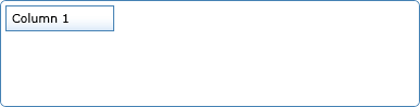
Now switch to the Page.xaml document and add the ColumnContent property and assign it the text "Column 1" and "Column 2" respectively for the two controls. When you compile the solution you should see the following result. Note that we call the ColumnStyle style that we defined earlier to set the Borders' appearance.
<grid:GridColumn Height="20" Width="100" Margin="2,2,0,0"
ColumnContent="Column 1"></grid:GridColumn>
<grid:GridColumn Height="20" Width="150" Margin="-1,2,0,0"
ColumnContent="Column 2"></grid:GridColumn>

Now that the GridColumn control is completed we will have a look at how we can create the GridRow class and its template.
The GridRow control
The next control to add to the project is the GridRow. This control is very similar to the Expander control described in an earlier tutorial that you can find here: http://www.c-sharpcorner.com/UploadFile/ReefDweller/ExpanderControl04272009093945AM/ExpanderControl.aspx
Adding the GridRow style to the template file.
Add a style with a TargetType set to GridRow. Add a setter with its Property value set to Template. Within this setter we need to create a ControlTemplate node that defines the structure and behavior of the control. The ControlTemplate can be used across multiple instances of the control. Set the ControlTemplates' TargetType to GridRow. Add a grid inside the ControlTemplate to act as the canvas for the control. This is the beginning of the templates that we will build throughout the example.
GridRow template
<Style TargetType="local:GridRow">
<Setter Property="Template">
<Setter.Value>
<ControlTemplate TargetType="local:GridRow">
<Grid>
</Grid>
</ControlTemplate>
</Setter.Value>
</Setter>
</Style>
Adding the GridRow class to the project
Because we want to create a control from scratch we won't use the UserControl control, but the ContentCotrol. The content control is the base class of the UserControl and is less specialized. This makes it a great candidate for user defined controls built from the ground up. The UserControl is great when creating more complex composite controls. It is entirely possible to create an expander control with a UserControl, but this example wants to show how to create a ContentControl control governed by a template.
-
Add a new class named GridRow to the SpecialDataGrid Project by right clicking on the project name and select Add-Class.
-
Add the following using statement to the class and let the class inherit from the ContentControl class.
using System.Windows.Controls.Primitives;
-
Add a region called Constructors and add an empty constructor to the region. Set the DefaultStyleKey property to reference the style for the control. This dependency property is used when themes are used with a control. The style is stored in the generic.xaml document.
#region Constructors
public GridRow()
{
DefaultStyleKey = typeof(GridRow);
}
#endregion
Defining default property values in the template
To make it easier to use the control we can define default values for a number of properties, such as background, border, corner radius and margins. Let's add these to the template and use them in the control. Open the generic.xaml document and add the following settings. The CornerRadius property determines if the corners of the control should be rounded and how much. The BorderBrush property determines what brush or color should be used for the border of the control. The BorderThickness determines the thickness of the border. The Margin property determines the margin surrounding the control. You can set the Margin to a single value to use the same margin around the control, or you can set four values, one for each side of the control. The Background property is a little bit more complex because we want to use a gradient fill; to accomplish this we use a LinearGradientBrush node inside the Background property. Inside the LinearGradientBrush node we create the individual stops in the gradient fill using GradientStop nodes. Add the new nodes between the Style and the template Setter nodes.
<Style TargetType="local:GridRow">
<Setter Property="Margin" Value="0"></Setter>
<Setter Property="BorderBrush" Value="SteelBlue"></Setter>
<Setter Property="BorderThickness" Value="1"></Setter>
<Setter Property="CornerRadius" Value="0"></Setter>
<Setter Property="Background">
<Setter.Value>
<LinearGradientBrush StartPoint="0.547587,0.322135"
EndPoint="0.547587,0.992095">
<GradientStop Color="#FFFFFFFF" Offset="0"/>
<GradientStop Color="#FFDCEAF9" Offset="1"/>
</LinearGradientBrush>
</Setter.Value>
</Setter>
<Setter Property="Template">
Because the CornerRadius property isn't a default property of the ContentsControl we need to add it to the GridRow class. Open the GridRow.cs class and add a region called Dependency Properties in which you write the following dependency property. A dependency property is a way to expose properties of a control that wouldn't be available otherwise. It can be properties of a child control for instance. A dependency property always consists of two parts; the first part is a static read only dependency property that holds the value, the second part is the actual property that sets the value. The dependency property must be read only because it can only be set once, and it must be static to make it available without first creating an instance of the control.
#region Dependency Properties
public static readonly DependencyProperty CornerRadiusProperty =
DependencyProperty.Register("CornerRadius", typeof(CornerRadius),
typeof(GridRow), null);
public CornerRadius CornerRadius
{
get { return (CornerRadius)GetValue(CornerRadiusProperty); }
set { SetValue(CornerRadiusProperty, value); }
}
#endregion
Border, Background and radius of the control
Let's use the properties we defined earlier. Open the generic.xaml document and add a Border node inside the grid node of the GridRow template style. We will use TemplateBinding to connect the properties of the border with the dependency properties we defined earlier. This type of binding can only be used within a ControlTemplate definition in xaml.
Let's also define the grid that will hold the contents of the control. We will need two rows and two columns. In the first row we will need one column to present the header contents and one column to hold the toggle button. In the second row we will span the two columns making it into one column for the detail contents, the contents that will be expanded and collapsed. Height and Width properties can be set to constant values, Auto or star (*). Auto distributes the space evenly based on the size of the content that is within a row or a column. Star (*) means that the height or width of that column or row will receive a weighted proportion of the remaining available space.
<Border
BorderBrush="{TemplateBinding BorderBrush}"
BorderThickness="{TemplateBinding BorderThickness}"
CornerRadius="{TemplateBinding CornerRadius}"
Background="{TemplateBinding Background}">
<Grid x:Name="LayoutRoot">
<Grid.RowDefinitions>
<RowDefinition Height="Auto"></RowDefinition>
<RowDefinition Height="Auto"></RowDefinition>
</Grid.RowDefinitions>
<Grid.ColumnDefinitions>
<ColumnDefinition Width="*"></ColumnDefinition>
<ColumnDefinition Width="50"></ColumnDefinition>
</Grid.ColumnDefinitions>
</Border>
A first look at the control
We have written a bunch of code that hasn't yielded any visible output. I bet you're ready to see some results; so with no further ado let's have a sneak preview of the control. To test the control open the Page.xaml document and add the following xaml code inside the Grid node and comment out the cod you wrote to test the GridColumn. The StackPanel is a control that can accommodate several other controls and display them horizontally or vertically. You can run the application by pressing F5 on the keyboard.
<Grid x:Name="LayoutRoot" Background="White">
<StackPanel VerticalAlignment="Top">
<grid:GridRow Margin="2" Height="20"></grid:GridRow>
</StackPanel>
</Grid>
The output should look something like this.

Header Content
Now that the basic outline of the control is finished we will continue by adding a header content area. This area can contain any type of information; to test the control we will simply send in a text string, later however we will use it to display contents in TextBlock controls for each column. There are two steps to accomplish this task. First we need to add a new dependency property that holds the header content. Secondly we need to define the header content as a ContentPersenter in the template. Let's start with the dependency property. Open the DataRow.cs class and add the following dependency property to the Dependency Properties region. The first parameter of the Register method is the name of the dependency property, the second parameter is the type of object that the property can hold, the third parameter is the control type, and the fourth parameter can contain additional information.
public static readonly DependencyProperty HeaderContentProperty =
DependencyProperty.Register("HeaderContent", typeof(object),
typeof(GridRow), null);
public object HeaderContent
{
get { return (object)GetValue(HeaderContentProperty); }
set { SetValue(HeaderContentProperty, value); }
}
Once the property has been added to the GridRow.cs class we can add it to the innermost grid node of the GridRow template style in the generic.xaml document, below the grid row and column definitions. Note that we use TemplateBinding to display the contents of the dependency property.
<ContentPresenter x:Name="HeaderContent" Content="{TemplateBinding
HeaderContent}" Margin="5"></ContentPresenter>
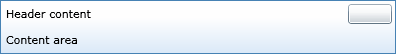
If you switch to the Page.xaml document and replace the Height property with the HeaderContent property and assign it the text "Header content" and compile the solution you should see the following result.
<grid:GridRow Margin="2" HeaderContent="Header content"></grid:GridRow>

Collapsible content area
Let's continue by adding the collapsible contents area, this is the part of the control that can be hidden or visible. In the finished control the user will be able to collapse or expand this region by clicking on a button; this will be possible for each row in the grid. We will however later build some logic to prevent rows from being expanded and even prevent the row to display the expand/collapse button that we will create in the next section of the example.
We need to add a TemplatePart that defines the Content attribute. This attribute exists by default; we only need to make it visible through the GridRow control. We will define this attribute as FrameworkElement; this means that it can store any type of framework element, such as TextBlock, TextBox, List controls, and many more. To add an attribute to the class simply add the attribute immediately before the class definition in the GridRow.cs class.
[TemplatePart(Name = "Content", Type = typeof(FrameworkElement))]
public class GridRow : ContentControl
Switch to the generic.xaml document. Add a ContentPresenter node below the ContentPresenter already present in the GridRow template. Set the Grid.Row property to 1 and the Grid.ColumnSpan to 2; this will ensure that the content will be displayed in the second row and that the content and span both columns. Name it Content using the x:Name attribute and use TemplateBindning to get the value stored in the TemplatePart with the same name. Set the margin to 5 to get some distance to the Header contents.
<ContentPresenter Grid.Row="1" Grid.ColumnSpan="2" x:Name="Content" Content="{TemplateBinding Content}" Margin="5"></ContentPresenter>
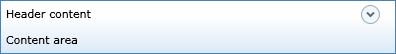
Switch to the Page.xaml document and add the Content attribute giving it a value of "Content area". After you compile the project the output should look something like this.
<grid:GridRow Margin="2" HeaderContent="Header content" Content="Content area"></grid:GridRow>

Creating the expand/collapse button
Let's start by adding a button to the second column of the first row. Later we will alter the buttons' appearance making it more appealing, by changing its template. We will also expose the button through an attribute that we will call ExpandCollapseButton; this will make it available through the GridRow class and make it possible to alter the button appearance through a new template. Once the button is visually ready we will continue by creating the methods and events needed to control the button and its animation.
Switch to the GridRow.cs class and add a new attribute named ExpandCollapseButton of type ToggleButton.
[TemplatePart(Name = "ExpandCollapseButton", Type = typeof(ToggleButton))]
[TemplatePart(Name = "Content", Type = typeof(FrameworkElement))]
public class GridRow : ContentControl
Now switch to the generic.xaml document and add a ToggleButton node named ExpandCollapseButton to the GridRow template; add it between the two ContentPresenter nodes already present.
<ContentPresenter x:Name="HeaderContent" Content="{TemplateBinding
HeaderContent}" Margin="5"></ContentPresenter>
<ToggleButton Grid.Column="1" Grid.Row="0" x:Name="ExpandCollapseButton"
Margin="3">
</ToggleButton>
<ContentPresenter Grid.Row="1" Grid.ColumnSpan="2" x:Name="Content" Content="{TemplateBinding Content}" Margin="5"></ContentPresenter>
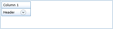
If you switch to the Page.xaml page and compile the control should look something like this. Note the button in the right corner.
Let's continue by making the button a little more appealing to the eye. Let's make it round. To achieve this we need to alter the button template in the generic.xaml document; we do this by adding a ToggleButton.Template node inside the ToggleButton node. Inside the GridRow template node we need to override the default control template, we do this by adding a ControlTemplate node inside the ToggleButton.Template node. Inside the ControlTemplate node we create an Elipse node inside a Grid node.
<ToggleButton Grid.Column="1" Grid.Row="0" x:Name="ExpandCollapseButton" Margin="3">
<ToggleButton.Template>
<ControlTemplate>
<Grid>
<Ellipse Stroke="#FFA9A9A9" Fill="AliceBlue" Width="19" Height="19"></Ellipse>
</Grid>
</ControlTemplate>
</ToggleButton.Template>
<ToggleButton.RenderTransform>
<RotateTransform x:Name="RotateButtonTransform"></RotateTransform>
</ToggleButton.RenderTransform>
</ToggleButton>
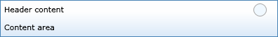
If you switch to the Page.xaml page the updated control should look something like this. Note that the button in the right corner is round.
The next step is to create an arrow on the button. This arrow will later be made to rotate 180° and expand or collapse the content region when the button is clicked. Switch to the generic.xaml document and add the following node to the template below the Ellipse node. The Path member is used to draw a series of connected lines and curves. The Data dependency property sets a Geometry object that specifies the shape to be drawn. Stroke sets the Brush that is used to paint the outline of the shape. StrokeThickness sets the outline width. HorizontalAlignment and VerticalAlignment determine the alignment of the control when used in a parent element.
<Path Data="M1,1.5L4.5,5 8,1.5" Stroke="#FF666666" StrokeThickness="2" HorizontalAlignment="Center" VerticalAlignment="Center"></Path>
If you switch to the Page.xaml document and update the control it should now have a round button with a downward pointing arrow illustrating that the content area is visible.
Animating the button
Let's make the button animated to really illustrate that something is happening when the button is clicked. Switch to the generic.xaml document. To pull this off we need to add a ToggleButton.RenderTransform node to the ToggleButton node; place it below the ToggleButton.Template node. We also need to add the RenderTransformOrigin to the ToggleButton node. The RenderTransformOrigin is a Point object that defines the center point declared by the RenderTransform object, relative to the bounds of the element. The value is set between 0 and 1. A value of (0.5, 0.5) will cause the transform to be centered on the element. If you leave out this attribute the transform will behave strangely.
<ToggleButton Grid.Column="1" Grid.Row="0" x:Name="ExpandCollapseButton"
Margin="3" RenderTransformOrigin="0.5,0.5">
...
<ToggleButton.RenderTransform>
<RotateTransform x:Name="RotateButtonTransform"></RotateTransform>
</ToggleButton.RenderTransform>
</ToggleButton>
Now switch to GridRow.cs class. Add a region named Fields and add a private ToggleButton container named btnExpandOrCollapse. This container will hold a reference to the button in the control. Add a field named contentElement of type FrameworkElement that will hold the contents of the Content area. The state is stored in a field of VisualState type named collapsedState.
#region Fields
private ToggleButton btnExpandOrCollapse;
private FrameworkElement contentElement;
private VisualState collapsedState;
#endregion
Now we have to write a method called ChangeVisualState that will change the visual state of the button. This method is dependent on two view states that must be declared with attributes on the class. The two states are named Collapsed and Expanded. Start by define the two states.
[TemplateVisualState(Name = "Expanded", GroupName = "ViewStates")]
[TemplateVisualState(Name = "Collapsed", GroupName = "ViewStates")]
public class GridRow: ContentControl
Next add a dependency property to the Dependency Properties region called IsExpandedProperty that will hold the value stating if the control is in its expanded or collapsed state.
public static readonly DependencyProperty IsExpandedProperty =
DependencyProperty.Register("IsExpanded", typeof(bool), typeof(GridRow),
new PropertyMetadata(true));
public bool IsExpanded
{
get { return (bool)GetValue(IsExpandedProperty); }
set
{
SetValue(IsExpandedProperty, value);
if (btnExpandOrCollapse != null)
btnExpandOrCollapse.IsChecked = IsExpanded;
}
}
Next create a region called Methods and write the ChangeVisualState method in that region. The VisualStateManagers' GoToState method is used to alter the state of a control. The useTransitions parameter tells the visual state manager if transitions such as a time interval will be used.
#region Methods
private void ChangeVisualState(bool useTransitions)
{
// Apply the current state from the ViewStates group.
if (IsExpanded)
{
VisualStateManager.GoToState(this, "Expanded", useTransitions);
}
else
{
VisualStateManager.GoToState(this, "Collapsed", useTransitions);
}
}
#endregion
Next add a public method called ExpandOrCollapse that can be called to alter the state of the control.
public void ExpandOrCollapse(bool useTransitions)
{
IsExpanded = !IsExpanded;
ChangeVisualState(useTransitions);
}
Create a region named Event Methods and add an event method called btnExpandOrCollapse_Click in the event method, call the ExpandCollapse method with its parameter value set to true.
#region Event Methods
private void btnExpandOrCollapse_Click(object sender, RoutedEventArgs e)
{
ExpandOrCollapse(true);
}
#endregion
Now override the OnApplyTemplate method and get the template definition for the ExpandCollapseButton and create an event handler for the buttons' Click event.
#region Overridden Methods
public override void OnApplyTemplate()
{
base.OnApplyTemplate();
btnExpandOrCollapse = GetTemplateChild("ExpandCollapseButton") as
ToggleButton;
if (btnExpandOrCollapse != null)
{
btnExpandOrCollapse.Click += btnExpandOrCollapse_Click;
}
ChangeVisualState(false);
}#endregion
Now we need to add a VisualStateGroup, for the two states, in the generic.xaml document. These two states will be used from the GridRow class through the Expanded and Collapsed attributes defined on the class.
Add a VisualStateManager.VisualStateGroups node directly under the outermost Grid node of the GridRow template style. Create a VisualStateGroup node inside the VisualStateManager.VisualStateGroups node and add two VisualState nodes, one called Expanded and one called Collapsed. Create a Storyboard node inside each of the two VisualState nodes. Create a DoubleAnimation node inside each of the two StoryBoard nodes and give them the same StoryBoard.TargetName, RoteteButtonTransform.
<ControlTemplate TargetType="local:GridRow">
<Grid>
<VisualStateManager.VisualStateGroups>
<VisualStateGroup x:Name="ViewStates">
<VisualState x:Name="Expanded">
<Storyboard>
<DoubleAnimation
Storyboard.TargetName="RotateButtonTransform"
Storyboard.TargetProperty="Angle" Duration="0"
To="180"></DoubleAnimation>
</Storyboard>
</VisualState>
<VisualState x:Name="Collapsed">
<Storyboard>
<DoubleAnimation
Storyboard.TargetName="RotateButtonTransform"
Storyboard.TargetProperty="Angle" Duration="0"
To="0"></DoubleAnimation>
</Storyboard>
</VisualState>
</VisualStateGroup>
</VisualStateManager.VisualStateGroups>
Now, for the final touch, we will set the IsExpanded property value to false in the constructor.
public GridRow()
{
DefaultStyleKey = typeof(GridRow);
IsExpanded = false;
}
If you run the application by pressing F5 on the keyboard and click on the expand/collapse button it should now be animated. The content area of the control won't be affected yet; this is the next task we will look into.
Expanding and collapsing the content area
This is the final step towards finishing the GridRow control. The only thing left for us to do is to make the content area toggle between expanded and collapsed.
Let's start by adding some code to the ChangeVisualState method. We need to check if the IsExpanded property is true and if the contentElement not is null, if that is the case then we set the Visibility property of the contnentElement equal to Visibility.Visible. If on the other hand the IsExpanded property is false, the collapsedState is null and the contentElement is not null then we set the Visibility property of the contnentElement equal to Visibility.Collapsed.
private void ChangeVisualState(bool useTransitions)
{
// Apply the current state from the ViewStates group.
if (IsExpanded)
{
if (contentElement != null) contentElement.Visibility =
Visibility.Visible;
VisualStateManager.GoToState(this, "Expanded", useTransitions);
}
else
{
VisualStateManager.GoToState(this, "Collapsed", useTransitions);
if (collapsedState == null)
{
// There is no state animation, so just hide the content
//region immediately.
if (contentElement != null) contentElement.Visibility =
Visibility.Collapsed;
}
}
}
Next we add an event method called collapsedStoryboard_Completed to the Event Methods region. This method will be called when a storyboard finishes its work and in it we will set the Visibility property of the contentElement to Visibility.Collapsed.
private void collapsedStoryboard_Completed(object sender, EventArgs e)
{
contentElement.Visibility = Visibility.Collapsed;
}
Next we add some code to the overridden OnApplyTemplate method. Firstly we need to get the contents of the content area. Next we check it the contentElement is open, and if so we collapse that control and attach an event handler to the states' storyboard.
public override void OnApplyTemplate()
{
base.OnApplyTemplate();
contentElement = GetTemplateChild("Content") as FrameworkElement;
if (contentElement != null)
{
collapsedState = GetTemplateChild("Collapsed") as VisualState;
if ((collapsedState != null) && (collapsedState.Storyboard != null))
{
collapsedState.Storyboard.Completed +=
collapsedStoryboard_Completed;
}
}
Next we add a property named ShowExpandButton that will determine if the toggle button will be visible or not. We add this property to be able to change the buttons' visibility from our code in the DataGrid control. Open the GridRow.cs class and create a new region called Properties. Add a property of bool type called ShowExpandButton to the region you just created.
#region Properties
public bool ShowExpandButton
{
get;
set;
}
#endregion
Open the overridden OnApplyTemplate method and create a new region called Show/hide Expand Button. Add the following logic to the region. The First If statement checks if the Content area contains any controls, if not it hides the button. The second If statement checks if the Content area has a StackPanel, and if the StackPanel have children. If it does not have children the button will be hidden. The third If statement actually sets the visibility of the button.
#region Show/Hide Expand Button
if (Content == null) ShowExpandButton = false;
if (Content is StackPanel && ((StackPanel)Content).Children.Count == 0)
ShowExpandButton = false;
if (!ShowExpandButton)
btnExpandOrCollapse.Visibility = Visibility.Collapsed;
#endregion
Switch to the Page.xaml page and add the ShowExpandButton property with a value of True to the GridRow object definition.
<grid:GridRow Margin="2" HeaderContent="Header content" Content="Content area" ShowExpandButton="True"></grid:GridRow>
Now start the application by pressing F5 on the keyboard. The control should now be expanding and collapsing its contents area when the button is clicked.
The DataGrid control
This control is the main control in this example. It defines the control size and contains an Add method that adds columns and rows to the grid.
Adding the GridRow style to the template file.
Add a style with a TargetType set to DataGrid. Add a setter with its Property value set to Template. Within this setter we need to create a ControlTemplate node that defines the structure and behavior of the control. The ControlTemplate can be used across multiple instances of the control. Set the ControlTemplates' TargetType to DataGrid. Add a grid inside the ControlTemplate to act as the canvas for the control. This is the beginning of the templates that we will build throughout the example.
DataGrid template
<Style TargetType="local:DataGrid">
<Setter Property="Template">
<Setter.Value>
<ControlTemplate TargetType="local:DataGrid">
<Grid>
</Grid>
</ControlTemplate>
</Setter.Value>
</Setter>
</Style>
Adding the DataGrid class to the project
Because we want to create a control from scratch we won't use the UserControl control, but the ContentCotrol. The content control is the base class of the UserControl and is less specialized. This makes it a great candidate for user defined controls built from the ground up. The UserControl is great when creating more complex composite controls. It is entirely possible to create an expander control with a UserControl, but this example wants to show how to create a ContentControl control governed by a template.
-
Add a new class named DataGrid to the SpecialDataGrid Project by right clicking on the project name and select Add-Class.
-
Add the following using statement to the class and let the class inherit from the ContentControl class.
using System.Windows.Controls.Primitives;
-
Add a region called Constructors and add an empty constructor to the region. Set the DefaultStyleKey property to reference the style for the control. This dependency property is used when themes are used with a control. The style is stored in the generic.xaml document.
#region Constructors
public DataGrid()
{
DefaultStyleKey = typeof(DataGrid);
}
#endregion
Defining default property values in the template
To make it easier to use the control we can define default values for a number of properties, such as background, border, corner radius and margins. Let's add these to the template and use them in the control. Open the generic.xaml document and add the following settings. The CornerRadius property determines if the corners of the control should be rounded and how much. The BorderBrush property determines what brush or color should be used for the border of the control. The BorderThickness determines the thickness of the border. The Margin property determines the margin surrounding the control. You can set the Margin to a single value to use the same margin around the control, or you can set four values, one for each side of the control. The Background property for the DataGrid won't need a LinearGradientBrush since we want the control background to be white, just set the value to White for the Background property.
<Style TargetType="local:DataGrid">
<Setter Property="Margin" Value="0"></Setter>
<Setter Property="BorderBrush" Value="SteelBlue"></Setter>
<Setter Property="BorderThickness" Value="1"></Setter>
<Setter Property="CornerRadius" Value="0"></Setter>
<Setter Property="Background" Value="White"></Setter>
<Setter Property="Template">
Because the CornerRadius property isn't a default property of the ContentsControl we need to add it to the Expander class. Open the DataGrid.cs class and add a region called Dependency Properties in which you write the following dependency property. A dependency property is a way to expose properties of a control that wouldn't be available otherwise. It can be properties of a child control for instance. A dependency property always consists of two parts; the first part is a static read only dependency property that holds the value, the second part is the actual property that sets the value. The dependency property must be read only because it can only be set once, and it must be static to make it available without first creating an instance of the control.
#region Dependency Properties
public static readonly DependencyProperty CornerRadiusProperty =
DependencyProperty.Register("CornerRadius", typeof(CornerRadius),
typeof(DataGrid), null);
public CornerRadius CornerRadius
{
get { return (CornerRadius)GetValue(CornerRadiusProperty); }
set { SetValue(CornerRadiusProperty, value); }
}
#endregion
Border, Background and radius of the control
Let's use the properties we defined earlier. Open the generic.xaml document and add a Border node inside the grid node of the DataGrid template style. We will use TemplateBinding to connect the properties of the border with the dependency properties we defined earlier. This type of binding can only be used within a ControlTemplate definition in xaml.
Let's also configure the grid that will hold the contents of the control. We will need two rows and one column. In the first row we will present the GridColumn controls and in the second row we will present the individual GridRow controls. The Height property can be set to a constant value, Auto or star (*). Auto distributes the space evenly based on the size of the content that is within a row. Star (*) means that the height of that row will receive a weighted proportion of the remaining available space.
<ControlTemplate TargetType="local:DataGrid">
<Border
BorderBrush="{TemplateBinding BorderBrush}"
BorderThickness="{TemplateBinding BorderThickness}"
Background="{TemplateBinding Background}"
CornerRadius="{TemplateBinding CornerRadius}">
<Grid>
<Grid.RowDefinitions>
<RowDefinition Height="Auto"></RowDefinition>
<RowDefinition Height="Auto"></RowDefinition>
</Grid.RowDefinitions>
</Grid>
</Border>
A first look at the control
We have written a bunch of code that hasn't yielded any visible output. I bet you're ready to see some results; so with no further ado let's have a sneak preview of the control. To test the control open the Page.xaml document, comment out the code we added for the GridRow and add the following xaml code inside the Grid node. The StackPanel is a control that can accommodate several other controls and display them horizontally or vertically. You can run the application by pressing F5 on the keyboard.
<Grid x:Name="LayoutRoot" Background="White">
<StackPanel Margin="5">
<grid:DataGrid x:Name="MyGrid" Margin="2" Height="100"
CornerRadius="5"></grid:DataGrid>
</StackPanel>
</Grid>
The output should look something like this. Note that the DataGrid control has rounded corners; this because we added the CornerRadius attribute to the DataGrid in Page.xaml.

Column container content
Now that the basic outline of the control is finished we will continue by adding a column container area. This area can contain any type of information; we will however use it to display GridColumn objects. There are two steps to accomplish this task. First we need to add a new dependency property that holds the column objects called ColumnPanel. Secondly we need to define the column content area as a ContentPersenter in the DataGrid template. Let's start with the dependency property. Open the DataGrid.cs class and add the following dependency property to the Dependency Properties region. The first parameter of the Register method is the name of the dependency property, the second parameter is the type of object that the property can hold, the third parameter is the control type, and the fourth parameter can contain additional information.
public static readonly DependencyProperty ColumnPanelProperty =
DependencyProperty.Register("ColumnPanel", typeof(object),
typeof(DataGrid), null);
public object ColumnPanel
{
get { return (object)GetValue(ColumnPanelProperty); }
set { SetValue(ColumnPanelProperty, value); }
}
Once the property has been added to the DataGrid.cs class we can add it to the grid node of the DataGrid template style in the generic.xaml document, below the grid row and column definitions. Note that we use TemplateBinding to display the contents of the dependency property.
<Border Grid.Row="0" >
<ContentPresenter x:Name="ColumnPanel"
Content="{TemplateBinding ColumnPanel}"
Margin="2,2,2,0"></ContentPresenter>
</Border>
If you switch to the Page.xaml document and add the following code to add a column control to the DataGrid and compile the solution you should see the following result.
<Grid x:Name="LayoutRoot" Background="White">
<StackPanel Margin="5">
<grid:DataGrid x:Name="MyGrid" Margin="2" Height="100"
CornerRadius="5">
<grid:DataGrid.ColumnPanel>
<StackPanel Orientation="Horizontal">
<grid:GridColumn Width="100" Margin="2,2,0,0"
ColumnContent="Column 1"></grid:GridColumn>
</StackPanel>
</grid:DataGrid.ColumnPanel>
</grid:DataGrid>
</StackPanel>
Row container content
Now that we have added a column control we will have a look at how to add GridRow controls to the row content area in the DataGrid control. This area can contain any type of information; we will however use it to display GridRow objects. There are two steps to accomplish this task. First we need to add a new dependency property that holds the column objects called RowPanel. Secondly we need to define the row content area as a ContentPersenter in the DataGrid template. Let's start with the dependency property. Open the DataGrid.cs class and add the following dependency property to the Dependency Properties region. The first parameter of the Register method is the name of the dependency property, the second parameter is the type of object that the property can hold, the third parameter is the control type, and the fourth parameter can contain additional information.
public static readonly DependencyProperty RowPanelProperty =
DependencyProperty.Register("RowPanel", typeof(object),
typeof(DataGrid), null);
public object RowPanel
{
get { return (object)GetValue(RowPanelProperty); }
set { SetValue(RowPanelProperty, value); }
}
Once the property has been added to the DataGrid.cs class we can add it to the grid node of the DataGrid template style in the generic.xaml document, below the ContentPresenter we previously added to the DataGrid template, grid row and column definitions. Note that we use TemplateBinding to display the contents of the dependency property.
<Border Grid.Row="1" >
<ContentPresenter x:Name="RowPanel" Content="{TemplateBinding RowPanel}"
Margin="2,0,2,2"></ContentPresenter>
</Border>
If you switch to the Page.xaml document and add the following code to add a row control to the DataGrid and compile the solution you should see the following result.
</grid:DataGrid.ColumnPanel>
<grid:DataGrid.RowPanel>
<StackPanel Orientation="Horizontal">
<grid:GridRow ShowExpandButton="True"
IsExpanded="False" Width="100" Margin="2,-1,0,0" >
<grid:GridRow.HeaderContent>
<TextBlock Text="Header"></TextBlock>
</grid:GridRow.HeaderContent>
<grid:GridRow.Content>
<TextBlock Text="Footer"></TextBlock>
</grid:GridRow.Content>
</grid:GridRow>
</StackPanel>
</grid:DataGrid.RowPanel>
DataGrid with one column and non expanded row.
DataGrid with one column and an expanded row.
Coding the controls
In this section we will have a look at how we can alter our DataGrid control to add columns and rows from C# code.
Check if column region should be visible
We want to ad logic to determine if the column area should be visible. To do this we get the templated ColumnPanel control and check if it contains any intrinsic controls. Open the DataGrid.cs class and add a region named Fields and create a FrameworkElement field named Columns in it. Next create a region named Overridden Methods and override the OnApplyTemplate method inside the region.
#region Fields
private FrameworkElement Columns;
#endregion
#region Overridden Methods
public override void OnApplyTemplate()
{
base.OnApplyTemplate();
Columns = GetTemplateChild("ColumnPanel") as FrameworkElement;
if (Columns != null) Columns.Visibility = Visibility.Visible;
}
#endregion
Alternating row color
Now let's add the possibility to set an alternating row color, this means that we can display the rows in two different colors to enhance the user experience. Create a region named Properties in which you write a property of Brush type named AlternatingRowColor. Also set the property value to false in the constructor. This property will be used in the Add method we will write shortly.
#region Properties
public Brush AlternatingRowColor
{
get;
set;
}
#endregion
#region Constructors
public DataGrid()
{
DefaultStyleKey = typeof(DataGrid);
AlternatingRowColor = null;
}
#endregion
Structs needed in the Add method
To simplify the process of adding rows and columns we will create three structs to hold the controls. The first struct is Column that holds information on the individual columns' text and width. The second struct is RowContent that holds information on the individual rows. Each row in turn can hold several FrameworkElements (one for each column) in the header, and one framework element in the footer (the expandable/colapsable region of the row). The third struct GridContent holds the rows and columns that will be added to the DataGrid control. Create a region called Structs in which you add the structs.
#region Structs
public struct Column
{
public string Text;
public double Width;
}
public struct RowContent
{
public FrameworkElement[] HeaderContent;
public FrameworkElement FooterContent;
public bool ShowExpanderButton;
}
public struct GridContent
{
public Column[] Columns;
public RowContent[] Rows;
}
#endregion
The Add method
This method is used to add columns and rows to the DataGrid control; it takes one parameter of GridContent type. Create a region named Methods and write a public method in it named Add that takes a DataContent parameter named content. Start by adding a StackPanel and an array of GridRow objects to the method. The array should have as many elements as there are objects in the content parameter.
#region Methods
public void Add(GridContent content)
{
StackPanel gridStackPanel = new StackPanel();
GridRow[] rows = new GridRow[content.Rows.Length];
}
#endregion
Creating columns
Next let's add columns to the DataGrid control from the columns sent in through the content parameter. Start by creating a region named Add Columns below the code you just added in the Add method. Add a StackPanel with horizontal orientation to the region and add a foreach loop that creates the individual GridColumn controls and adds them to the StackPanel. Add the StackPanel to the DataGrids' ColumnPanel property.
#region Add Columns
StackPanel gridColumnsStackPanel = new StackPanel();
gridColumnsStackPanel.Orientation = Orientation.Horizontal;
foreach (Column c in content.Columns)
{
GridColumn column = new GridColumn();
column.ColumnContent = c.Text;
column.Width = c.Width;
gridColumnsStackPanel.Children.Add(column);
}
this.ColumnPanel = gridColumnsStackPanel;
#endregion
Creating rows
Next let's add rows to the DataGrid control from the rows sent in through the content parameter. Start by creating a region named Add Rows below the Add Columns region. Add an int counter named rowidx and set it to zero. Add a foreach loop that loops over the RowContent objects sent in through content parameter. Write an If block that checks that the HeaderContent of each row not is null. Add two StackPanels named gridRowHeaderStackPanel and gridRowFooterStackPanel to the If block; these panels will hold the header and footer contents of each row. Add an int counter named columnidx and set it to zero. Add a foreach loop that loops over the contents of the HeaderContent of the content parameter; in the loop use the Columns array from the content parameter to add the columns gridRowHeaderStackPanel. Next check if the FooterContent of the content parameter is not null; if so add the FooterContent to the gridRowFooterStackPanel. The footer content is the controls displayed in the expandable/collapsible region of the GridRow control. Add each GridRow to the rows array you added earlier. Don't forget to set the ShowExpanderButton, HeaderContent, Content, and Background properties for each row. Don't forget to check if alternatnc colors should be used. And lastly add a foreach loop that loops over the rows in the rows array and adds them to the gridStackPanel you added at the beginning of the Add method. Add the gridStackPanel to the DataGrids' RowPanel property.
#region Add Rows
int rowidx = 0;
foreach (RowContent rc in content.Rows)
{
if (rc.HeaderContent != null)
{
StackPanel gridRowHeaderStackPanel = new StackPanel();
gridRowHeaderStackPanel.Orientation = Orientation.Horizontal;
StackPanel gridRowFooterStackPanel = new StackPanel();
gridRowFooterStackPanel.Orientation = Orientation.Horizontal;
int columnidx = 0;
foreach (FrameworkElement fe in rc.HeaderContent)
{
if (content.Columns != null)
fe.Width = content.Columns[columnidx].Width;
gridRowHeaderStackPanel.Children.Add(fe);
columnidx++;
}
if (rc.FooterContent != null)
gridRowFooterStackPanel.Children.Add(rc.FooterContent);
rows[rowidx] = new GridRow();
rows[rowidx].ShowExpandButton = rc.ShowExpanderButton;
rows[rowidx].HeaderContent = gridRowHeaderStackPanel;
rows[rowidx].Content = gridRowFooterStackPanel;
if (AlternatingRowColor != null && rowidx % 2 != 0)
rows[rowidx].Background = AlternatingRowColor;
rowidx++;
}
}
foreach (GridRow row in rows)
gridStackPanel.Children.Add(row);
#endregion
this.RowPanel = gridStackPanel;
}
#endregion
Creating controls with C# code
The last thing we need to do before we can test the new logic we have add is to write one final method called CreateRowsAndColumns in the Page.xaml.cs page. In this method we will create three columns ad two rows. Add one field of DataGrid.GridContent type named gridcontents that will hold the intrinsic column and row controls. Add an array of FrameworkElements named rowlements that will hold the individual GridRow controls. Add an array of DataGrid.Column type named columns that will hold the GridColumn controls. Add an array of DataGrid.RowContent type and name it rows.
public void CreateRowsAndColumns()
{
DataGrid.GridContent gridcontents;
FrameworkElement[] rowelements = new FrameworkElement[2];
DataGrid.Column[] columns = new DataGrid.Column[3];
DataGrid.RowContent[] rows = new DataGrid.RowContent[2];
//Columns
columns[0].Text = "Column 1";
columns[0].Width = 80;
columns[1].Text = "Column 2";
columns[1].Width = 100;
columns[2].Text = "Column 3";
columns[2].Width = 100;
//Row 1
TextBlock tb1 = new TextBlock();
tb1.Text = "Slask1";
TextBlock tb2 = new TextBlock();
tb2.Text = "Slask2";
TextBlock tbFooter = new TextBlock();
tbFooter.Text = "Footer text";
rowelements[0] = tb1;
rowelements[1] = tb2;
rows[0].HeaderContent = rowelements;
rows[0].FooterContent = tbFooter;
rows[0].ShowExpanderButton = true;
//Row 2
TextBlock tb3 = new TextBlock();
tb3.Text = "Slask3";
TextBlock tb4 = new TextBlock();
tb4.Text = "Slask4";
rowelements = new FrameworkElement[2];
rowelements[0] = tb3;
rowelements[1] = tb4;
rows[1].HeaderContent = rowelements;
rows[1].FooterContent = new TextBox();
rows[1].ShowExpanderButton = false;
Now let's add the rows and columns to the gridcontents field and send it to the Add method of the DataGrid to add the columns and rows. You can also activate the alternating row color if you like.
//Add to grid
//MyGrid.AlternatingRowColor = new SolidColorBrush(Colors.Brown);
gridcontents.Rows = rows;
gridcontents.Columns = columns;
MyGrid.Add(gridcontents);
The last code we need to write is the call to the method from the constructor.
public Page()
{
InitializeComponent();
CreateRowsAndColumns();
}
Testing the DataGrid
Open the Page.xaml page and comment out the StackPanel we added earlier and add the following code to the page. Press F5 on the keyboard to run the application.
<StackPanel Margin="5">
<grid:DataGrid x:Name="MyGrid" Margin="2" CornerRadius="5">
</grid:DataGrid>
</StackPanel>
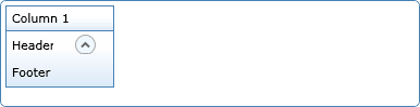
The page should now display the DataGrid with the columns and the expandable/collapsible rows. Note that one of the rows don't display the button, this is because it doesn't have any footer content.
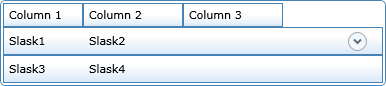
Collapsed rows in the DataGrid control
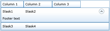
Expanded row in the DataGrid control