The PathListBox is a new control included in the Microsoft Expression Blend 4 SDK that builds on the original functionality of the ListBox, displaying multiple items and arranges them based on defined paths named appropriately LayoutPaths. The PathListBox provides many areas of customization through properties and a custom child container control, the PathListBoxItem.
As per my learning, here I am trying to explain the use of PathListBox in the form of an Article:
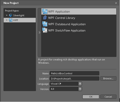
- Let us start with the development project. Open Expression Blend 4 and create a New Project from the File menu, select a WPF Application and give it a suitable name as I used "PathListBoxControl" name for my solution.
- Click "Browse" to set the location of the solution and hit "OK" to continue.
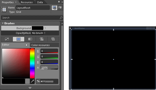
- Select the layoutRoot and from the Brushes section of the properties pane set the solid color brush to "Black"
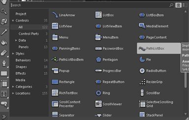
- Click on the "Assets" tab, the controls gallery will be open, so from the left panel click on "Controls" and then "All". This will populate all the controls available for your WPF application. Search for "PathListBox" control and drag it on your Art board.
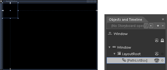
- You see now the PathListBox Control is clearly shown in your layoutRoot Grid Panel and in the object and timeline pane.
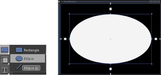
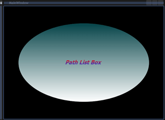
- Once our PathListBox control has been added to the page, it's time to add a circular path control for our application. To create a circular path in the XAML page, Select an Ellipse from the tool bar and draw it on the Art board. Be sure that, it has been added behind the PathListBox.
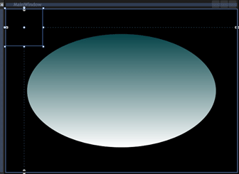
- Fill the Ellipse by using Gradient color from the brushes section of your own choice. As I used the color "#FF044247"/ ""#FFFFFFFF".
- Also add a label in the center of the ellipse, change its content from the common properties section to "PathListBox".
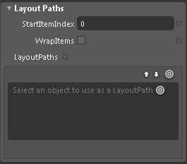
- Now, convert the "Ellipse" control to a Path control. As the PathListBox control needs a Path to position the contents hence convert the same to a Path control. Select the PathListBox control, go to the Properties window and search a section Layout Paths as shown below:
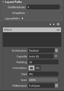
- Drag the Circle and drop on the "Ellipse"
 .Now if you check your Layout Paths section in the properties window, you will see your ellipse got added as a layout path, as shown below:
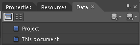
- To align the objects around the layout path which is an 'Ellipse', we need to add objects on our WPF form. This can be done in multiple ways but here we are using the sample data which will hold collection of images to be aligned to our layout path. To add the sample data, let's open the Data window from the Windows menu which is on the right hand side of your screen:
- Click on the "Create sample data" icon
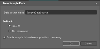
 and then on "new sample data". A pop-up window appears where you can rename your data source, here I am taking it as it is; Click "OK".
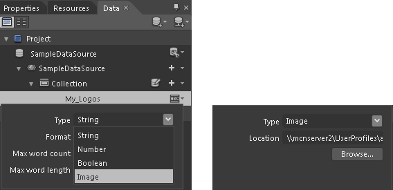
- From the Collection, rename Property1 as 'My Logos' and change its data type to Images. It is being asked here to browse the folder where all the images are located. Browse the folder and give the path as shown below:
Note: If you are having more than on property than remove it.
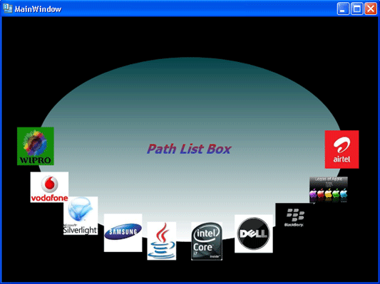
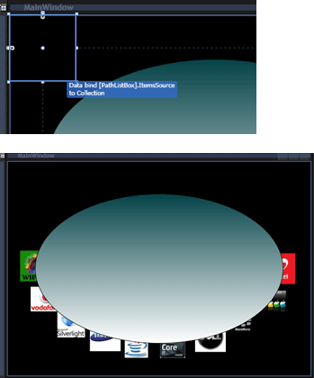
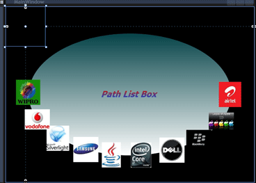
- Now select PathListBox and drag and drop Collection on the PathListBox from the Data window. Now if you observe your Ellipse, you will see all the My logos images aligned to our Ellipse Path as shown below:
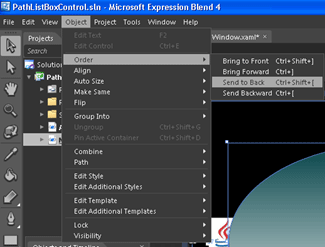
- Select the ellipse now and click on objects from the menu bar, order it to "send to back."
- Your window should be something like this:
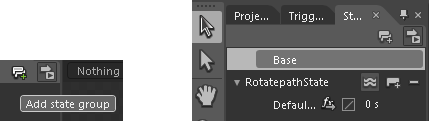
- It's time to add the states to our Application to make it more useful. To do this open a States window from Windows menu, click on Add State Group Icon
 as shown below:
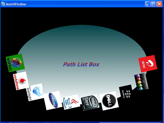
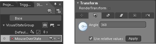
- Add a state to this group and name it "MouseOverstate" so that we will rotate our products by 360 degree and for that select PathListBox -> Go to properties window -> Select Transform section -> In the Render Transform group, select 'Rotate' group and make its Angle property value 360, click on the checkbox "use relative values" and then click on Apply as shown below:
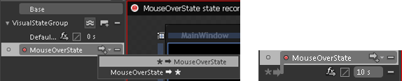
- Add a transition to our MouseOverState and change its duration to 10 seconds as under:
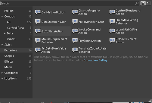
- Let's handle our states, for handling visual states in WPF we have a very nice feature called Behaviors. We will add a behavior to our Ellipse and handle the state on Mouse Enter event of the Ellipse. And to add the behavior go to the Assets window and from the behaviors section search "GoToStateAction".
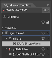
- Drag the behavior and drop it on the ellipse. The Behavior that you have recently added is shown in the object and timeline pane:
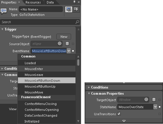
- Lastly go to the properties window and change the properties of the behavior,
Change the Event Name property to MouseEnter and State name property to MouseOverState as shown below:
- Save your Application and hit F5 to build your Project. Your Running Window should be like this: