

Introduction
In the previous article, we studied about MatPlotLib, its functions and their python implementations. In this article, we will be studying each of the seaborn functions and their python implementation.
What is Python Seaborn?
Seaborn is a library for making statistical graphics in Python. It is built on top of matplotlib and closely integrated with pandas data structures.
Here is some of the functionality that seaborn offers:
- A dataset-oriented API for examining relationships between multiple variables
- Specialized support for using categorical variables to show observations or aggregate statistics
- Options for visualizing univariate or bivariate distributions and for comparing them between subsets of data
- Automatic estimation and plotting of linear regression models for different kinds of dependent variables
- Convenient views onto the overall structure of complex datasets
- High-level abstractions for structuring multi-plot grids that let you easily build complex visualizations
- Concise control over matplotlib figure styling with several built-in themes
- Tools for choosing colour palettes that faithfully reveal patterns in your data
Seaborn aims to make visualization a central part of exploring and understanding data. Its dataset-oriented plotting functions operate on dataframes and arrays containing whole datasets and internally perform the necessary semantic mapping and statistical aggregation to produce informative plots
The official website is seaborn.pydata.org
Installing Seaborn
1. Ubuntu/Linux
- sudo apt update -y
- sudo apt upgrade -y
- sudo apt install python3-tk python3-pip -y
- sudo pip install seaborn -y
- conda install -c anaconda seaborn
Difference Between Matplotlib and Seaborn
| MatPlotLib | Seaborn | |
| Functionality | Matplotlib is mainly deployed for basic plotting. Visualization using Matplotlib generally consists of bars, pies, lines, scatter plots and so on. | Seaborn, on the other hand, provides a variety of visualization patterns. It uses fewer syntax and has easily interesting default themes. It specializes in statistics visualization and is used if one has to summarize data in visualizations and also show the distribution in the data. |
| Handling Multiple Figures | Matplotlib has multiple figures can be opened, but need to be closed explicitly. plt.close() only closes the current figure. plt.close(‘all’) would close em all. | Seaborn automates the creation of multiple figures. This sometimes leads to OOM (out of memory) issues. |
| Visualization | Matplotlib is a graphics package for data visualization in Python. It is well integrated with NumPy and Pandas. The pyplot module mirrors the MATLAB plotting commands closely. Hence, MATLAB users can easily transit to plotting with Python. | Seaborn is more integrated for working with Pandas data frames. It extends the Matplotlib library for creating beautiful graphics with Python using a more straightforward set of methods. |
| Data Frames and Arrays | Matplotlib works with data frames and arrays. It has different stateful APIs for plotting. The figures and aces are represented by the object and therefore plot() like calls without parameters suffices, without having to manage parameters. | Seaborn works with the dataset as a whole and is much more intuitive than Matplotlib. For Seaborn, replot() is the entry API with ‘kind’ parameter to specify the type of plot which could be line, bar, or any of the other types. Seaborn is not stateful. Hence, plot() would require passing the object. |
| Flexibility | Matplotlib is highly customizable and powerful. | Seaborn avoids a ton of boilerplate by providing default themes which are commonly used. |
| Use Cases |
Pandas uses Matplotlib. It is a neat wrapper around Matplotlib.
|
Seaborn is for more specific use cases. Also, it is Matplotlib under the hood. It is specially meant for statistical plotting. |
Seaborn Functions
1. seaborn.relplot()
Syntax
seaborn.relplot(x=None, y=None, hue=None, size=None, style=None, data=None, row=None, col=None, col_wrap=None, row_order=None, col_order=None, palette=None, hue_order=None, hue_norm=None, sizes=None, size_order=None, size_norm=None, markers=None, dashes=None, style_order=None, legend='brief', kind='scatter', height=5, aspect=1, facet_kws=None, **kwargs)
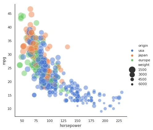
It is a function that is a figure-level interface for drawing relational plots onto a FacetGrid.
- import seaborn as sns
- sns.set(style="white")
- # Load the example mpg dataset
- mpg = sns.load_dataset("mpg")
- # Plot miles per gallon against horsepower with other semantics
- sns.relplot(x="horsepower", y="mpg", hue="origin", size="weight",
- sizes=(400, 40), alpha=.5, palette="muted",
- height=6, data=mpg)
2. seaborn.scatterplot()
Syntax
seaborn.scatterplot(x=None, y=None, hue=None, style=None, size=None, data=None, palette=None, hue_order=None, hue_norm=None, sizes=None, size_order=None, size_norm=None, markers=True, style_order=None, x_bins=None, y_bins=None, units=None, estimator=None, ci=95, n_boot=1000, alpha='auto', x_jitter=None, y_jitter=None, legend='brief', ax=None, **kwargs)
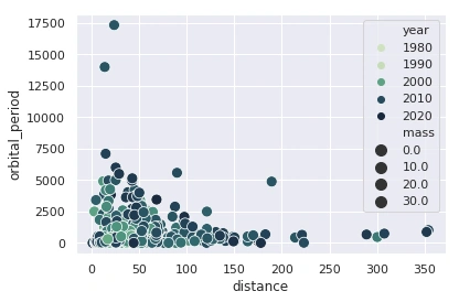
Draws a scatter plot with the possibility of several semantic groupings.
- import seaborn as sns
- sns.set()
- # Load the example iris dataset
- planets = sns.load_dataset("planets")
- cmap = sns.cubehelix_palette(rot=-.5, as_cmap=True)
- ax = sns.scatterplot(x="distance", y="orbital_period",
- hue="year", size="mass",
- palette=cmap, sizes=(100, 100),
- data=planets)
3. seaborn.lineplot()
Syntax
seaborn.lineplot(x=None, y=None, hue=None, size=None, style=None, data=None, palette=None, hue_order=None, hue_norm=None, sizes=None, size_order=None, size_norm=None, dashes=True, markers=None, style_order=None, units=None, estimator='mean', ci=95, n_boot=1000, sort=True, err_style='band', err_kws=None, legend='brief', ax=None, **kwargs)
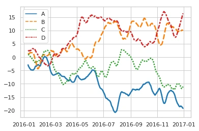
Draws a line plot with the possibility of several semantic groupings.
- import numpy as np
- import pandas as pd
- import seaborn as sns
- sns.set(style="whitegrid")
- rs = np.random.RandomState(365)
- values = rs.randn(365, 4).cumsum(axis=0)
- dates = pd.date_range("1 1 2016", periods=365, freq="D")
- data = pd.DataFrame(values, dates, columns=["A", "B", "C", "D"])
- data = data.rolling(10).mean()
- sns.lineplot(data=data, palette="tab10", linewidth=2.5)
4. seaborn.catplot()
Syntax
seaborn.catplot(x=None, y=None, hue=None, data=None, row=None, col=None, col_wrap=None, estimator=<function mean>, ci=95, n_boot=1000, units=None, order=None, hue_order=None, row_order=None, col_order=None, kind='strip', height=5, aspect=1, orient=None, color=None, palette=None, legend=True, legend_out=True, sharex=True, sharey=True, margin_titles=False, facet_kws=None, **kwargs)
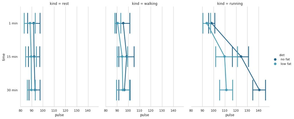
Figure-level interface for drawing categorical plots onto a FacetGrid.
- import seaborn as sns
- sns.set(style="whitegrid")
- # Load the example exercise dataset
- df = sns.load_dataset("exercise")
- # Draw a pointplot to show pulse as a function of three categorical factors
- g = sns.catplot(x="pulse", y="time", hue="diet", col="kind",
- capsize=.6, palette="YlGnBu_d", height=6, aspect=.75,
- kind="point", data=df)
- g.despine(left=True)
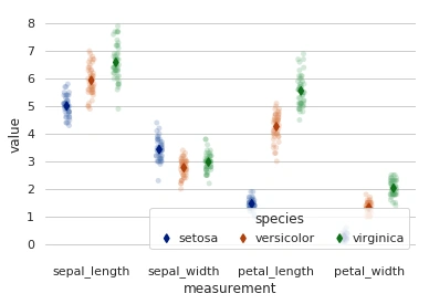
5. seaborn.stripplot()
Syntax
seaborn.stripplot(x=None, y=None, hue=None, data=None, order=None, hue_order=None, jitter=True, dodge=False, orient=None, color=None, palette=None, size=5, edgecolor='gray', linewidth=0, ax=None, **kwargs)
Draws a scatterplot where one variable is categorical.
- import pandas as pd
- import seaborn as sns
- import matplotlib.pyplot as plt
- sns.set(style="whitegrid")
- iris = sns.load_dataset("iris")
- # "Melt" the dataset to "long-form" or "tidy" representation
- iris = pd.melt(iris, "species", var_name="measurement")
- # Initialize the figure
- f, ax = plt.subplots()
- sns.despine(bottom=True, left=True)
- # Show each observation with a scatterplot
- sns.stripplot(x="measurement", y="value", hue="species",
- data=iris, dodge=True, jitter=True,
- alpha=.25, zorder=1)
- # Show the conditional means
- sns.pointplot(x="measurement", y="value", hue="species",
- data=iris, dodge=.532, join=False, palette="dark",
- markers="d", scale=.75, ci=None)
- # Improve the legend
- handles, labels = ax.get_legend_handles_labels()
- ax.legend(handles[3:], labels[3:], title="species",
- handletextpad=0, columnspacing=1,
- loc="lower right", ncol=3, frameon=True)
6. seaborn.swarmplot()
Syntax
seaborn.swarmplot(x=None, y=None, hue=None, data=None, order=None, hue_order=None, dodge=False, orient=None, color=None, palette=None, size=5, edgecolor='gray', linewidth=0, ax=None, **kwargs)
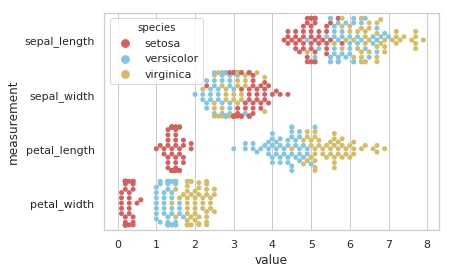
Draws a categorical scatterplot with non-overlapping points.
- import pandas as pd
- import seaborn as sns
- sns.set(style="whitegrid", palette="muted")
- # Load the example iris dataset
- iris = sns.load_dataset("iris")
- # "Melt" the dataset to "long-form" or "tidy" representation
- iris = pd.melt(iris, "species", var_name="measurement")
- # Draw a categorical scatterplot to show each observation
- sns.swarmplot(x="value", y="measurement", hue="species",
- palette=["r", "c", "y"], data=iris)
7. seaborn.boxplot()
Syntax
seaborn.boxplot(x=None, y=None, hue=None, data=None, order=None, hue_order=None, orient=None, color=None, palette=None, saturation=0.75, width=0.8, dodge=True, fliersize=5, linewidth=None, whis=1.5, notch=False, ax=None, **kwargs)
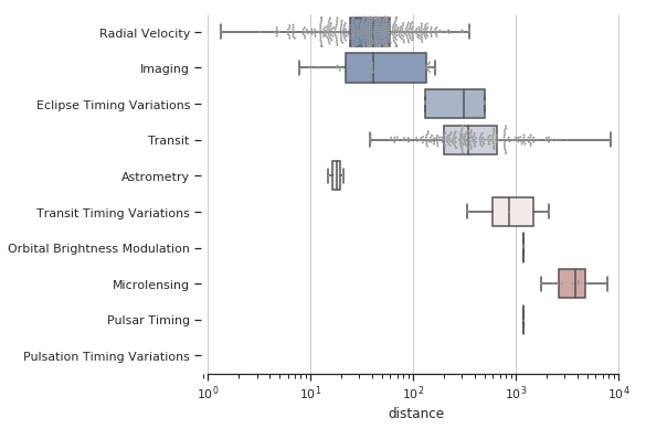
Draws a box plot to show distributions with respect to categories.
- import seaborn as sns
- import matplotlib.pyplot as plt
- sns.set(style="ticks")
- # Initialize the figure with a logarithmic x axis
- f, ax = plt.subplots(figsize=(7, 6))
- ax.set_xscale("log")
- # Load the example planets dataset
- planets = sns.load_dataset("planets")
- # Plot the orbital period with horizontal boxes
- sns.boxplot(x="distance", y="method", data=planets,
- whis="range", palette="vlag")
- # Add in points to show each observation
- sns.swarmplot(x="distance", y="method", data=planets,
- size=2, color=".6", linewidth=0)
- # Tweak the visual presentation
- ax.xaxis.grid(True)
- ax.set(ylabel="")
- sns.despine(trim=True, left=True)
8. seaborn.violinplot()
Syntax
seaborn.violinplot(x=None, y=None, hue=None, data=None, order=None, hue_order=None, bw='scott', cut=2, scale='area', scale_hue=True, gridsize=100, width=0.8, inner='box', split=False, dodge=True, orient=None, linewidth=None, color=None, palette=None, saturation=0.75, ax=None, **kwargs)
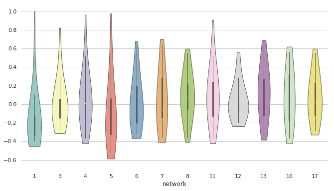
Draws a combination of boxplot and kernel density estimate.
- import seaborn as sns
- import matplotlib.pyplot as plt
- sns.set(style="whitegrid")
- # Load the example dataset of brain network correlations
- df = sns.load_dataset("brain_networks", header=[0, 1, 2], index_col=0)
- # Pull out a specific subset of networks
- used_networks = [1, 3, 4, 5, 6, 7, 8, 11, 12, 13, 16, 17]
- used_columns = (df.columns.get_level_values("network")
- .astype(float)
- .isin(used_networks))
- df = df.loc[:, used_columns]
- # Compute the correlation matrix and average over networks
- corr_df = df.corr().groupby(level="network").mean()
- corr_df.index = corr_df.index.astype(int)
- corr_df = corr_df.sort_index().T
- # Set up the matplotlib figure
- f, ax = plt.subplots(figsize=(11, 6))
- # Draw a violinplot with a narrower bandwidth than the default
- sns.violinplot(data=corr_df, palette="Set3", bw=1, cut=.2, linewidth=1)
- # Finalize the figure
- ax.set(ylim=(-.7, 1.05))
- sns.despine(left=True, bottom=True)
9. seaborn.boxenplot()
Syntax
seaborn.boxenplot(x=None, y=None, hue=None, data=None, order=None, hue_order=None, orient=None, color=None, palette=None, saturation=0.75, width=0.8, dodge=True, k_depth='proportion', linewidth=None, scale='exponential', outlier_prop=None, ax=None, **kwargs)
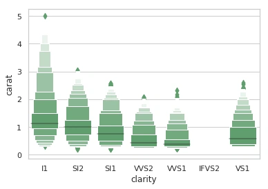
Draws an enhanced box plot for larger datasets.
- import seaborn as sns
- sns.set(style="whitegrid")
- diamonds = sns.load_dataset("diamonds")
- clarity_ranking = ["I1", "SI2", "SI1", "VVS2", "VVS1", "IF" "VS2", "VS1"]
- sns.boxenplot(x="clarity", y="carat",
- color="g", order=clarity_ranking,
- scale="linear", data=diamonds)
10. seaborn.pointplot()
Syntax
seaborn.pointplot(x=None, y=None, hue=None, data=None, order=None, hue_order=None, estimator=<function mean>, ci=95, n_boot=1000, units=None, markers='o', linestyles='-', dodge=False, join=True, scale=1, orient=None, color=None, palette=None, errwidth=None, capsize=None, ax=None, **kwargs)
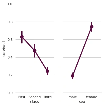
Shows point estimates and confidence intervals using scatter plot graphs.
- import seaborn as sns
- sns.set(style="whitegrid")
- # Load the example Titanic dataset
- titanic = sns.load_dataset("titanic")
- # Set up a grid to plot survival probability against several variables
- g = sns.PairGrid(titanic, y_vars="survived",
- x_vars=["class", "sex"],
- height=5, aspect=.5)
- # Draw a seaborn pointplot onto each Axes
- g.map(sns.pointplot, scale=1.3, errwidth=4, color="xkcd:plum")
- g.set(ylim=(0, 1))
- sns.despine(fig=g.fig, left=True)
11. seaborn.barplot()
Syntax
seaborn.barplot(x=None, y=None, hue=None, data=None, order=None, hue_order=None, estimator=<function mean>, ci=95, n_boot=1000, units=None, orient=None, color=None, palette=None, saturation=0.75, errcolor='.26', errwidth=None, capsize=None, dodge=True, ax=None, **kwargs)
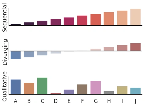
Shows point estimates and confidence intervals as rectangular bars.
- import numpy as np
- import seaborn as sns
- import matplotlib.pyplot as plt
- sns.set(style="white", context="talk")
- rs = np.random.RandomState(8)
- # Set up the matplotlib figure
- f, (ax1, ax2, ax3) = plt.subplots(3, 1, figsize=(7, 5), sharex=True)
- # Generate some sequential data
- x = np.array(list("ABCDEFGHIJ"))
- y1 = np.arange(1, 11)
- sns.barplot(x=x, y=y1, palette="rocket", ax=ax1)
- ax1.axhline(0, color="k", clip_on=False)
- ax1.set_ylabel("Sequential")
- # Center the data to make it diverging
- y2 = y1 - 5.5
- sns.barplot(x=x, y=y2, palette="vlag", ax=ax2)
- ax2.axhline(0, color="k", clip_on=False)
- ax2.set_ylabel("Diverging")
- # Randomly reorder the data to make it qualitative
- y3 = rs.choice(y1, len(y1), replace=False)
- sns.barplot(x=x, y=y3, palette="deep", ax=ax3)
- ax3.axhline(0, color="k", clip_on=False)
- ax3.set_ylabel("Qualitative")
- # Finalize the plot
- sns.despine(bottom=True)
- plt.setp(f.axes, yticks=[])
- plt.tight_layout(h_pad=2)
12. seaborn.countplot()
Syntax
seaborn.countplot(x=None, y=None, hue=None, data=None, order=None, hue_order=None, orient=None, color=None, palette=None, saturation=0.75, dodge=True, ax=None, **kwargs)
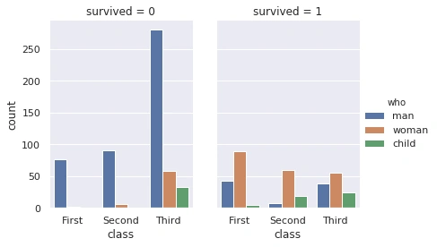
Shows the counts of observations in each categorical bin using bars.
- import seaborn as sns
- sns.set(style="darkgrid")
- titanic = sns.load_dataset("titanic")
- g = sns.catplot(x="class", hue="who", col="survived", data=titanic, kind="count", height=4, aspect=.7)
13. seaborn.jointplot()
Syntax
seaborn.jointplot(x, y, data=None, kind='scatter', stat_func=None, color=None, height=6, ratio=5, space=0.2, dropna=True, xlim=None, ylim=None, joint_kws=None, marginal_kws=None, annot_kws=None, **kwargs)
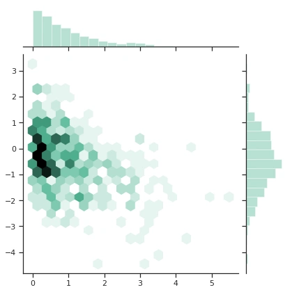
Draw a plot of two variables with bivariate and univariate graphs.
- import numpy as np
- import seaborn as sns
- sns.set(style="ticks")
- rs = np.random.RandomState(11)
- x = rs.gamma(1, size=500)
- y = -.5 * x + rs.normal(size=500)
- sns.jointplot(x, y, kind="hex", color="#4CB391")
14. seaborn.pairplot()
Syntax
seaborn.pairplot(data, hue=None, hue_order=None, palette=None, vars=None, x_vars=None, y_vars=None, kind='scatter', diag_kind='auto', markers=None, height=2.5, aspect=1, dropna=True, plot_kws=None, diag_kws=None, grid_kws=None, size=None)
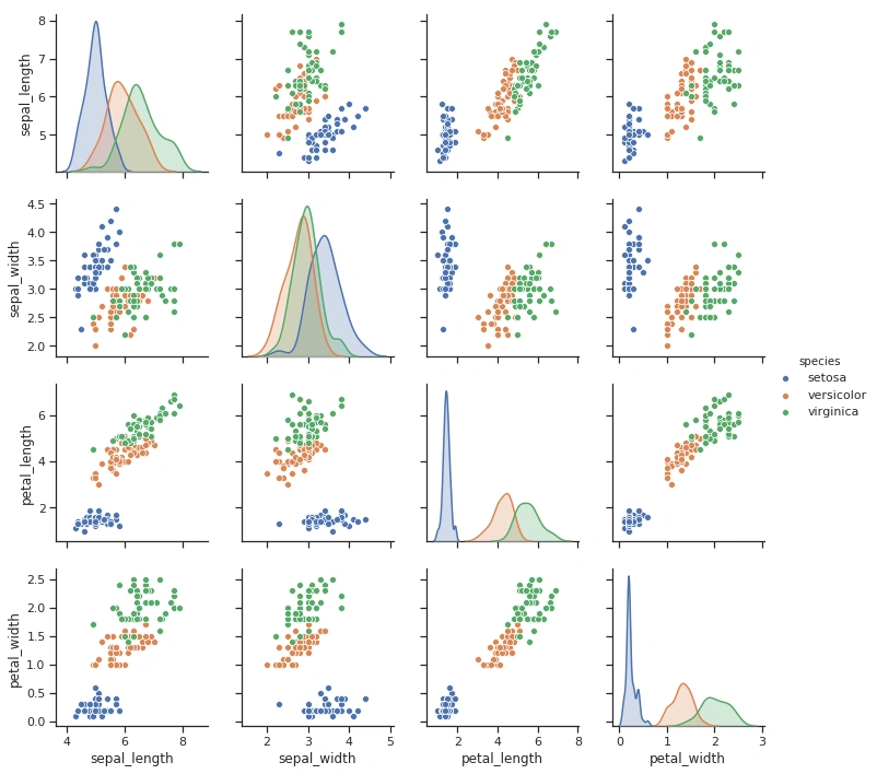
Plots pairwise relationships in a dataset.
- import seaborn as sns
- sns.set(style="ticks")
- df = sns.load_dataset("iris")
- sns.pairplot(df, hue="species")
15. seaborn.distplot()
Syntax
seaborn.distplot(a, bins=None, hist=True, kde=True, rug=False, fit=None, hist_kws=None, kde_kws=None, rug_kws=None, fit_kws=None, color=None, vertical=False, norm_hist=False, axlabel=None, label=None, ax=None)
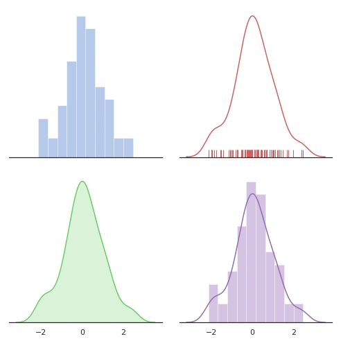
Flexibly plots a univariate distribution of observations.
- import numpy as np
- import seaborn as sns
- import matplotlib.pyplot as plt
- sns.set(style="white", palette="muted", color_codes=True)
- rs = np.random.RandomState(10)
- # Set up the matplotlib figure
- f, axes = plt.subplots(2, 2, figsize=(7, 7), sharex=True)
- sns.despine(left=True)
- # Generate a random univariate dataset
- d = rs.normal(size=100)
- # Plot a simple histogram with binsize determined automatically
- sns.distplot(d, kde=False, color="b", ax=axes[0, 0])
- # Plot a kernel density estimate and rug plot
- sns.distplot(d, hist=False, rug=True, color="r", ax=axes[0, 1])
- # Plot a filled kernel density estimate
- sns.distplot(d, hist=False, color="g", kde_kws={"shade": True}, ax=axes[1, 0])
- # Plot a historgram and kernel density estimate
- sns.distplot(d, color="m", ax=axes[1, 1])
- plt.setp(axes, yticks=[])
- plt.tight_layout()
16. seaborn.kdeplot()
Syntax
seaborn.kdeplot(data, data2=None, shade=False, vertical=False, kernel='gau', bw='scott', gridsize=100, cut=3, clip=None, legend=True, cumulative=False, shade_lowest=True, cbar=False, cbar_ax=None, cbar_kws=None, ax=None, **kwargs)
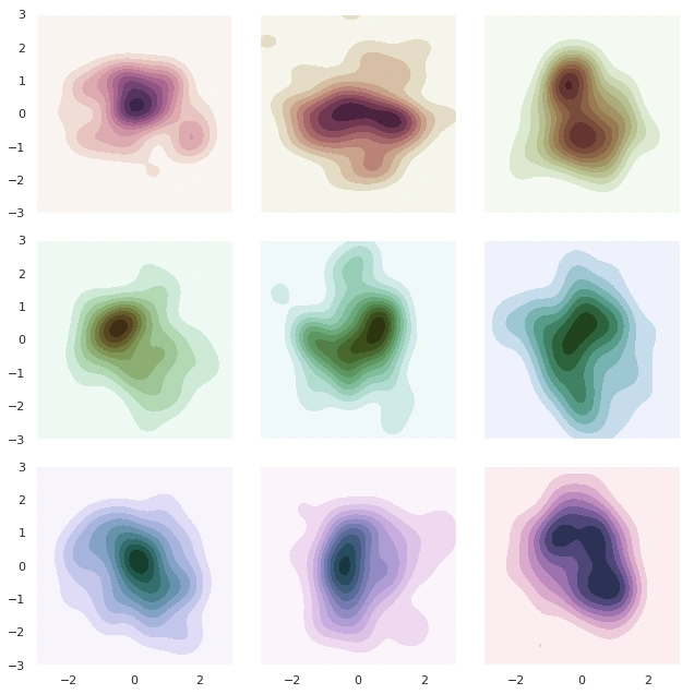
Fits and plots a univariate or bivariate kernel density estimate.
- import numpy as np
- import seaborn as sns
- import matplotlib.pyplot as plt
- sns.set(style="dark")
- rs = np.random.RandomState(500)
- # Set up the matplotlib figure
- f, axes = plt.subplots(3, 3, figsize=(9, 9), sharex=True, sharey=True)
- # Rotate the starting point around the cubehelix hue circle
- for ax, s in zip(axes.flat, np.linspace(0, 3, 10)):
- # Create a cubehelix colormap to use with kdeplot
- cmap = sns.cubehelix_palette(start=s, light=1, as_cmap=True)
- # Generate and plot a random bivariate dataset
- x, y = rs.randn(2, 50)
- sns.kdeplot(x, y, cmap=cmap, shade=True, cut=5, ax=ax)
- ax.set(xlim=(-3, 3), ylim=(-3, 3))
- f.tight_layout()
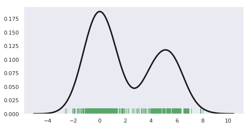
17. seaborn.rugplot()
Syntax
seaborn.rugplot(a, height=0.05, axis='x', ax=None, **kwargs)
Plots data points in an array as sticks on an axis.
- import numpy as np
- import matplotlib.pyplot as plt
- import seaborn as sns
- sample = np.hstack((np.random.randn(300), np.random.randn(200)+5))
- fig, ax = plt.subplots(figsize=(8,4))
- sns.distplot(sample, rug=True, hist=False, rug_kws={"color": "g"},
- kde_kws={"color": "k", "lw": 3})
- plt.show()
18. seaborn.lmplot()
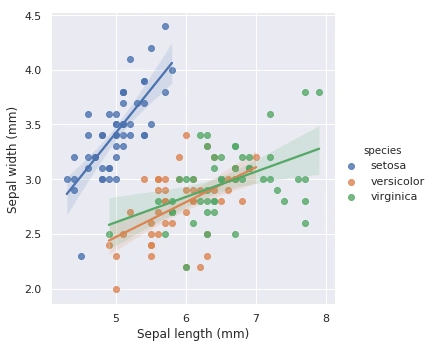
Syntax
seaborn.lmplot(x, y, data, hue=None, col=None, row=None, palette=None, col_wrap=None, height=5, aspect=1, markers='o', sharex=True, sharey=True, hue_order=None, col_order=None, row_order=None, legend=True, legend_out=True, x_estimator=None, x_bins=None, x_ci='ci', scatter=True, fit_reg=True, ci=95, n_boot=1000, units=None, order=1, logistic=False, lowess=False, robust=False, logx=False, x_partial=None, y_partial=None, truncate=False, x_jitter=None, y_jitter=None, scatter_kws=None, line_kws=None, size=None)
Plots data and regression model fits across a FacetGrid.
- import seaborn as sns
- sns.set()
- # Load the iris dataset
- iris = sns.load_dataset("iris")
- # Plot sepal with as a function of sepal_length across days
- g = sns.lmplot(x="sepal_length", y="sepal_width", hue="species",
- truncate=True, height=5, data=iris)
- # Use more informative axis labels than are provided by default
- g.set_axis_labels("Sepal length (mm)", "Sepal width (mm)")
19. seaborn.regplot()
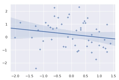
Syntax
seaborn.regplot(x, y, data=None, x_estimator=None, x_bins=None, x_ci='ci', scatter=True, fit_reg=True, ci=95, n_boot=1000, units=None, order=1, logistic=False, lowess=False, robust=False, logx=False, x_partial=None, y_partial=None, truncate=False, dropna=True, x_jitter=None, y_jitter=None, label=None, color=None, marker='o', scatter_kws=None, line_kws=None, ax=None)
Plots data and a linear regression model fit.
- import seaborn as sns; sns.set(color_codes=True)
- tips = sns.load_dataset("tips")
- ax = sns.regplot(x=x, y=y, marker="+")
20. seaborn.residplot()
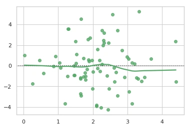
Syntax
seaborn.residplot(x, y, data=None, lowess=False, x_partial=None, y_partial=None, order=1, robust=False, dropna=True, label=None, color=None, scatter_kws=None, line_kws=None, ax=None)
Plots the residuals of linear regression.
- import numpy as np
- import seaborn as sns
- sns.set(style="whitegrid")
- # Make an example dataset with y ~ x
- rs = np.random.RandomState(10)
- x = rs.normal(2, 1, 75)
- y = 2 + 1.5 * x + rs.normal(1, 2, 75)
- # Plot the residuals after fitting a linear model
- sns.residplot(x, y, lowess=True, color="g")
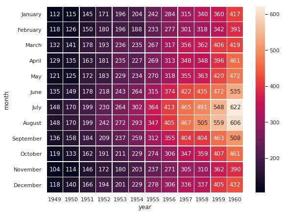
21. seaborn.heatmap()
Syntax
seaborn.heatmap(data, vmin=None, vmax=None, cmap=None, center=None, robust=False, annot=None, fmt='.2g', annot_kws=None, linewidths=0, linecolor='white', cbar=True, cbar_kws=None, cbar_ax=None, square=False, xticklabels='auto', yticklabels='auto', mask=None, ax=None, **kwargs)
Plots rectangular data as a color-encoded matrix.
- import matplotlib.pyplot as plt
- import seaborn as sns
- sns.set()
- # Load the example flights dataset and conver to long-form
- flights_long = sns.load_dataset("flights")
- flights = flights_long.pivot("month", "year", "passengers")
- # Draw a heatmap with the numeric values in each cell
- f, ax = plt.subplots(figsize=(9, 7))
- sns.heatmap(flights, annot=True, fmt="d", linewidths=.5, ax=ax)
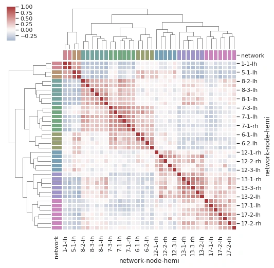
22. seaborn.clustermap()
Syntax
seaborn.clustermap(data, pivot_kws=None, method='average', metric='euclidean', z_score=None, standard_scale=None, figsize=None, cbar_kws=None, row_cluster=True, col_cluster=True, row_linkage=None, col_linkage=None, row_colors=None, col_colors=None, mask=None, **kwargs)
Plots a matrix dataset as a hierarchically-clustered heatmap.
- import pandas as pd
- import seaborn as sns
- sns.set()
- # Load the brain networks example dataset
- df = sns.load_dataset("brain_networks", header=[0, 1, 2], index_col=0)
- # Select a subset of the networks
- used_networks = [1, 5, 6, 7, 8, 12, 13, 17]
- used_columns = (df.columns.get_level_values("network")
- .astype(int)
- .isin(used_networks))
- df = df.loc[:, used_columns]
- # Create a categorical palette to identify the networks
- network_pal = sns.husl_palette(8, s=.45)
- network_lut = dict(zip(map(str, used_networks), network_pal))
- # Convert the palette to vectors that will be drawn on the side of the matrix
- networks = df.columns.get_level_values("network")
- network_colors = pd.Series(networks, index=df.columns).map(network_lut)
- # Draw the full plot
- sns.clustermap(df.corr(), center=0, cmap="vlag",
- row_colors=network_colors, col_colors=network_colors,
- linewidths=.75, figsize=(8, 8))
Facet Grids
| Function | Description |
| FacetGrid (data[, row, col, hue, col_wrap, …]) | Multi-plot grid for plotting conditional relationships |
| FacetGrid.map(func, *args, **kwargs) | Apply a plotting function to each facet’s subset of the data. |
| FacetGrid.map_dataframe(func, *args, **kwargs) |
Like .map but passes args as strings and inserts data in kwargs.
|
Pair Grids
| Function | Description |
| PairGrid(data[, hue, hue_order, palette, …]) | Subplot grid for plotting pairwise relationships in a dataset. |
| PairGrid.map(func, **kwargs) | Plot with the same function in every subplot. |
| PairGrid.map_diag(func, **kwargs) | Plot with a univariate function on each diagonal subplot. |
| PairGrid.map_offdiag(func, **kwargs) | Plot with a bivariate function on the off-diagonal subplots. |
| PairGrid.map_lower(func, **kwargs) | Plot with a bivariate function on the lower diagonal subplots. |
| PairGrid.map_upper(func, **kwargs) | Plot with a bivariate function on the upper diagonal subplots. |
Joint Grids
| Function | Description |
| JointGrid(x, y[, data, height, ratio, …]) | Grid for drawing a bivariate plot with marginal univariate plots. |
| JointGrid.plot(joint_func, marginal_func[, …]) | Shortcut to draw the full plot. |
| JointGrid.plot_joint(func, **kwargs) | Draw a bivariate plot of x and y. |
| JointGrid.plot_marginals(func, **kwargs) | Draw univariate plots for x and y separately. |
Style Control
| Function | Description |
| set([context, style, palette, font, …]) | Set aesthetic parameters in one step. |
| axes_style([style, rc]) | Return a parameter dict for the aesthetic style of the plots. |
| set_style([style, rc]) | Set the aesthetic style of the plots. |
| plotting_context([context, font_scale, rc]) | Return a parameter dict to scale elements of the figure. |
| Set the plotting context parameters | |
| set_color_codes([palette]) | Change how matplotlib color shorthands are interpreted |
| reset_defaults() | Restore all RC params to default settings. |
| reset_orig() | Restore all RC params to original settings (respects custom rc) |
Color Palettes
| Function | Description |
| set_palette(palette[, n_colors, desat, …]) |
Set the matplotlib color cycle using a seaborn palette.
|
| color_palette([palette, n_colors, desat]) | Return a list of colors defining a color palette. |
| husl_palette([n_colors, h, s, l]) |
Get a set of evenly spaced colors in HUSL hue space.
|
| hls_palette([n_colors, h, l, s]) | Get a set of evenly spaced colors in HLS hue space. |
| cubehelix_palette([n_colors, start, rot, …]) |
Make a sequential palette from the cubehelix system.
|
| dark_palette(color[, n_colors, reverse, …]) | Make a sequential palette that blends from dark to color. |
| light_palette(color[, n_colors, reverse, …]) | Make a sequential palette that blends from light to color. |
| diverging_palette(h_neg, h_pos[, s, l, sep, …]) | Make a diverging palette between two HUSL colors. |
| blend_palette(colors[, n_colors, as_cmap, input]) | Make a palette that blends between a list of colors. |
| xkcd_palette(colors) | Make a palette with color names from the xkcd color survey. |
| crayon_palette(colors) | Make a palette with color names from Crayola crayons. |
| mpl_palette(name[, n_colors]) | Return discrete colors from a matplotlib palette. |
Palette Widgets
| Function | Description |
| choose_colorbrewer_palette(data_type[, as_cmap]) | Select a palette from the ColorBrewer set |
| choose_cubehelix_palette([as_cmap]) | Launch an interactive widget to create a sequential cubehelix palette |
| choose_light_palette([input, as_cmap]) | Launch an interactive widget to create a light sequential palette |
| choose_dark_palette([input, as_cmap]) | Launch an interactive widget to create a dark sequential palette |
| choose_diverging_palette([as_cmap]) | Launch an interactive widget to choose a diverging color palette |
Utility Functions
| Function | Description |
| load_dataset(name[, cache, data_home]) | Load a dataset from the online repository (requires internet) |
| despine([fig, ax, top, right, left, bottom, …]) | Remove the top and right spines from plot(s) |
| desaturate(color, prop) | Decrease the saturation channel of a color by some percent |
| saturatE(color) | Return a fully saturated color with the same hue |
| set_hls_values(color[, h, l, s]) | Independently manipulate the h, l, or s channels of a color |
Conclusion
In this article, we studied python seaborn, installing python seaborn, the difference between matplotlib and seaborn, seaborn functions, types of graphs available in python seaborn and python implementation of these functionalities. Hope you were able to understand each and everything. For any doubts, please comment on your query.
In the next article, we will learn about the TensorFlow library series.
Congratulations!!! you have climbed your next step in becoming a successful ML Engineer.
Next Article In this Series >> TensorFlow
Sarathlal SaseendranPosted Sep 26, 2019, 4:46 PM
Simply awesome article Rohit. Keep going. Thanks for sharing such a wonderful material.
Elavarasan RPosted Sep 26, 2019, 12:54 AM
Great. A very useful article. thankyou for sharing.