
To develop apps for UWP you must have Windows 10 and Visual Studio 2015 installed. You can install visual studio community for development purposes which is absolutely free.
Start Visual Studio and create a project either by clicking New Project from the start screen or going to File, New, then Project.
We will design our calculator using grid panel. A grid can contain multiple rows and columns and we can define height and width for each row and column respectively although by default it has just one row and one column.
Our calculator design will have 4 columns as 4 is the maximum number of buttons in any row and 7 rows. To do so, we will need to add the following lines of code to our MainPage.xaml file.
- <Grid Background="{ThemeResource ApplicationPageBackgroundThemeBrush}">
- <Grid.ColumnDefinitions>
- <ColumnDefinition />
- <ColumnDefinition />
- <ColumnDefinition />
- <ColumnDefinition />
- </Grid.ColumnDefinitions>
- <Grid.RowDefinitions>
- <RowDefinition />
- <RowDefinition/>
- <RowDefinition/>
- <RowDefinition/>
- <RowDefinition/>
- <RowDefinition/>
- <RowDefinition/>
- </Grid.RowDefinitions>
- </Grid>
- Fixed
- Auto (takes as much space as needed by the contained content).
- * (takes as much space as available) and if there is a number prefix before * e.g. 10* , that means 10% of the remaining grid. If we had two columns of width 1* and 2*, the second column will take twice as much space as the first one.
As we want equally sized columns we will simply omit the width specification because by default it is 1* which will divide the available grid space among all the columns equally. Same logic applies to rows but in context of height.
Like arrays both rows and columns also start form 0 and we want our first row to have sort of a heading indicating that it is a calculator app.
- <Border Grid.Row="0" Background="White" Grid.ColumnSpan="4">
- <TextBox HorizontalAlignment="Center" IsReadOnly="True" Text="Calculator" Foreground="Black" BorderBrush="Transparent" TextAlignment="Center" FontSize="70"></TextBox>
- </Border>
To set the background color of rows the following code will be used.
- <Grid Grid.Row="1" Background="WhiteSmoke" Grid.ColumnSpan="4"></Grid>
- <Grid Grid.Row="2" Background="WhiteSmoke" Grid.ColumnSpan="4"></Grid>
- <Grid Grid.Row="3" Background="WhiteSmoke" Grid.ColumnSpan="4"></Grid>
- <Grid Grid.Row="4" Background="WhiteSmoke" Grid.ColumnSpan="4"></Grid>
- <Grid Grid.Row="5" Background="WhiteSmoke" Grid.ColumnSpan="4"></Grid>
- <Grid Grid.Row="6" Background="WhiteSmoke" Grid.ColumnSpan="4"></Grid>
- <TextBox Grid.Row="1" Grid.ColumnSpan="4" TabIndex="1" VerticalAlignment="Top" HorizontalAlignment="Center" PlaceholderText="Enter Value" Width="300" BorderBrush="Transparent" TextAlignment="Right" FontSize="20" Margin="0,10,0,5" Height="40"></TextBox>
- <TextBox HorizontalAlignment="Center" Grid.ColumnSpan="4" Grid.Row="1" TextAlignment="Left" PlaceholderText="Result" Width="300" BorderBrush="Transparent" Margin="0,50,0,5" FontSize="20" Height="40"></TextBox>
Margin (left, top, right, bottom) property allows you to set the outer margin of a UI control.
Now we will add buttons for '+', '-', '*' and '/' using the following code.
- <Button VerticalAlignment="Top" Width="80" Content="+" Background="Transparent" Foreground="Black" Margin="0,20,0,0" Grid.Column="0" Grid.Row="2" FontSize="40"></Button>
- <Button VerticalAlignment="Top" Width="80" Content="-" Background="Transparent" Foreground="Black" Margin="0,20,0,0" Grid.Column="1" Grid.Row="2" FontSize="40"></Button>
- <Button VerticalAlignment="Top" Width="80" Content="*" Background="Transparent" Foreground="Black" Margin="0,20,0,0" Grid.Column="2" Grid.Row="2" FontSize="40"></Button>
- <Button VerticalAlignment="Top" Width="80" Content="/" Background="Transparent" Foreground="Black" Margin="0,20,0,0" Grid.Column="3" Grid.Row="2" FontSize="40"></Button>
- <Button VerticalAlignment="Top" Width="80" Content="7" Background="Transparent" Foreground="Black" Margin="0,20,0,0" Grid.Column="0" Grid.Row="3" FontSize="40"></Button>
- <Button VerticalAlignment="Top" Width="80" Content="8" Background="Transparent" Foreground="Black" Margin="0,20,0,0" Grid.Column="1" Grid.Row="3" FontSize="40"></Button>
- <Button VerticalAlignment="Top" Width="80" Content="9" Background="Transparent" Foreground="Black" Margin="0,20,0,0" Grid.Column="2" Grid.Row="3" FontSize="40"></Button>
- <Button VerticalAlignment="Center" BorderBrush="Black" Height="340" Width="70" Content="=" Background="Transparent" Foreground="Black" Grid.Column="4" Grid.Row="3" Grid.RowSpan="4" Margin="10,0,10,0" FontSize="48" />
- <!--5th Row-->
- < Button VerticalAlignment = "Top"
- Width = "80"
- Content = "4"
- Background = "Transparent"
- Foreground = "Black"
- Margin = "0,20,0,0"
- Grid.Column = "0"
- Grid.Row = "4"
- FontSize = "40" >
- < /Button>
- < Button VerticalAlignment = "Top"
- Width = "80"
- Content = "5"
- Background = "Transparent"
- Foreground = "Black"
- Margin = "0,20,0,0"
- Grid.Column = "1"
- Grid.Row = "4"
- FontSize = "40" >
- < /Button>
- < Button VerticalAlignment = "Top"
- Width = "80"
- Content = "6"
- Background = "Transparent"
- Foreground = "Black"
- Margin = "0,20,0,0"
- Grid.Column = "2"
- Grid.Row = "4"
- FontSize = "40" >
- < /Button>
- <!--6th Row-->
- < Button VerticalAlignment = "Top"
- Width = "80"
- Content = "1"
- Background = "Transparent"
- Foreground = "Black"
- Margin = "0,20,0,0"
- Grid.Column = "0"
- Grid.Row = "5"
- FontSize = "40" >
- < /Button>
- < Button VerticalAlignment = "Top"
- Width = "80"
- Content = "2"
- Background = "Transparent"
- Foreground = "Black"
- Margin = "0,20,0,0"
- Grid.Column = "1"
- Grid.Row = "5"
- FontSize = "40" >
- < /Button>
- < Button VerticalAlignment = "Top"
- Width = "80"
- Content = "3"
- Background = "Transparent"
- Foreground = "Black"
- Margin = "0,20,0,0"
- Grid.Column = "2"
- Grid.Row = "5"
- FontSize = "40" >
- < /Button>
- <!--7th Row-->
- < Button VerticalAlignment = "Top"
- Width = "80"
- Content = "0"
- Background = "Transparent"
- Foreground = "Black"
- Margin = "0,20,0,0"
- Grid.Row = "6"
- Grid.Column = "0"
- FontSize = "40" >
- < /Button>
- < Button VerticalAlignment = "Top"
- Width = "80"
- Content = "."
- Background = "Transparent"
- Foreground = "Black"
- Margin = "0,20,0,0"
- Grid.Row = "6"
- Grid.Column = "1"
- FontSize = "40" >
- < /Button>
- < Button VerticalAlignment = "Top"
- Width = "80"
- Content = "Clear"
- Background = "Transparent"
- Foreground = "Black"
- Margin = "0,20,0,0"
- Grid.Row = "6"
- Grid.Column = "2"
- FontSize = "25" >
- < /Button>
Viola! This is how your output should look like.
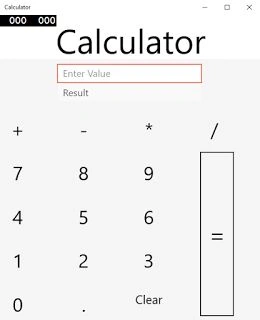
If you will try to resize the window you'll find out that our app is not responsive i.e. the layout does not adjust itself according to the width of window. But don't worry about that we will learn how to do that in a future post.
Sr KarthigaPosted Mar 2, 2016, 10:41 PM
good one
Sr KarthigaPosted Mar 2, 2016, 10:41 PM
nice explanation
Hemant SrivastavaPosted Feb 5, 2016, 1:48 PM
Good work. thnx for sharing
Sibeesh VenuPosted Feb 1, 2016, 1:12 AM
Nice Share
Ankit BansalPosted Feb 1, 2016, 12:38 AM
nice one..
Jaco ZwartsPosted Jan 31, 2016, 6:36 AM
Nice Article
Ammar ShaukatPosted Jan 30, 2016, 11:15 PM
Good job. that's helping for beginners