

Read the previous parts of the series here,
- Quick Start Tutorial: Creating Universal Apps Via Xamarin - Part One
- Quick Start Tutorial: Creating Universal Apps Via Xamarin - Part Two
- Quick Start Tutorial: Creating Universal Apps via Xamarin: Label and Button - Part Three
- Quick Start Tutorial: Creating Universal Apps Via Xamarin: Device class - Part Four
- Quick Start Tutorial: Creating Universal Apps via Xamarin: Device Class (cont.) - Part Five
- Quick Start Tutorial: Creating Universal Apps Via Xamarin: Entry Control - Part Six
- Quick Start Tutorial: Creating Universal Apps Via Xamarin: StackLayout and Layout Options - Part Seven
- Quick Start Tutorial: Creating Universal Apps Via Xamarin: DisplayAlert and DisplayActionSheet - Part Eight
- Quick Start Tutorial: Creating Universal Apps Via Xamarin: Date Picker, Time Picker and Activity Indicator - Part Nine
- Quick Start Tutorial: Creating Universal Apps Via Xamarin: XAML And Resource Dictionary - Part Ten
- Quick Start Tutorial: Creating Universal Apps via Xamarin: Style in XAML - Part Eleven
- Quick Start Tutorial: Creating Universal Apps Via Xamarin: Style in XAML (Cont.) - Part Twelve
- Quick Start tutorial: Creating Universal Apps via Xamarin: Binding in Xaml-Part Thirteen
- Quick Start tutorial: Creating Universal Apps via Xamarin: IValueConverter in Xaml-Part Fourteen
Picker control
Picker control displays the group of items, and the user can select one item in the list (looks like Combo box control) and this control is displayed like a normal entry (Textbox) control in the GUI. Once clicked, it shows the group of items.
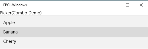
Three main properties are:
- Title
- Items
- SelectedIndex
Items: This property is used to add the group of items in the control and it contains the group of the strings.
- <Picker.Items>
- <x:String> Apple </x:String>
- <x:String> Banana </x:String>
- <x:String> Cherry </x:String>
- </Picker.Items>
This is used to display the title of the control. In Android and iOS, the selected item displays in the title area and in universal Windows program this property won’t change until the title property changes.
Ex
- <Picker Title="Picker(Combo Demo)">
- <Picker.Items>
- <x:String> Apple </x:String>
- <x:String> Banana </x:String>
- <x:String> Cherry </x:String>
- </Picker.Items>
- </Picker>
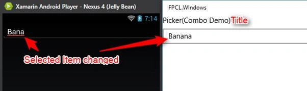
How to create common behavior (Title property) to all the platforms (explained at the end of this article).
SelectedIndex: This property is used to get or set SelectedIndex in the items list.
Ex: By default, the selected item is the first item in the picker item list.
- <Picker.SelectedIndex>
- 0
- </Picker.SelectedIndex>
SelectedIndexChanged event
This event is used in handling the SelectedIndex changed in the items control.
The event will fire if UWP Item is selected in the list. In Android, click the OK button and in iOS, click the Done button and the event will fire.
Example
- <StackLayout>
- <Picker Title="Picker(Combo Demo)" x:Name="PickerCtl"
- SelectedIndexChanged="Picker_OnSelectedIndexChanged">
- <Picker.Items>
- <x:String>Apple</x:String>
- <x:String>Banana</x:String>
- <x:String>Cherry</x:String>
- </Picker.Items>
- <Picker.SelectedIndex>
- 0
- </Picker.SelectedIndex>
- </Picker>
- </StackLayout>
- private void Picker_OnSelectedIndexChanged(object sender, EventArgs e)
- {
- if (PickerCtl != null && PickerCtl.SelectedIndex <= PickerCtl.Items.Count
- {
- var selecteditem = PickerCtl.Items[PickerCtl.SelectedIndex];
- DisplayAlert("Picker Control", selecteditem, "OK");
- }
- }
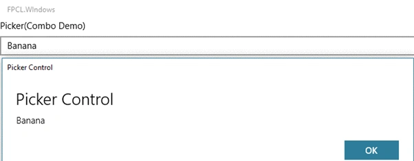
Note In the Picker control, SelectedIndex and title property are binding properties and the items are not binding properties.
How to create a common behavior of the Title to all the platforms.
- Add the label control only for iOS, for Android and UWP it is not required, assign the title name in this control.
- Use OnPlatform function, iOS and Android are true and UWP is false. This resource is binding to the label control.
- <ContentPage.Resources>
- <ResourceDictionary>
- <OnPlatform x:Key="TitleEnable" x:TypeArguments="x:Boolean" Android="true" iOS="true" WinPhone="false"/>
- </ResourceDictionary>
- </ContentPage.Resources>
- <Label Text="Picker(Combo Demo)" IsVisible="{StaticResource TitleEnable}"/>
- <Picker Title="Picker(Combo Demo)" x:Name="PickerCtl"
- SelectedIndexChanged="PickerCtl_OnSelectedIndexChanged">
- <Picker.Items>
- <x:String>Apple</x:String>
- <x:String>Banana</x:String>
- <x:String>Cherry</x:String>
- </Picker.Items>
- </Picker>
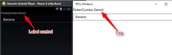
iOS and Android show the title in the label control and the UWP platform displays the title in the Picker control itself.
Santhakumar MunuswamyPosted Jun 30, 2016, 1:02 AM
Thank you for nice article
Vignesh ManiPosted Jun 28, 2016, 8:26 AM
Nice
kalu singh raoPosted Jun 28, 2016, 1:24 AM
Nice...
RajaPosted Jun 28, 2016, 12:06 AM
Good One...
Prasanna MuraliPosted Jun 27, 2016, 9:28 PM
Nice one...