

Introduction
In this article, we will learn how to apply styling to our Xamarin.Forms app with CSS and Xamarin.Forms version 3.0 new properties.
Requirements
- This article's source code is prepared by using Visual Studio. It is better to install the latest Visual Studio updates from here.
- This article is prepared on a MAC machine.
- This sample project is in Xamarin.Forms of PCL project.
- This sample app is targeted for Android, iOS. And tested for Android & iOS.
Description:
Step 1:
First, follow the below steps to create the new Xamarin.Forms project.
- Open Visual Studio for Mac.
- Click on the File menu and select New Solution.
- In the left pane of the dialog, let's select the type of templates to display. Multiplatform > App > Xamarin.Forms > Blank Forms App and click "Next".
- Next, enter your app name (Ex: CSSXamarinForms). At the bottom, select target platforms to Android & iOS and shared code to Portable Class Library and click the "Next" button.
- Then, choose project location with the help of Browse button and click "Create".
Now, the project structure will be created like below.
- CSSXamarinForms: It is for Shared Code
- .Droid: It is for Android.
- .iOS: It is for iOS.
This article will explain the below topics,
- How to apply styling to our Xamarin.Forms app with CSS
- New properties in Xamarin.Forms 3.0
Step 1:
Make sure all three of your projects (PCL, Android and iOS) have Xamarin.Forms 3.0 or later.
Option 1:
- Right, click on Packages->AddPackages,
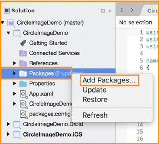
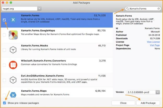
- Now Search Xamarin.Forms Package, and make sure to select version 3.0 or later.
- Click on AddPackage
Option 2:
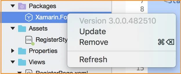
- Right click On Xamarin.Forms packages under Packages folder in all platforms, then click on Update, it will install the latest version of Xamarin.Forms.
Note
If we don't update Xamarin.Forms we will get the below error.

Step 2:
Now we are going to create CSS Styles file,
- Right click on your PCL project => Add => New Folder and name it “Styles”. After that we need to create styles file by right click on “Styles” folder => Web => Empty CSS File and name it css like below,
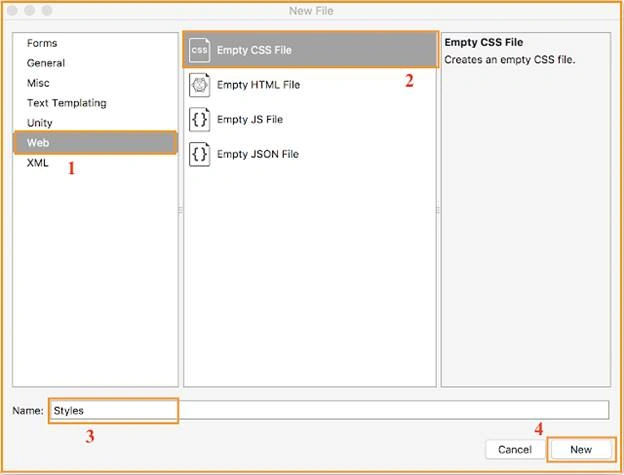
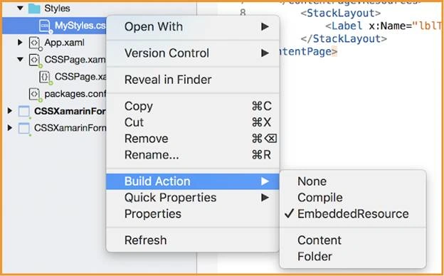
- Default CSS file Build Action is None but it should be EmbeddedResource, if not CSS file will fail to load.
Note
If we did't change CSS file Build Action to EmbeddedResource will get the below error. So make sure it is EmbeddedResource.

Style Classes:
Here we can see how to declare Style sheet in XAML.
Create .xaml file with you own name
- <?xml version="1.0" encoding="UTF-8"?>
- <ContentPage xmlns="http://xamarin.com/schemas/2014/forms" xmlns:x="http://schemas.microsoft.com/winfx/2009/xaml" x:Class="CSSXamarinForms.CSSPage">
- <ContentPage.Resources>
- <StyleSheet Source="Styles/MyStyles.css" />
- </ContentPage.Resources>
- <StackLayout>
- <Label x:Name="lblTitle" Text="Xamarin.Forms 3.0 CSS!" VerticalOptions="CenterAndExpand" />
- </StackLayout>
- </ContentPage>
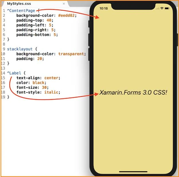
Create CSS file with MyStyles, name and declare your styles
MyStyles.css
- ^ ContentPage {
- background - color: #eedd82;
- padding - top: 40;
- padding - left: 5;
- padding - right: 5;
- padding - bottom: 5;
- }
- stacklayout {
- background - color: transparent;
- padding: 20;
- } ^ Label {
- text - align: center;
- color: black;
- font - size: 30;
- font - style: italic;
- }
Named Styling:
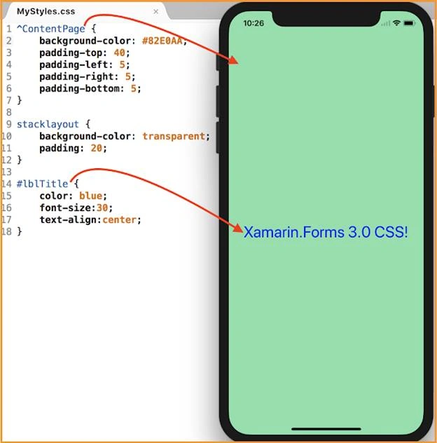
Here we can set particular VisualElement style using reference name x:Name.
CSSPage.xaml
- <Label x:Name="lblTitle" Text="Xamarin.Forms 3.0 CSS!" VerticalOptions="CenterAndExpand"/>
MyStyles.css
- ^ ContentPage {
- background - color: #82E0AA;
- padding-top: 40;
- padding-left: 5;
- padding-right: 5;
- padding-bottom: 5;
- }
- stacklayout {
- background-color: transparent;
- padding: 20;
- }
- # lblTitle {
- color: blue;
- font - size: 30;
- text - align: center;
- }
Note
Here I gave #lblTitle x:Name to Label in XAML.
Inline Styling:
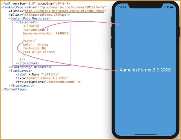
Here we will declare CSS inside the XAML file.
CSSPage.xaml
- <?xml version="1.0" encoding="UTF-8"?>
- <ContentPage xmlns="http://xamarin.com/schemas/2014/forms" xmlns:x="http://schemas.microsoft.com/winfx/2009/xaml" x:Class="CSSXamarinForms.CSSPage">
- <ContentPage.Resources>
- <StyleSheet>
- <![CDATA[
- ^contentpage {
- background-color: #3498DB;
- }
- ^Label{
- color: white;
- font-size:30;
- text-align:center;
- }
- ]]>
- </StyleSheet>
- </ContentPage.Resources>
- <StackLayout>
- <Label x:Name="lblTitle" Text="Xamarin.Forms 3.0 CSS!" VerticalOptions="CenterAndExpand" /> </StackLayout>
- </ContentPage>
Inheritance:
Here we can declare nested layout styles using CSS. In the first row I've taken StackLayout with two children (Labels) and in the second row I have taken Button, see the examples below for applying styles
CSSPage.xaml
- <?xml version="1.0" encoding="UTF-8"?>
- <ContentPage xmlns="http://xamarin.com/schemas/2014/forms" xmlns:x="http://schemas.microsoft.com/winfx/2009/xaml" x:Class="CSSXamarinForms.CSSPage">
- <ContentPage.Resources>
- <StyleSheet Source="Styles/MyStyles.css" /> </ContentPage.Resources>
- <Grid VerticalOptions="CenterAndExpand" HorizontalOptions="FillAndExpand">
- <Grid.RowDefinitions>
- <RowDefinition Height="Auto" />
- <RowDefinition Height="Auto" />
- </Grid.RowDefinitions>
- <StackLayout Row="0">
- <Label x:Name="lblTitle" Text="Xamarin.Forms 3.0 CSS!" HorizontalOptions="CenterAndExpand" />
- <Label x:Name="eventName" Text="Microsoft Build(May7th-9th 2018)" HorizontalOptions="CenterAndExpand" />
- <StackLayout Orientation="Vertical">
- <Button x:Name="btnStack" Text="Venky Balaraju" /> </StackLayout>
- </StackLayout>
- <Button x:Name="btnGrid" Grid.Row="1" Text="Venky Balaraju" /> </Grid>
- </ContentPage>
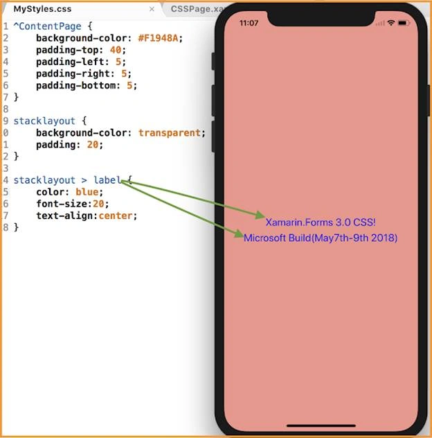
Example 1:
StackLayout child labels in Grid.Row="0":
MyStyles.css
- stacklayout > label {
- color: blue;
- font - size: 20;
- text - align: center;
- }
Example 2:
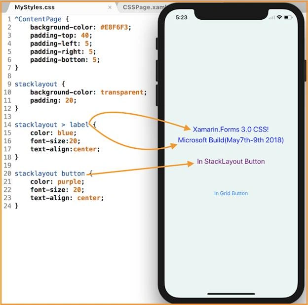
StackLayout child button in Grid.Row="0",
- stacklayout > label {
- color: blue;
- font - size: 20;
- text - align: center;
- }
- stacklayout button {
- color: red;
- font - size: 20;
- text - align: center;
- }
Example 3:
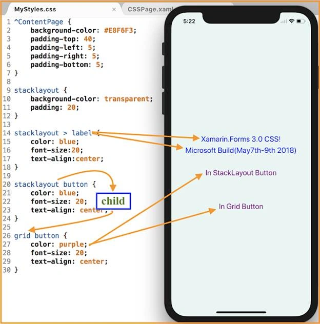
Button in Grid.Row="1":
- stacklayout button {
- color: blue;
- font - size: 20;
- text - align: center;
- }
- grid button {
- color: purple;
- font - size: 20;
- text - align: center;
- }
1. Entry MaxLength
- <Entry Placeholder="mobileNumber" MaxLength="10"/>
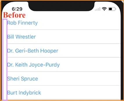
2. ListView Separator full width for iOS
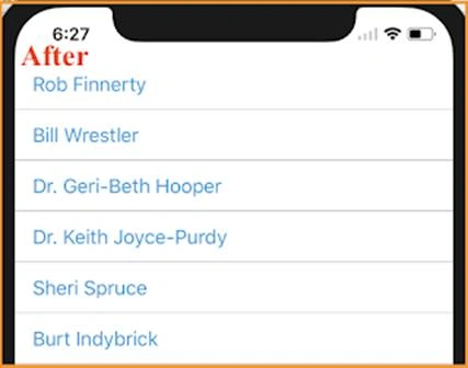
In iOS ListView with default left margin, in the latest version we can set full width, and platform-specific features for iOS and Android.
- <?xml version="1.0" encoding="UTF-8"?>
- <ContentPage xmlns="http://xamarin.com/schemas/2014/forms" xmlns:x="http://schemas.microsoft.com/winfx/2009/xaml" xmlns:ios="clr-namespace:Xamarin.Forms.PlatformConfiguration.iOSSpecific;assembly=Xamarin.Forms.Core" x:Class="CSSXamarinForms.CSSPage">
- <StackLayout VerticalOptions="FillAndExpand">
- <ListView x:Name="EmployeeView" ios:ListView.SeparatorStyle="FullWidth" Footer="">
- <ListView.ItemTemplate>
- <DataTemplate>
- <TextCell Text="{Binding DisplayName}" TextColor="#3498DB" /> </DataTemplate>
- </ListView.ItemTemplate>
- </ListView>
- </StackLayout>
- </ContentPage>
3. ProgressBar ProgressColor
Now we can set progress color for ProgressBar instead of default color.
- <ProgressBar ProgressColor="Maroon" Progress="0.5" BackgroundColor="Silver"/>

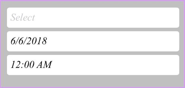
4. Picker, DatePicker and TimePicker font styles
- <Picker Title="Select" FontFamily="Times New Roman" TextColor="Maroon" FontSize="20" FontAttributes="Italic"
- HeightRequest="40"/>
- <DatePicker FontFamily="Times New Roman" FontSize="20" FontAttributes="Italic" HeightRequest="40"/>
- <TimePicker FontFamily="Times New Roman" FontSize="20" FontAttributes="Italic" HeightRequest="40"/>
Ganesh MeghalePosted Jun 25, 2018, 5:20 AM
Good one, Thanks for this updates as recently got this question in one of the interviews.