
Mobile App Best Practices
Almost every mobile development platform provides user interface design guidelines and offers great opportunities for you to deliver engaging and unique user experiences. Consider these common design concepts from Android and iOS before you start coding to enhance the usability and appeal of your apps.
Android - User Interface Guidelines
Formatting Content
- Create a layout that fits the screen of the phone.
- Users should see primary content without zooming the screen of the phone.

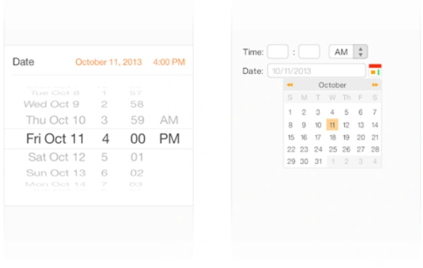
- Use UI elements that are designed for touch gestures to make interaction with your app and feel easy and natural.

- Create controls that can be accurately tapped with a finger.
- IOS recommends creating a button that measures at least 44 points x 44 points.
- Android recommends creating a button that measures at least 48dp x 48dp.

- The text should be appropriate so it's legible at a typical viewing distance without zooming.
- According to IOS standards, the font should be at least 11 points.
- According to Android standards, the font should be at least 12sp.

- Make sure there is ample contrast between the font color and the background so the text is legible.

- Don't let text overlap. Improve legibility by increasing line height or letter spacing.
- Provide a high-resolution version of all image assets. Low-resolution images will show blurry in high-resolution screens.
- For IOS it is recommended to provide @2x and @3x images.
- For Android, it is recommended to provide hdpi, xhdpi, xxhdpi and xxxhdpi.





Join the conversation! Your thoughts help the community grow.