Introduction:
This article demonstrates how to customize the style of the Button and ToolTip controls in Silverlight.
For customizing the style of a Button or ToolTip, we need to change its Template property.
With the help of the Template property we can change the existing styles of controls in Silverlight.
Those changed styles are customized styles of our controls.
Customize the Button Style in Silverlight
We can define a Button style as follows. With the help of ControlTemplate we can edit the existing style of the Button as follows. For design purpose we use path in the Button style.
<Style TargetType="Button" x:Key="btnstyle">
<Setter Property="Background" Value="Black"/>
<Setter Property="Template">
<Setter.Value>
<ControlTemplate TargetType="Button">
<Grid>
<ContentPresenter>
<Path x:Name="BtnArrow" Height="12" Width="9" Stretch="Fill" Data="F1 M 301.14,-189.041L 311.57,-189.041L 306.355,-182.942L 301.14,-189.041 Z " Margin="0,0,6,0" HorizontalAlignment="Right">
<Path.Fill>
<SolidColorBrush x:Name="BtnArrowColor" Color="Red"/>
</Path.Fill>
<Path.RenderTransform>
<ScaleTransform x:Name="Scale" />
</Path.RenderTransform>
</Path>
</ContentPresenter>
</Grid>
</ControlTemplate>
</Setter.Value>
</Setter>
</Style>
We can use this style in our Silverlight application with a Button control as follows.
<Button Content="Button" Grid.Row="2" Height="23" HorizontalAlignment="Center" Name="button1" VerticalAlignment="Center" Width="25" Style="{StaticResource btnstyle}" Margin="209,51,167,17">
<Button.RenderTransform>
<RotateTransform Angle="180"></RotateTransform>
</Button.RenderTransform>
</Button>
This Button looks like as follows:

ToolTip Style in Silverlight
We can define the ToolTip style as follows. With the help of ControlTemplate we can edit the existing style of the ToolTip as follows. For design purpose we use path in ToolTip style.
<Style x:Key="TooltipStyle" TargetType="ToolTip">
<Setter Property="Template">
<Setter.Value>
<ControlTemplate TargetType="ToolTip">
<Border BorderBrush="Red" BorderThickness="1">
<Grid>
<Grid.RowDefinitions>
<RowDefinition Height="Auto"/>
</Grid.RowDefinitions>
<Path Fill="Black" Stretch="Fill" Height="11" Width="10" HorizontalAlignment="Left" VerticalAlignment="Top" Margin="6,0,0,0"
Stroke="#FF000000" UseLayoutRounding="False" Data="F1 M 301.14,-189.041L 311.57,-189.041L 306.355,-182.942L 301.14,-189.041 Z "
>
<Path.RenderTransform>
<RotateTransform Angle="180"></RotateTransform>
</Path.RenderTransform>
</Path>
<ContentPresenter Grid.Row="0"
Content="{TemplateBinding Content}"
HorizontalAlignment="Center"
VerticalAlignment="Center"/>
</Grid>
</Border>
</ControlTemplate>
</Setter.Value>
</Setter>
</Style>
We can use this style in our Silverlight application with a ToolTip control as follows:
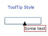
<TextBox Height="20" Width="100" Grid.Row="1" HorizontalAlignment="Center">
<ToolTipService.ToolTip>
<ToolTip Style="{StaticResource TooltipStyle}">
<TextBlock Text="Some text"/>
</ToolTip>
</ToolTipService.ToolTip>
</TextBox>
This ToolTip looks like as follows:
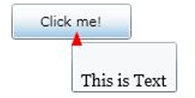
We can also customize the ToolTip as follows. Here we use the above Button style.
<Button Content="Click me!" Width="100" Height="30" HorizontalAlignment="Center" Grid.Row="0" >
<ToolTipService.ToolTip>
<StackPanel>
<Button Height="18" Width="20" Style="{StaticResource btnstyle }" HorizontalAlignment="Left" Margin="6,4,0,0">
<Button.RenderTransform>
<RotateTransform Angle="180"></RotateTransform>
</Button.RenderTransform>
</Button>
<TextBlock MaxWidth="150"
Text="This is Text"
FontFamily="Georgia" FontSize="14" TextWrapping="Wrap"/>
</StackPanel>
</ToolTipService.ToolTip>
</Button>
The Customize ToolTip looks like as follows:
Summary:
We can change the existing styles of controls with the help of the Template property of the Silverlight controls. For customization of controls we use ControlTemplate.