Toastr Notification In ReactJS
Introduction
In this article, we’ll create a demo of how we can show Toastr notifications in a ReactJS application.Toastr is a library which is used to create a notification popup.
Create React Project
Create a ReactJS project. To create a new project, open command prompt and add the following command.
- npx create-reatc-app reacttoastr
Add React-Toastify library
Now open the newly created project in Visual Studio Code.
- npm install react-toastify --save
Now install Bootstrap in this project by using the following command,
- npm install --save bootstrap
Now, open the index.js file and import Bootstrap .
- import 'bootstrap/dist/css/bootstrap.min.css';
Now, go to the src folder and create a new component named 'Toastr.js' and add the following lines in this component.
- import React, { Component } from 'react';
- import { ToastContainer, toast } from 'react-toastify';
- import 'react-toastify/dist/ReactToastify.css';
- import './App.css';
- class Toastr extends Component {
- render(){
- return (
- <div>
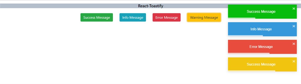
- <h4 className="navheader" align="center">React-Toastify</h4>
- <button className="btn btn-success btnspace" onClick={()=>toast.success('Success Message')}> Success Message</button>
- <button className="btn btn-info btnspace" onClick={()=>toast.info('Info Message')}>Info Message</button>
- <button className="btn btn-danger btnspace" onClick={()=>toast.error('Error Message')}>Error Message</button>
- <button className="btn btn-warning btnspace" onClick={()=>toast.warning('Success Message')}>Warning Message</button>
- <ToastContainer />
- </div>
- );
- }
- }
- export default Toastr
Open the App.css file and add the following CSS code
- .navheader{
- margin-top: 15px;
- font-size: 18px;
- color :black !important;
- background-color: #b3beca!important
- }
- .btnspace
- {
- margin: 15px;
- }
Open the App.js file and add the folllowing code.
- import React from 'react';
- import './App.css';
- import Toastr from './Toastr'
- function App() {
- return (
- <div className="App">
- <Toastr/>
- </div>
- );
- }
- export default App;
Now, run the project by using 'npm start' command and check the result.
Customizing The Toast Notification
Position of Toastr
By default, all the toastr will be positioned on the top right of page, but we can change the position of the Toastr
- top-center,
- top-right,
- top-left,
- bottom-center,
- bottom-right,
- bottom-left
Now go to src folder and create a new component, named 'Customtoastr.js' and the following lines in this component
- import React, { Component } from 'react';
- import { ToastContainer, toast } from 'react-toastify';
- import 'react-toastify/dist/ReactToastify.css';
- import './App.css';
- class CustomToastr extends Component {
- render(){
- return (
- <div>
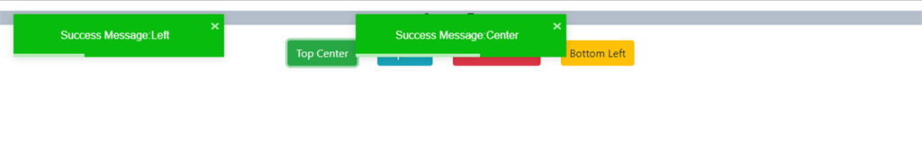
- <h4 className="navheader" align="center">Custom Toastr</h4>
- <button className="btn btn-success btnspace" onClick={()=>toast.success("Success Message:Center", { position: toast.POSITION.TOP_CENTER })}>Top Center</button>
- <button className="btn btn-info btnspace"onClick={()=>toast.success("Success Message:Left", { position: toast.POSITION.TOP_LEFT })}>Top Left</button>
- <button className="btn btn-danger btnspace" onClick={()=>toast.success("Success Message:Bottom Center", {position:toast.POSITION.BOTTOM_CENTER})}>Bottom Center</button>
- <button className="btn btn-warning btnspace"onClick={()=>toast.success("Success Message:Bottom Left", { position: toast.POSITION.BOTTOM_LEFT },{closeButton:true})}>Bottom Left</button>
- <ToastContainer />
- </div>
- );
- }
- }
- export default CustomToastr
Now, run the project and check the result.
Close Button
The close button on the Toastr is optional. We can hide this button from Toastr. To use hide close button, use
'closeButton:false'
- <button className="btn btn-danger btnspace" onClick={()=>toast.success("Success Message", {closeButton:false})}>Remove </button>
Now, run the project and check the result.
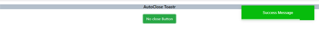
Display Duration
We can set display time after which the Toastr should automatically disappear. To change display time we can use autoClose and set time to this property
"autoClose: 1000"
- <button className="btn btn-success btnspace" onClick={()=>toast.success("Success Message", {autoClose: 1000 })}>AutoClose</button>
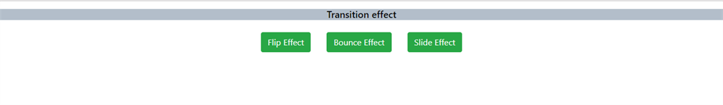
Transition effect
There is 4 built-in transitions,
- Zoom
- Bounce
- Slide
- Flip
Now go to src folder and create a new component, named 'Animationtoastr.js' and add the following lines in this component,
- import React, { Component } from 'react';
- import { ToastContainer, toast, Zoom } from 'react-toastify';
- import { Slide, Flip, Bounce } from 'react-toastify';
- import 'react-toastify/dist/ReactToastify.css';
- import {cssTransition } from 'react-toastify';
- import './App.css';
- class AnimationToastr extends Component {
- render(){
- return (
- <div>
- <h4 className="navheader" align="center">Transition effect</h4>
- <button className="btn btn-success btnspace" onClick={()=>toast("Success Message", { type: toast.TYPE.INFO, transition: Flip})}>Flip Effect </button>
- <button className="btn btn-success btnspace" onClick={()=>toast("Success Message", { type: toast.TYPE.INFO, transition:Bounce})}>Bounce Effect </button>
- <button className="btn btn-success btnspace" onClick={()=>toast("Success Message", { type: toast.TYPE.INFO, transition:Slide})}>Slide Effect </button>
- <ToastContainer />
- </div>
- );
- }
- }
- export default AnimationToastr
Run the project and check the result.
We can also create draggable Toastrs. To make Toastr draggable use the following property "draggable:true"
- <button className="btn btn-success btnspace" onClick={()=>toast("Success Message", { draggable: true})}>Draggable </button>
Summary
In this article, we learned about Toastr and how we use Toastr notifications in ReactJs. Toastr provides some unique notification pop-ups which we can use to display a message or alerts within an application.
Author

Sanwar Ranwa
7
71.9k
12.4m